


![]() Tampa Bay Rays Logo PNG
Tampa Bay Rays Logo PNG
The Tampa Bay Rays logo emphasizes their aspiration for a stellar career. It features a bright star that stands out against a dark blue background. The emblem’s style is free and creative, breaking the standard rules of typography since the leg of the first letter extends far beyond the word’s boundaries.
The history of the Tampa Bay Rays began decades before its official debut. From the 1960s onward, local officials in St. Petersburg, led by publisher Jack Lake, pushed to secure a Major League team. In 1990, Tropicana Field was built in advance, even before a franchise was secured.
During the 1980s and 1990s, the city attempted to attract existing clubs, including the Minnesota Twins, San Francisco Giants, Chicago White Sox, Texas Rangers, and Seattle Mariners. Despite financial offers and infrastructure, none of these moves materialized. The breakthrough came in 1998, when the Tampa Bay Devil Rays joined MLB as an expansion team.
Poor results marked the first decade. The team finished last in its division consistently until 2002 and struggled to compete in the American League East. Structural changes followed, including a shift in the approach to ownership and long-term planning.
In 2007, owner Stuart Sternberg initiated a full rebrand. The name changed to Tampa Bay Rays, with a new identity focused on light imagery rather than marine references. A revised color system was introduced, centered on dark blue, light blue, and gold.
In 2008, the impact became visible. The Rays won the division and defeated the Boston Red Sox in the ALCS, reaching the World Series for the first time, though losing to the Philadelphia Phillies.
In the following years, the club maintained a competitive presence, regularly appearing in the postseason and building stable rivalries within the division, while continuing to operate from Tropicana Field.
Meaning and History
![]()
Four logos exist in the baseball franchise’s short history (established in 1998). They are divided into two groups: before and after 2008. This clear classification is due to the style of individual symbols, which underwent a redesign at the end of the 2000s. While it previously combined text and graphics, the word part has become predominant.
What is Tampa Bay Rays?
The Tampa Bay Rays are a Major League Baseball team named after the Tampa Bay area, with St. Petersburg as their home city. They appeared in 1998, ending the region’s 30-year quest for its own Major League Baseball franchise. Since its founding, the club has competed in the American League East.
1998 – 2000
![]()
Since the original team name was the Tampa Bay Devil Rays, the first logo depicted a devil ray swimming to the left. The inscription “Devil Rays” was placed below and “Tampa Bay” above the straight length of the tail. Behind it was an oval with a rainbow gradient.
2001 – 2007
![]()
In 2001, the Tampa Bay Rays logo was replaced with a similar but more austere one. The black devil ray still pointed in the same direction. Moreover, it was now placed below the “Tampa Bay” inscription. The oval was also present, but it had changed to blue-green from the previous rainbow gradient. The “Devil Rays” inscription was removed from the logo.
2008 – 2018
![]()
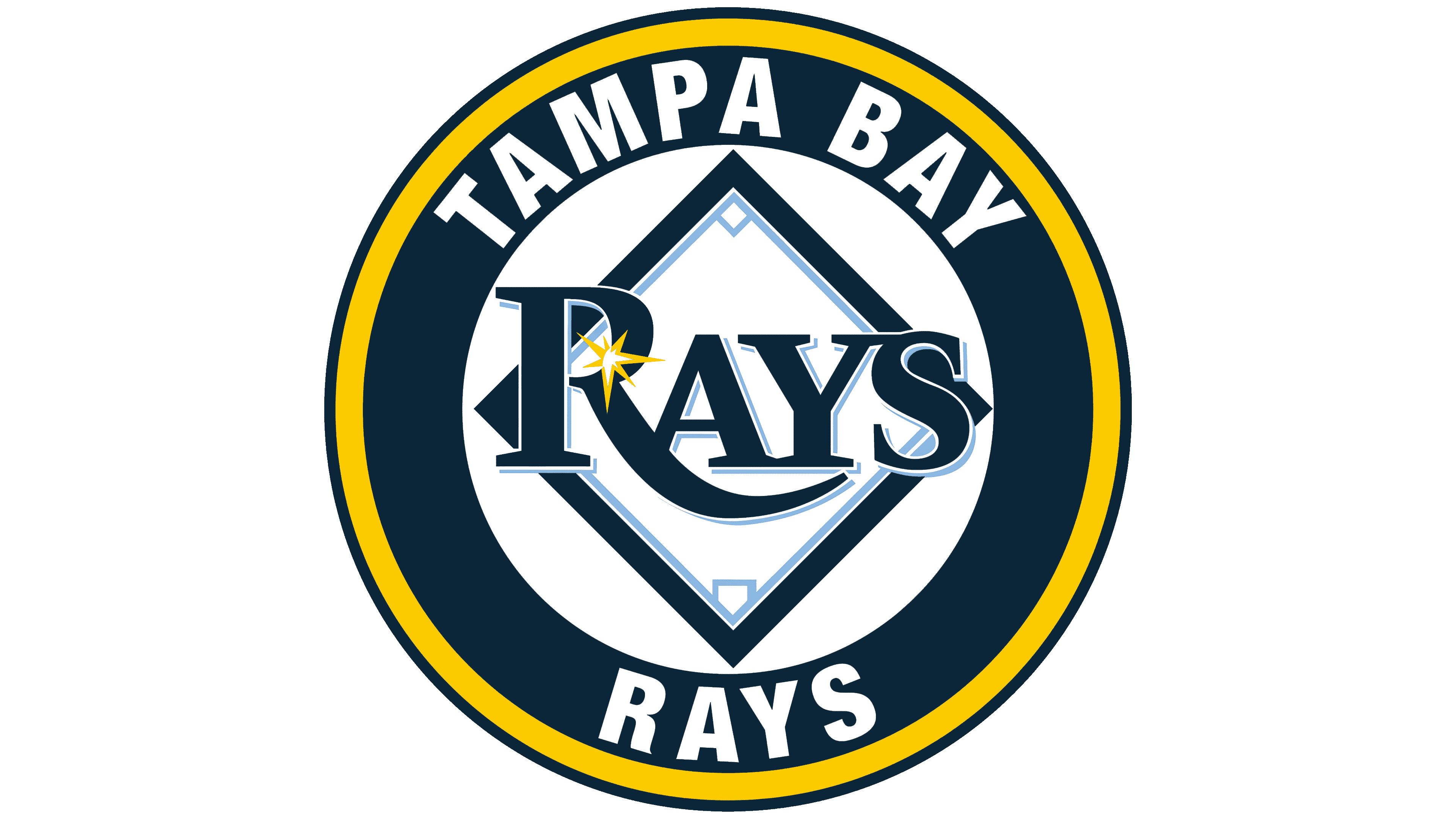
In 2008, the Tampa Bay Rays needed a new logo after a name change. Thus, the devil ray was abolished. Instead, a sunray appeared in the letter “R” of the dark blue inscription “Rays,” now taking center stage. The elongated tail of the letter “R” symbolizes water. The Tampa Bay Rays’ emblem looked like a white baseball diamond with a blue outline. The dark blue color symbolizes deep waters, and the bright blue the Florida sky. The sunray signifies sunny Florida.
2019 – today
![]()
Recently, the Tampa Bay Rays made another small change to their logo. The modern version was adopted in 2019. It is based on the previous version, from which the baseball diamond serving as the background for the word “Rays” disappeared. The developers enlarged the inscription in the updated version, leaving everything else unchanged.
As before, the “R” is depicted with an elongated leg, forming an inverted arch or the crest of a wave. It connects with “A” and reaches the lower notch of “Y.” All elements have a double frame on the right, creating a peculiar shadow and a 3D effect. The upper half of the capital letter is a shining star with seven sharp rays of varying lengths.
Rays Skateboard Logo
![]()
In 2024, the Tampa Bay Rays baseball team introduced a unique Rays Skateboard logo inspired by the team’s City Connect uniforms, celebrating the region’s skateboarding culture. The design vividly captures Tampa’s rich street culture, blending skateboarding, street art, and youthful energy.
At the heart of the logo is a stingray seamlessly transitioning into a skateboard, symbolizing the fusion of the area’s marine heritage and modern street culture. The stingray, rendered in black with soft contours, conveys dynamism, fluidity, and flexibility qualities inherent to skateboarding and the graceful sea creature. The graphic suggests the stingray performing a “stalefish” trick, adding an energetic touch to the visual.
Neon green and blue outlines frame the emblem, enhancing its three-dimensional effect and emphasizing its urban style. These colors reflect the region’s natural elements, from the waters surrounding Tampa to the green spaces where skate sessions occur.
The skateboard in the design features a texture reminiscent of an actual deck, tying into the City Connect uniform concept. Purple trucks and accents stand out against the overall design, adding boldness and vibrancy. These color highlights showcase attention to detail and a modern aesthetic.
The deck also features unique graphic elements, including a stitch motif symbolizing individuality and creativity while highlighting local cultural roots. This detail further strengthens the connection between the logo and the community.
The emblem encapsulates Tampa’s skateboarding subculture, where skateboarding, music, and art converge. The stingray motif reinforces ties to nature and the sea, paying homage to the team’s name and origins. The dynamic form of the visual mark embodies forward motion and freedom, echoing the spirit of skateboarders.
The new logo became part of a broader Tampa Bay Rays campaign promoting skateboarding and urban culture. The initiative included skateboarding events such as professional trick demonstrations, themed activities, and a limited-edition release of skateboards featuring the logo. These skateboards, merging sports themes with local cultural elements, quickly gained popularity among collectors and team fans.
Font and Colors

The debut logo differed radically from modern versions because the club had a different name. The first two options included an image of a sea devil, a giant stingray. It crossed the diagonally placed oval, on which “TAMPA BAY ” was written in the second logo and “DEVIL RAYS” in addition to it in the first.
The two remaining emblems feature the team’s wordmark, which resulted from the rebranding. Initially, the word “Rays” was on a diamond-shaped background, a baseball stadium with all lines and bases. Then designers simplified the logo to make it visible on modern carriers.
The Tampa Bay Rays logo uses a font reminiscent of Hermecito A SC. It is a serif font developed by designer Ari Rafaeli and published by ARTypes. All letters are uppercase, but the first is distinguished by size and is much larger than the rest. The highlight of the inscription is the elongated leg of “R,” which symbolizes the waves.
The logo’s color palette is also related to the water theme. Dark blue combined with light blue symbolizes the ocean and resonates with the baseball club’s name. Yellow conveys Florida’s hot sun and warm sand, while white serves as the background, adding contrast.
FAQ
Why did the Tampa Bay Devil Rays change their name?
Initially, the club was called the Tampa Bay Devil Rays, named after the ray known as the devil fish due to the horn-like fins on its head. New owner Stuart L. Sternberg removed the word “devil” to completely change the nickname’s meaning as part of a rebranding. So now, the team’s name is associated only with sunlight.
What does the Tampa Bay Baseball Club logo represent?
Since 2019, the baseball club’s logo has the word “RAYS” written in capital letters. Although all symbols are uppercase, the letter “R” is almost twice as large as the others. Its long, protruding leg runs under the letters “AY.” Above the letter “R” is a white-yellow star symbolizing a flash of light. The inscription is blue with white outlines.
What is the mascot of the Tampa Bay Rays?
The Tampa Bay Rays’ mascot is the blue and fluffy Raymond. It’s difficult to understand what creature it is, but according to legend, it belongs to the fictional biological species Canus Manta Whatthefluffalus. Team representatives claim they saw this friendly animal while fishing: it crawled out of the water, attracted by the smell of hot dogs, befriended people, and agreed to become the franchise’s mascot.
What is the salary of the Tampa Bay Devil Rays team?
As of 2021, the total salary of all players is just over $ 88 million per year. Meanwhile, the highest-paid baseball player, Kevin James Kiermaier, earns $ 11.5 million per year.