


![]() Arizona Diamondbacks Logo PNG
Arizona Diamondbacks Logo PNG
The Arizona Diamondbacks logo pays tribute to the sporting heritage of America’s esteemed baseball teams while creating a distinctive mark for the Phoenix club. The logo is minimalist, with the team name and state affiliation taking center stage. It features a stylized depiction of the western diamondback, the team’s mascot, serving as the foundation for the modern Arizona Diamondbacks logo. Beyond its aesthetic appeal, the logo symbolizes the team’s fierce, resilient spirit, drawing inspiration from the Diamondback rattlesnake’s perseverance and adaptability.
The Arizona Diamondbacks joined Major League Baseball (MLB) in 1995 when Phoenix secured an expansion franchise led by Jerry Colangelo. In 1996, the club received its name, linked to the desert rattlesnake, and construction began on Bank One Ballpark.
By 1997, the structure was formed under manager Buck Showalter. The first game took place on March 31, 1998, against the Colorado Rockies. The debut season ended 65–97, while Travis Lee earned Rookie of the Year.
In 1999, the team reached 100 wins and led the NL West. Randy Johnson began his run of Cy Young awards. In 2000, Arizona repeated as division winner but lost in the playoffs to the New York Mets.
The 2001 season became the peak. Arizona beat the St. Louis Cardinals and the Atlanta Braves to reach the World Series, then won the title in seven games against the Yankees in its fourth season.
From 2002 to 2006, results fluctuated, though the division title returned in 2002. In 2007, the team reached the NLCS but lost to the Colorado Rockies.
Between 2008 and 2010, performance dropped. In 2011, Arizona again won the division, with Kirk Gibson named NL Manager of the Year.
From 2012 to 2016, the roster featured Paul Goldschmidt but missed the playoffs. In 2017, the team returned to postseason play, only to lose to the Los Angeles Dodgers.
The 2020 season ended 25–35. In 2021, the club finished 52–110, the worst record in its history. A rebuild began in 2022 with a 74–88 record led by Zac Gallen and Daulton Varsho.
In 2023, young players, including Corbin Carroll, led the way as the team stayed in the wild-card race.
Meaning and History
![]()
Before the franchise expanded, the founders asked Phoenix residents to vote on one of the name options. The list included several versions, primarily focused on the key symbol of the Arizona-Sonoran Desert: the rattlesnake. Moreover, a baseball field in America is often called a “diamond.” Thus, the Arizona Diamondbacks were born as a play on words with a double meaning. Today, the name is often shortened to D-backs.
The current club’s emblem is an artistic tapestry that beautifully reflects the club’s symbolism. The logo centers on an elegantly stylized image of a western diamondback, a snake found in the sands of Arizona. This thoughtful symbol underscores the club’s deep connection to its geographical roots and emphasizes regional pride.
Over the years, the club has respected its original design, maintaining the primary elements of the debut logo. Although subtle enhancements and refinements have been made, the essence of the original emblem remains virtually unchanged. Such careful preservation of design elements emphasizes the club’s commitment to its roots and represents a beautiful blend of continuity and evolution.
What is Arizona Diamondbacks?
The Arizona Diamondbacks represent the city of Phoenix in professional baseball. It plays at Chase Field, is part of Major League Baseball, and has been a member of the National League West since its foundation in 1998. The franchise’s informal name is D-backs.
1998 – 2006
![]()
The original logo of the “Arizona Diamondbacks” was created with deep respect for symbolism and visual narration, weaving the team’s identity into an engaging design narrative. It centers on a large, bright letter “A,” thoughtfully stylized to resemble a snake’s gaping mouth. Instead of the usual connecting line in the design, an innovative approach was used: the snake’s tongue was masterfully illustrated, giving the logo a powerful sense of the team’s namesake creature.
Beneath this impressive letter “A,” the team’s full name is set, in two styles, to highlight its unique etymology. The word “Diamond,” larger and bolder, was rendered in a deep, rich purple color. This bold color choice draws attention and gives the design a regal, majestic look, symbolizing the team’s aspiration for perfection and dominance.
The word “Backs,” on the other hand, was depicted as if made of sand on a dark purple background. This creative decision is a clear nod to Arizona’s native sands, underscoring the team’s regional affiliation. This innovative play of textures created a striking visual dichotomy and served as a constant reminder of the team’s connection to its home state.
The central part of the logo, the letter “A,” was a visual feast in a stunning combination of dark green and dark purple. This dual color scheme enhanced the logo’s aesthetics, adding sophistication and complexity. Blending these colors served as a visual metaphor for harmony between the team and its environment, strengthening the intertwining of their shared history.
2007
![]()
In 2007, after 8 years, the “Arizona Diamondbacks” decided to undertake a subtle yet significant logo evolution. Retaining the distinctive letter “A,” reminiscent of a snake’s gaping mouth, they added fresh elements. They updated the color palette to give their brand style new impetus.
The symbolic letter “A,” representing the eponymous team and the state of Arizona, retained its original form but transformed in color. From the original palette, the scheme transitioned to bright red and bold black. This bright and striking change evoked intensity, befitting the team’s competitive spirit and symbolizing its passion and fiery determination.
The font for the team name was changed. It was set in a different font, giving it a fresh, modern look while retaining the brand’s overall essence. The color also shifted from dark purple to a bold, strong black, further emphasizing the brand’s powerful character. To make the name stand out and create visual contrast, a thin yellow outline was added to the letters, creating a subtle glow that enhances the logo’s overall impact.
The proportions of the logo elements were also redesigned. The iconic letter “A” became more compact, and the team name was enhanced for greater visibility. This adjustment maintained the logo’s balance and harmony, making it more visually appealing and easier to read.
A bright feature of the updated logo was the creative addition of “tails” to the letters “A” and “K” in the word “Backs.” This distinctive modification resembles a snake’s fangs, further strengthening the team’s association with the Diamondback rattlesnake.
The Arizona Diamondbacks’ emblem from 2007 to 2011 brilliantly combined tradition and innovation. Carefully considered changes to color, typography, and design elements created a more modern, dynamic, and memorable logo that continues to symbolize the team’s unique individuality and energetic spirit.
2008 – 2011
![]()
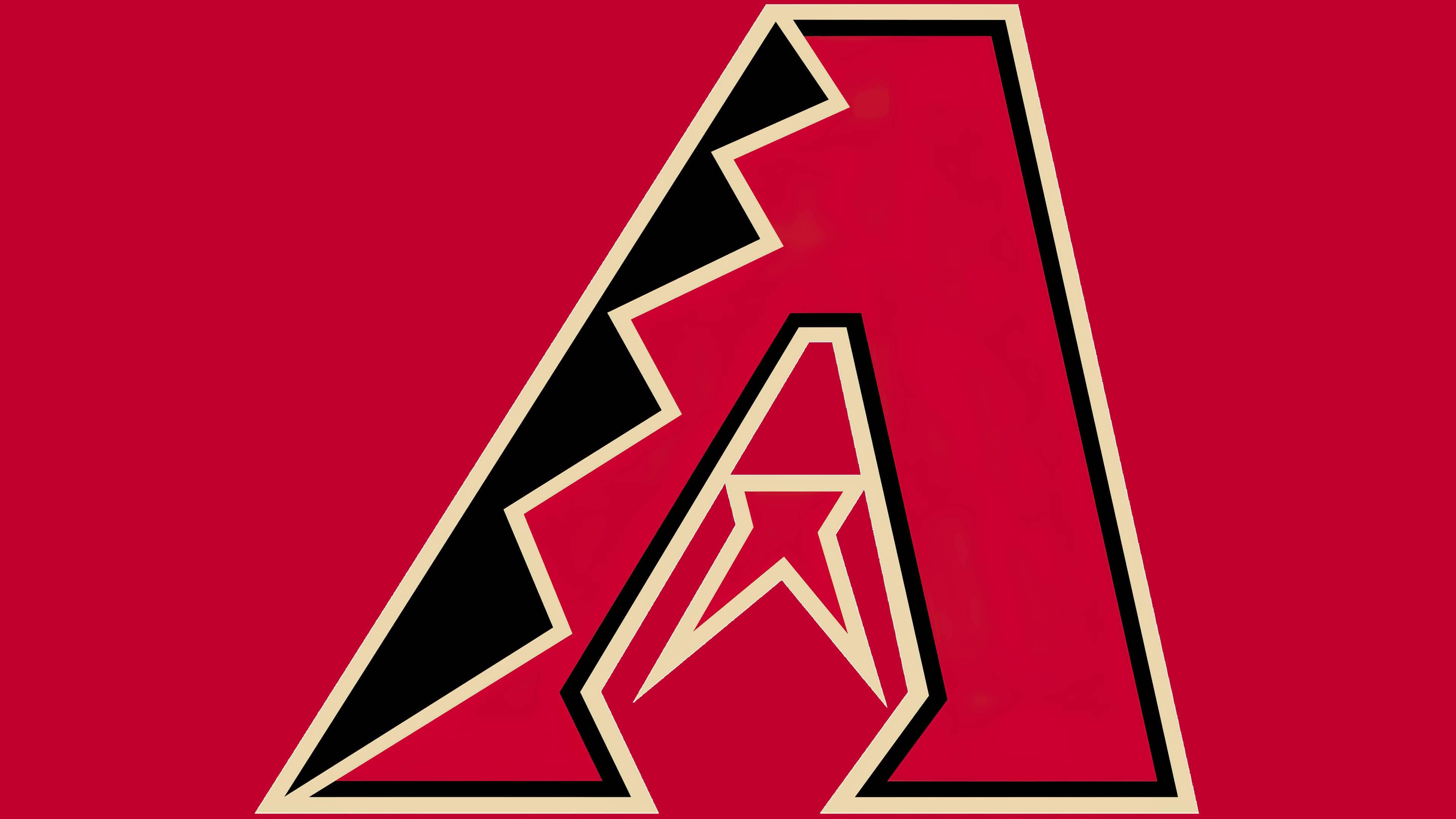
2012 – 2023
![]()
The current club logo, simple and minimalist, marks a departure from its previous, more complex iterations. However, the color palette remains unwaveringly true to its roots, maintaining a unique charm and stunning visual appeal.
Elements synonymous with Arizona are cleverly integrated into the concept. This includes bold Sedona red, reminiscent of the copper actively mined in the state, and evoking images of the breathtaking canyon near Sedona. It is complemented by gentle Sonoran beige, a shade that echoes the sands of the Sonoran Desert. To complete the scheme, black and white colors were harmoniously included, adding depth and contrast to the design. Notably, the turquoise used previously, symbolizing Arizona’s distinctive greenish-blue stone, was omitted in this version, aligning with the logo’s minimalist approach.
The emblem centers on the letter “A,” the primary symbol in the team’s and state’s names. This letter is artistically transformed to resemble a rattlesnake, a creature of great significance to the club’s identity. The intricate ornament, mimicking snake skin, and the forked tongue replacing the usual connecting bar in the letter make the snake motif convincing and expressive. The tongue and letter shine in vibrant Sedona red, while the snakeskin pattern is rendered in rich black. The light sand border further highlights these features.
Unlike previous designs, the logo now increases in size, dominating the space it occupies. The team name, which was constant in previous versions, is deliberately omitted in the design. This change in design strategy emphasizes the stylized letter “A,” allowing the logo to convey the club’s identity in a bold, wordless way. The current logo effectively embodies the club’s spirit, combining local symbolism with modern design principles.
2024 – today
![]()
Font and Colors
Throughout its short history, the Arizona baseball players’ logo has changed little. The capital letter “A” still resembles a coiled snake ready to strike. The letter represents its body, and the horizontal bar represents a protruding tongue. Therefore, all variants schematically replicate the formidable reptile. Moreover, the official symbol of Arizona is a specific rattlesnake species in the genus Viper, discovered by herpetologist Frank Willard.
The emblem replicates the pattern on the snake’s body. To do this, artists transferred it to the left side of the sign, forming a graphic ornament from four crest-like protrusions. They are highlighted not only by color but also by a light contour line. The central element is very interesting. It simultaneously resembles two attributes: a forked tongue and sharp fangs.

The inscription on the debut version is set in italic. All letters are uppercase and have prominently expressed serifs. Now, an individual font, reminiscent of encrypted symbols, is used. In the first and second versions, the letters “D” in the word “Diamond” are emphasized: the designers enlarged them and made them identical.
The official palette of the emblem is divided into two periods: before 2006 and after. Initially, turquoise-green, blue-violet, and dark sand dominated. The first was used to color the letter, the second to color the twisted ornament, and the third to color the edging lines.
Then, designers maximally linked the colors to the Arizona desert and included Sedona red #A71930, Sonoran sand #E3D4AD, white #FFFFFF, and black #000000 in the scheme. Additionally, the beige is called the shade of sand from the canyon near Sedona. In its honor, it was named Sonoran Sand. Later, the team added teal color #30CED8.