The oldest baseball team in St. Louis possesses a strong modern identity. The St. Louis Cardinals logo successfully demonstrates the connection between brand features, sports profile, name, and the reflection of the team’s spirit and philosophy.
St. Louis Cardinals: Brand overview
| Founded: | 1882 |
| Founder: | Bill DeWitt Jr. |
| Headquarters: | St. Louis, Missouri, U.S. |
| Website: | mlb.com |
The St. Louis Cardinals are a professional baseball club in the MLB. They represent the NL Central Division and are located in St. Louis, Missouri. Established in 1882, the team’s career began a year earlier in 1881, initially called “Brown Stockings.” Then, it was acquired by businessman Christian Friedrich Wilhelm and renamed “St. Louis Browns.” In 1899, the entrepreneur sold the franchise to the Robison brothers, Frank and Stanley. It was later inherited by Helen H. Britton and belonged to her almost until the beginning of 1918.
The next owner was Sam Breadon, who initiated a rapid change of owners: R. Hannegan (1947-1949) and F. Saigh (1947-1953). Anheuser-Busch acquired the St. Louis Cardinals in 1953 and managed it for a long time until 1995 inclusive. Currently, the team is owned by William DeWitt Jr.
The club officially registered its current name in 1900. It received it by chance. One day, Willie McHale, a reporter for the St. Louis Republic, saw a fan point to the red gaiters of the players and said it was the shade of a cardinal. McHale noted the comparison and included it in his column. Naturally, this mention spread and became a nickname that Christian Friedrich Wilhelm liked.
Meaning and History
Upon changing its name to “Cardinals,” the team immediately changed its logo. Initially, it was in the form of interconnected “StL.” The idea of associating athletes with the image of the namesake birds arose in the 1920s. The first graphic sign with cardinals dates back to 1922. All subsequent versions are modifications. Designers experimented with the emotional mood of the birds, their character, color, size, and number. Moreover, this emblem was popular with fans: according to ESPN, it was recognized as the best among all baseball team logos.
What is St. Louis Cardinals?
The St. Louis Cardinals are a Major League Baseball team that has been playing in the National League Central since 1994. Known for its numerous victories: it has won 11 World Series and received 19 NL pennants, thus ranking third among all franchises. It is also one of the oldest baseball clubs in the USA, founded in 1882 based on the “Brown Stockings.”
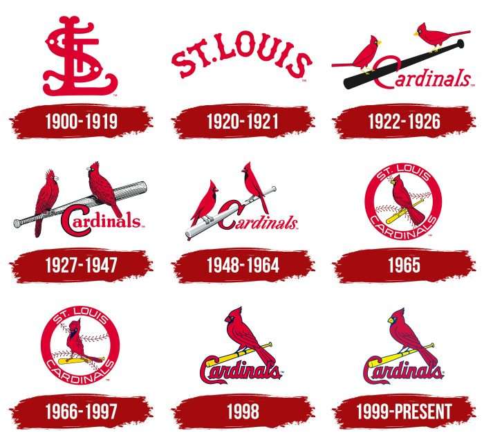
1900 – 1919
The first logo of the “St. Louis Cardinals” was the intertwined red initials of the team’s name, STL. The letter “S” is adorned with two small white diamonds. This logo first appeared on the team’s caps and sleeves in 1900.
1920 – 1921
The second logo depicted the name of the city St. Louis in red, placing the letters in an arc.
1922 – 1926
For the first time, the emblem featured two red cardinals sitting on both ends of a wooden brown baseball bat. Below the bat is the word “Cardinals,” where the letter “C” hooks onto the baseball bat.
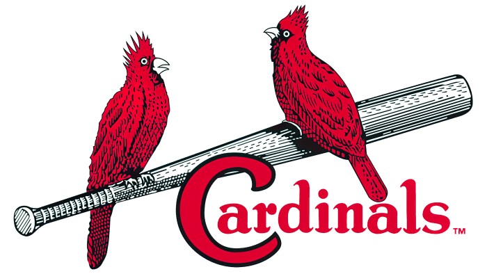
1927 – 1947
A modified version of the previous logo. With the addition of various shades of red, the birds look more voluminous. The baseball bat changed from brown to silver. Below is the team’s name.
1948 – 1964
Another reworked version of the image of two cardinals sitting on a silver baseball bat. The birds were given black chests and sharp crests. The red letter “C” in the team name is outlined in black.
1965
The sixth emblem of the “St. Louis Cardinals” features a red cardinal sitting on a small yellow baseball bat. The entire picture is depicted inside a red ring with the full name of the team. Inside the ring is a classic white baseball.
1966 – 1997
The same red bird sitting on a yellow baseball bat is now depicted in profile. On its head is a classic red baseball cap. The font of the name “St. Louis Cardinals” was also changed. Throughout the logo, the red color took on a lighter and brighter shade.
1998
Comparing several logos from previous years, we concluded that the 1998 logo depicts a dark red cardinal sitting on a yellow baseball bat. Below the image is the word “Cardinals,” where the letter “C” extends beyond the edge of the bat.
1999 – today
The logo received updated stylization: the bird not only stands on the baseball bat but also grasps it. The letter “C” creates the impression that it is hanging on the bat. The script became more powerful than before, though it remains in calligraphic writing. The form is semi-joined because the first symbol is separate, and the rest are connected.
The word “Cardinals” is located under the bat on which the cardinal sits. The contours of all elements are outlined in blue. The red color (of the bird and the name) became more saturated compared to previous versions. The baseball bat and beak are lemon-yellow, and the eye is white.
St. Louis Cardinals: Interesting Facts
The St. Louis Cardinals are a big deal in baseball. They’ve been around for a long time and have a lot of fans.
- Winning Big: They’ve won the World Series 11 times, which is a lot; only the New York Yankees have won more. They took home the trophy in 1926, 1931, 1934, 1942, 1944, 1946, 1964, 1967, 1982, 2006, and 2011.
- The Cardinal Way: They play baseball correctly, always trying hard and being good sports, whether on the field or not.
- Smart Moves: Branch Rickey made some cool changes long ago that helped the Cardinals find and train new players. This helped them win a lot.
- Stan Musial: He was an amazing player who spent his whole career, 22 years, with the Cardinals. He won many awards and was known for being a great hitter and a good person.
- Red Schoendienst: Red played, coached, and managed for the Cardinals for more than 70 years. He loved baseball.
- Ozzie Smith’s Flips: Ozzie Smith was amazing at defense and would do flips on the field, which everyone loved.
- Rogers Hornsby: He was one of the best hitters ever and had some of his best years with the Cardinals in the 1920s.
- Bob Gibson’s Amazing Year: Bob Gibson was an incredible pitcher who had a year in 1968 that was so good the rules of baseball were changed because of him.
- The Gas House Gang: The 1934 Cardinals were tough and fun. They won the World Series with a lot of personality.
- Busch Stadium: The place where they play opened in 2006 and is the third one with the Busch name. It’s a great place to watch a game, with a nice city view. It has seen some great baseball moments, including two World Series.
These points show why the Cardinals are a big part of baseball history. They’re known for being good at baseball and having a great team spirit.
Font and Colors
The first two versions of St. Louis Cardinals were textual; all subsequent ones featured a bird sitting on a baseball bat. Throughout the evolution, the appearance of the cardinal constantly changed, as did its number. For example, from 1922 to 1964, there were two birds, and they were located at opposite ends of the baseball bat with the letter “C” hanging on it.
The image of the cardinal varied from cartoonish to realistic. The most plausible style is now used – removing small details such as the crest, plumage, and beak. The only constant in the emblem remained the signature palette.
The earliest version contains a monogram composed of the letters “S,” “T,” and “L” from the words “St. Louis.” Its basis is a font reminiscent of the Old English alphabet. Although the signs are superimposed on each other, they are clearly visible and legible. In 1992, a hook-shaped letter “C” and lowercase writing of the word “Cardinals” appeared. In the current version, the letters are italicized, and the capital “C” has an elongated lower part.
The logo uses corporate colors: cardinal red, midnight navy blue, white, and yellow. In the 1927-1964 versions, silver was also present, which designers later replaced with gold.
St. Louis Cardinals color codes
| Red | Hex color: | #c41e3a |
|---|---|---|
| RGB: | 196 32 59 | |
| CMYK: | 0 100 63 12 | |
| Pantone: | PMS 200 C |
| Midnight Navy Blue | Hex color: | #22205f |
|---|---|---|
| RGB: | 34 32 95 | |
| CMYK: | 100 64 0 60 | |
| Pantone: | PMS 289 C |
| Yellow | Hex color: | #fdda00 |
|---|---|---|
| RGB: | 253 218 0 | |
| CMYK: | 0 6 95 0 | |
| Pantone: | PMS 108 C |
FAQ
Did the “Cardinals” change their logo?
This statement is not entirely true, as the team still uses the logo adopted in 1999. On the other hand, it changed very often until a final version emerged at the turn of the century. Designers experimented with birds, inscriptions, and baseball bats. But in 2020, the monogram “ST” logo adorning the players’ caps was updated for the first time in 56 years.
What does the “St. Louis Cardinals” logo represent?
The central element of the “St. Louis Cardinals” emblem is a baseball bat. A red bird, a cardinal, sits on it, after which the team got its name. Below is the word “Cardinals.” The first letter, “C,” wraps around the bat, creating the impression that it is hanging in space. A handwritten italic font is used for the inscription.
What is the St. Louis Cardinals font?
The St. Louis Cardinals font cannot be identified because it was specially developed for the baseball franchise. Rather, it is a set of individual glyphs. The letters are handwritten and slightly tilted to the right.
How did the “St. Louis Cardinals” get their logo?
The St. Louis Cardinals have come a long way from a monogram to a bird sitting on a baseball bat. Initially, there were two birds, but then their number was reduced to one. The bat, which was previously black, has now become gold.
