Among American baseball teams, the franchise from New York stands out with its success. The New York Yankees logo is the most recognizable and symbolizes unity and superiority, embodying the name, sport, and national commitment. The cap with the club’s emblem has become a fashionable brand.
New York Yankees: Brand overview
| Founded: | 1901 |
| Founder: | Yankee Global Enterprises |
| Headquarters: | New York, U.S. |
| Website: | mlb.com |
The New York Yankees are the most successful franchise in the USA. They have won the most trophies in Major League Baseball history and are probably the most famous baseball team outside the country. Additionally, it is a global brand. In 2017, Forbes recognized the club as the most expensive in MLB ($3.7 billion). It’s the second most valuable sports franchise in the USA and the world after the Dallas Cowboys of the National Football Conference. European football set-jet remained behind. The Yankees have won 27 World Series championships and 40 American League pennants, which is an MLB record.
The New York Yankees are based in the Bronx borough of New York. The team plays in the American League’s Eastern Division of MLB.
The franchise’s history spans about 120 years. The Yankees began their career in the American League in 1901 as the Baltimore Orioles. In 1903, the club was renamed the New York Highlanders. Sports journalists coined the name “Yankees” for the club in 1904 as it was easier to fit into headlines. In 1913, after a change in the team’s ownership and relocation to New York, the club officially received its current name – “New York Yankees.”
In the early 1970s, the Yankees were a mid-tier team, but 1973 marked significant changes for the team. It was purchased by renowned American shipbuilder George Steinbrenner, who owned the team until his death in 2010. His 37-year ownership was the longest, most productive, and most profitable in club history. During this period, the Yankees won seven World Series. Today, the team is owned by Yankee Global Enterprises, LLC, managed by the late George Steinbrenner’s family.
The team played at their stadium from 1923 to 1973 and from 1976 to 2008. In 2009, the team moved to a new stadium called “Yankee Stadium.” The old stadium was closed and subsequently demolished. The construction cost was $2.3 billion, of which $1.2 billion was taxpayer subsidies.
Yankee Stadium ranks first in the list of the most expensive and profitable stadiums in history. The Yankees are one of the most outstanding teams in sports history, whose home and away matches are attended by millions of viewers.
Meaning and History
The New York Yankees emblem is one of the most recognizable logos in sports, familiar to every New Yorker. The emblem is older than the baseball team itself. There is an official version of the logo’s origin, but it seems somewhat contradictory. According to the franchise’s version, the history of the logo is as follows. The famous intertwined letters N and Y first appeared on the left sleeve of the jersey and cap in 1909. The logo was inspired by the silver “Valor Medal” in the form of a shield, designed by Louis B. Tiffany in 1877 and awarded to John McDowell, the first New York policeman shot while on duty. Bill Devery, the team’s co-owner, essentially expropriated the emblem to symbolize unity and athletic skill.
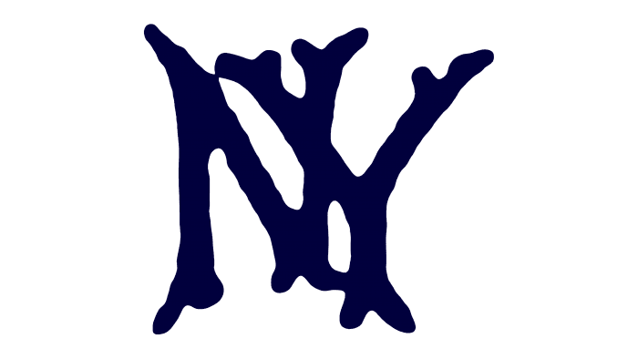
Before 1904, the Yankees’ predecessors, the New York Highlanders, wore shirts with the letters N and Y separately placed on each chest part of the uniform. In 1905, the club adopted a new version of intertwining letters, but it was not the logo we are accustomed to today. This logo did not last long, and within three seasons, the New York Highlanders abandoned the new emblem and returned to the old one.
In 1909, Bill Devery, co-owner of the New York Highlanders, decided to bring back the emblem with the crossing letters N and Y. Initially, it was placed on the left sleeve of the jersey and the cap. The logo remained there for five years. In 1917, it was removed from the jersey in favor of pinstripes. The Yankees’ logo stayed on the cap until 1936.
The Yankees’ cap is one of the most fashionable headwear in modern pop culture. Justin Bieber, LeBron James, Nelson Mandela, Tom Brady, Jay Z, and other celebrities are avid fans of the Yankees caps. Anyone who has ever heard Jay-Z’s hit “Empire State of Mind” knows the original line: “I made the Yankee hat more famous than a Yankee can.”
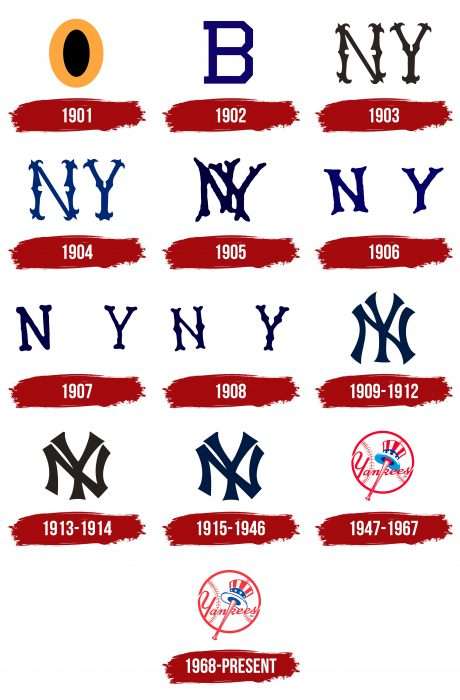
From 1901 to 1947, letters predominated in the team’s logos. They were most varied: single, double, separate, monogrammed, slanted, and straight. In general, the baseball club’s management readily experimented with changing the franchise’s name. But despite the rebranding, the symbolism always remained constant – the combination of “N” and “Y” taken from the word “New York.” However, with the onset of the era of graphic logos, everything changed radically, and the inscription “Yankees” became key.
What is New York Yankees?
The New York Yankees are the most successful professional team in the USA in terms of records and victories. At the same time, it ranks second among American sports franchises in estimated value (price – $5 billion). The club has existed since 1901 but has been based in New York only since 1903. It is currently owned by the private company Yankee Global Enterprises, LLC.
1901
In the first two seasons, the team was called the Baltimore Orioles, so the original 1901 emblem looked like a printed orange letter “O,” colored inside in black. The letter “O” undoubtedly meant “Orioles.”
1902
The following year, the emblem was changed to a blue letter “B,” which denoted the city of Baltimore.
1903
Two years later, the franchise was renamed the “New York Highlanders”. The New York Yankees’ logo depicted a black “NY” in Old English font, used as an abbreviation for New York.
1904
In 1904, the New York Highlanders used the 1903 logo with minor changes: the black color was replaced with blue.
1905
New crossing letters “NY” appeared on the team’s fifth emblem, but not in the form they are used today. The letter Y overlapped the letter N. In addition, the color of the letters was changed to dark blue.
1906
The new font in the logo differed in the distance between the blue letters N and Y. They still denoted New York City.
1907
The letters N and Y continued to drift in the same position as in the previous logo, but their color was again changed to dark blue.
1908
The new font style seemed more voluminous, and the letters looked as if made from someone’s bones. The color and placement of the letters remained the same.
1909 – 1912
In 1909, the enduring logo appeared as we know it. It was the first logo with stylized intersecting NY letters. According to the franchise owners’ version, the design of the most recognizable emblem in sports was created by Louis Tiffany.
1913 – 1914
Twelve years later, the franchise received the familiar name “New York Yankees.” The emblem’s font became simpler, and the blue color was replaced with brown.
1915 – 1946
Very few sports logos are considered “iconic.” The Yankees’ logo is one of them. The eleventh logo lasted 30 years. The font remained the same, but the primary color again became dark blue.
1947 – 1967
In 1947, American sports artist Henry Alonzo Keller created a hat concept for the “New York Yankees.” Since then, the franchise has used this sign. The New York Yankees logo featured a white baseball with red seams and stitches and the inscription “Yankees” in red font. A red bat formed the vertical line of the letter “K.” The logo also depicted Uncle Sam’s hat – a common national personification of the USA.
1968 – today
The modern version was approved in 1968. It was so successful and informative that it is still used today. It has rich content: the club’s name, type of sport, country, moral values, and purpose. They are represented in the form of inscriptions, a ball, a bat, a gentleman’s pot hat, and their coloring.
In the current version, the bat is positioned diagonally and extends beyond the emblem. Above it is a hat with a brim, colored in the national flag of the USA. The word “Yankees” serves as the background. The letters “Y” and “s” form long lines that create the border of a large baseball. It is the main shape of the logo.
New York Yankees: Interesting Facts
The New York Yankees are a famous baseball team with many wins and cool stories.
- 27 World Series Wins: They’ve won the World Series 27 times, more than any other team, with their first win in 1923 and the latest in 2009.
- Babe Ruth: The Yankees acquired Babe Ruth from the Boston Red Sox in 1920. This was a huge deal, and it helped the Yankees become good at baseball.
- Yankee Stadium: The first opened in 1923 and was known as “The House That Ruth Built.” In 2009, it moved to a new stadium across the street from the old one.
- Nickname: They’re called the “Bronx Bombers” because they’re great at hitting home runs. This nickname shows how strong they are at batting.
- Retired Numbers: They’ve retired more player numbers than any other team to remember their greatest players, such as Lou Gehrig, Joe DiMaggio, Mickey Mantle, and Derek Jeter.
- Derek Jeter: Derek Jeter was the team captain from 2003 to 2014. He’s famous for being a great leader and having the most hits in Yankees history.
- Rivalry with Boston Red Sox: The Yankees and the Boston Red Sox have a long rivalry. It’s known for exciting games, and Babe Ruth was traded from the Red Sox to the Yankees.
- Monument Park: This special place in Yankee Stadium celebrates the team’s best players and moments with plaques and monuments.
- Joe DiMaggio’s Record: In 1941, Joe DiMaggio hit safely in 56 straight games, setting a record that no one has beaten.
- First to Fly: The Yankees were the first baseball team to travel to games by plane, switching from trains in the late 1940s.
The New York Yankees have a long history of famous players, big wins, and many fans. They’re an important part of baseball.
Font and Colors
All official logo versions are divided into two types: alphabetic and alphabetic-graphic. There is also a division into simple and complex, free and round. Free ones have no particular construction: these are simple letters written in a specific font and associated with the team’s name. Round ones have a “frame” and are formed from several elements.
The main attribute among them is a large baseball with two characteristic fir tree pattern lines. The rest of the details are placed on it: the bat, a headgear in the color of the American flag, and the club’s name. The first emblems did without this. They consisted of one or two letters: first “O” (for “Orioles”), then “B” (for “Baltimore”), and then “NY” (for “New York”).
In the debut versions of the logo, a simple font was used – chopped and printed. A few seasons later, ornate letters in Old English style appeared. Monograms were made in an individual font – semi-curved lines with extensions at the ends. In the current version, the inscription is done in italics, slanted to the right. The color palette consists of dark blue, white, and red.
New York Yankees color codes
| Midnight Navy Blue | Hex color: | #132448 |
|---|---|---|
| RGB: | 18 36 72 | |
| CMYK: | 100 68 0 12 | |
| Pantone: | PMS 289 C |
| Gray | Hex color: | #c4ced3 |
|---|---|---|
| RGB: | 196 206 211 | |
| CMYK: | 0 0 37 | |
| Pantone: | PMS Cool Gray 7 C |
FAQ
What does the New York Yankees symbol mean?
All elements of the New York Yankees logo are filled with meaning. The inscription symbolizes the team’s name, the baseball and bat represent the sport, and the hat, colored in the colors of the American flag, is modeled after Uncle Sam’s hat. This cartoon character, as it is known, personifies the United States.
What is the origin of the New York Yankees logo?
This baseball club originated in 1901 as the Baltimore Orioles and used a logo with a large orange letter “O” until it was renamed the New York Highlanders. This letter meant nothing other than the word “Orioles.” The “New York Yankees” received their current name in 1913, and with it, a graphic symbol in the form of a dark gray monogram, “NY.”
Why do the “Yankees” have two NY logos?
The notion that the “New York Yankees” have two versions of the NY logo is mistaken: there are at least three. One version is used on the player’s helmet, another on the cap, and a third on the home jersey. They differ in the shape of the letters. Why this is so is unknown. Perhaps the team members don’t fuss about such trivialities.
Have the “Yankees” changed their logo?
The Yankees’ logo changed many times until the final version with a baseball, bat, and cap appeared. This happened in 1968. Since then, the team has used only this version and does not plan any other redesigns – at least in the near future.
