


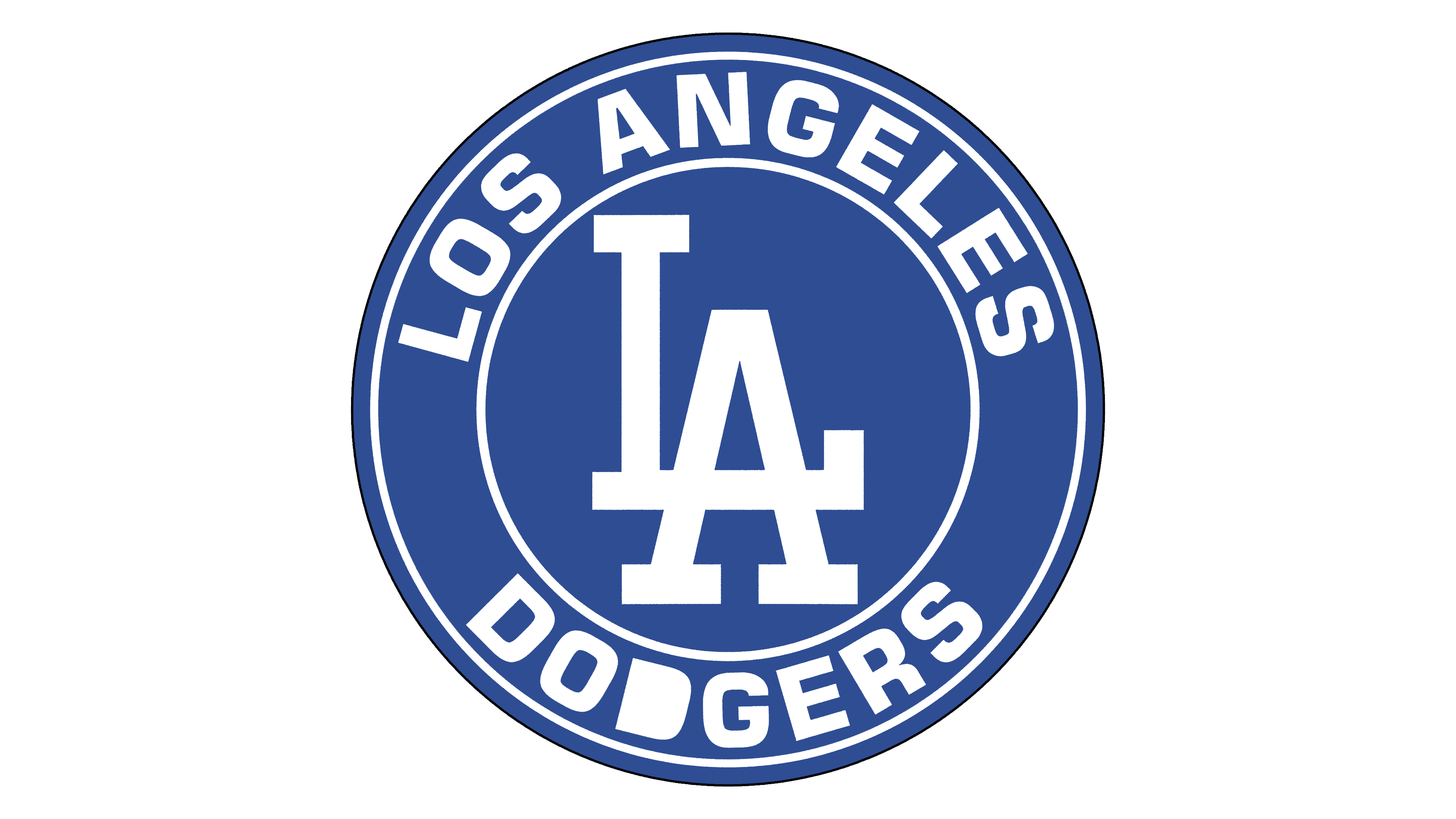
![]() Los Angeles Dodgers Logo PNG
Los Angeles Dodgers Logo PNG
Since its establishment in 1889 in Brooklyn, the Los Angeles baseball team has been known for the recognizability of its emblem. The modern brand logo is the most recognizable and popular. The new Los Angeles Dodgers logo embodies optimism, excellence, passion, and a will to win.
The Los Angeles Dodgers are a professional baseball team from the United States. They compete in MLB and represent the National League West. The team is based in Los Angeles, California, and was officially founded in 1889.
This franchise originated in Brooklyn, New York, and was founded in 1883 as the Brooklyn Robins. It is also known as the Brooklyn Dodgers. In 1958, the team moved to Los Angeles.
The team’s founders were businessmen Charles Ebbets, Ferdinand Abell, Harry von der Horst, and Ned Hanlon. They owned the “Los Angeles Dodgers” until 1904. Then von der Horst left the group, and Henry Medicus took his place. In this composition, the owners managed the franchise for another 2.5 years. By 1907, only two remained: Charles Ebbets and Henry Medicus.
From 1912 to 1925, Charles Ebbets, Ed McKeever, and Stephen McKeever managed the club. Over the next 25 years, it was owned by several people (Branch Rickey, Walter O’Malley, Andrew Schmitz) and the Brooklyn Trust Company, which joined McKeever. In 1950, the club was concentrated, on the one hand, on Walter O’Malley’s. Then, it went to Peter O’Malley. Then, Frank McCourt bought it.
On March 27, 2012, it was announced that an agreement had been concluded between the owner of the “Los Angeles Dodgers” and Guggenheim Baseball Management LLC. The total value of the transaction reached 2 billion dollars. The sale was registered on May 1 of the same year. The franchise is managed by Guggenheim’s CEO, Mark Walter; former Los Angeles Lakers player Magic Johnson; former presidents of several baseball teams, Stan Kasten; and movie mogul Peter Guber.
Meaning and History
![]()
The Los Angeles Dodgers club logo is among the world’s most popular and recognizable sports logos. Until 1938, the logo mainly featured the letter “B” from the team’s then-location, Brooklyn. In 1938, for the first time in the logo’s history, the full name appeared, and over time, an improved version of the image emerged.
After moving to Los Angeles, the club changed the logo’s design. Previous versions were taken as a sample. Details were reworked, the palette shifted towards greater saturation, and the lines acquired an intense accent. The brand colors are based on deep blue and red. The former embodies optimism and perfection, a striving for victory and passion.
What is Los Angeles Dodgers?
The Los Angeles Dodgers are a sports club from Major League Baseball. It entered the National League in 1890, seven years after its debut. At that time, it was called the “Brooklyn Grooms.” The nickname “Dodgers” became official only in 1932, and before the 1958 season, the team moved to Los Angeles.
1899 – 1901
![]()
The New York club was initially called the “Brooklyn Superbas.” Its first emblem was a large red Old English letter “B,” symbolizing the Brooklyn district.
1902 – 1908
![]()
Two years later, the color of the letter “B” changed from red to dark blue.
1909
![]()
In 1909, the Super Bass made the blue in the logo slightly lighter and changed the lettering to Bruce Double Pica.
1910
![]()
The letter’s blue darkened again to a deep blue. The letter “B” itself was placed inside a white diamond with a dark blue outline.
1911
![]()
The team changed its name to “Brooklyn Trolley Dodgers,” but the logo remains unchanged.
1912 – 1913
![]()
The diamond’s previously intersecting lines are now connected, and the letter “B,” symbolizing Brooklyn, has become slightly larger. The team also changed its name again to the Brooklyn Dodgers.
1914 – 1925
![]()
The club changed its name to “Brooklyn Robins.” The blue diamond was removed from the logo, and only the blue letter “B” remained, as in 1909.
1926 – 1927
![]()
The team returns to using the 1912 logo.
1928
![]()
The letter “B,” in Bruce Double Pica, is placed inside a white circle with a red outline.
1929
![]()
A year later, the logo’s letter color changed to light purple, and a thin, bright red outline was added to the design.
1930
![]()
The font style is the same as last year, but the letter color changes to red with a thin blue outline.
1931
![]()
Robins uses the classic blue letter “B” with a thin blue outline as a logo.
1932 – 1936
![]()
The club changed its name to the Brooklyn Dodgers. The “B” font again resembles Bruce Double Pica, and the letter turns dark blue.
1937
![]()
This year was the last when the letter “B” was used. In 1937, it was made in a classic green-and-white print.
1938 – 1944
![]()
The team’s full name, “Dodgers,” is written diagonally in blue. A thin blue line underscores the name.
1945 – 1957
![]()
The word “Dodgers” is slightly aligned, and the underline has become thinner. The logo added an image of a red-and-white flying baseball, with red strokes indicating its flight path.
1958 – 1967
![]()
The team moved to Los Angeles and changed its name to the Los Angeles Dodgers. Minor changes are also noticeable in the logo. Again, the word “Dodgers” has a thicker underline, and the red-white ball is depicted on top. The ball’s flight trajectory also covers a larger area.
1968 – 1971
![]()
The team’s name is highlighted in an even thicker font. The red baseball remained in its place.
1972 – 1978
![]()
The word “Dodgers” has become darker blue, but the red ball is still in flight.
1979 – 2011
![]()
The revised logo lasted for 32 years. The name became more precise, and the contours of the ball and its trajectory became more refined.
2012 – today
![]()
The modified version of the Los Angeles Dodgers logo is hardly different from the previous ones. The word “Dodgers” remained dark blue, and some details connecting the letters were refined or completely removed from the logo. The current “LA Dodgers” logo uses a semi-cursive handwritten font, with the letter “D” set apart from the other letters and the letter “O” lacking a “tail.” The line between the letters “G” and “E” is slightly thinner. This made it easier to visually perceive the team’s name, placed against the background of a flying baseball and its trajectory. The trajectory’s lines and the baseball itself made it clearer.
Font and Colors
The team’s twenty-one logos are divided into two periods: before and after the move. In the first half, the variant with the letter B prevailed, as the franchise was located in Brooklyn, which was reflected in its name. Then, it changed its name and location. Overall, the club underwent 10 name changes.
Eventually, in 1938, the emblem featured the inscription “Dodgers,” running diagonally from bottom to top. The trail from the letter “s” extends far beyond its limits, almost reaching the capital “D.” A wide ribbon twists at the end and underscores the bottom of the emblem.
Over time, developers added a flying baseball to the logo. The thin red strokes along its trajectory indicate that it was thrown and is flying, cutting through the air. The direction of flight is from bottom to top. The logo has never changed throughout this version; only the color scheme was adjusted.
The debut logo used Old English script. Then came the Bruce Double Pica font used for the key symbol. In 1938, a new version was approved, featuring a cursive font similar to handwriting. The first letter is uppercase; the rest are lowercase. The word is written in calligraphic handwriting, semi-connected with the separately standing letter “D.” The other letters are connected and have smooth transitions.
The franchise’s proprietary palette consists of individual Dodger Blue colors. It combines red (the ball and the strokes surrounding it) with white (the background). Blue and green are also used occasionally.
FAQ
What does “Dodger” mean in baseball?
This is the name of a baseball club, originally nicknamed the “Brooklyn Trolley Dodgers” because of the dangerous tram lines that crossed Brooklyn. Subsequently, the name was shortened to Brooklyn Dodgers, and after the team moved to Los Angeles, it was replaced with Los Angeles Dodgers.
What does the “Los Angeles Dodgers” logo represent?
The logo features the blue word “Dodgers” in a handwritten font, positioned diagonally. A long line extends from the letter “s,” underscoring all the letters except the first “D.” The team’s name stands out against the background of short red lines depicting a baseball path. The ball itself is located slightly above. It is white and has red outlines.
Are any of the “Dodgers” originally from Los Angeles?
As of 2021, no current Los Angeles Dodgers players were born in Los Angeles. Despite this, they are successfully building their careers in this region.
Who designed the “Dodgers” logo?
American sports illustrator Henry Alonzo Keller created the first version of the logo featuring the flying ball. His drawing was modified many times. Under Ross Yoshida’s leadership, the graphic design department worked on the last version.