


![]() Angeles Angels Logo PNG
Angeles Angels Logo PNG
The Los Angeles Angels franchise has a logo that fits the sports environment and the locality it represents. The eponymous city has imparted its lightness, sincerity, and monumentality, unmatched by any other place in the country. The emblem with a single letter looks presentable and majestic.
The history of the Los Angeles Angels begins in 1961, when Gene Autry founded the franchise after receiving an expansion slot in Los Angeles. The team initially shared a stadium with the Los Angeles Dodgers before moving to Anaheim in 1966. In 1965, it adopted the name California Angels to reflect a broader regional identity.
A key moment came in 1972, when the club traded Jim Fregosi to the New York Mets for Nolan Ryan. In 1973, Ryan struck out 383 batters and threw two no-hitters, later recording four of his seven career no-hitters with the team.
In 1979, the Angels reached the playoffs for the first time but lost to the Baltimore Orioles. They returned to the ALCS in 1982 and 1986, with the latter ending in a decisive loss to the Boston Red Sox after they had led the series late.
After a decline, the franchise was acquired by The Walt Disney Company in 1996–97 and renamed Anaheim Angels. Under manager Mike Scioscia, the team rebuilt and reached the postseason in 2002.
In that year, the Angels defeated the New York Yankees and Minnesota Twins, then beat the San Francisco Giants in the World Series after a comeback in Game 6.
In 2004, Vladimir Guerrero joined the team, and the team won multiple AL West titles. In 2011, Mike Trout was drafted. In 2018, Shohei Ohtani joined the team, winning MVP in 2021 and 2023 before leaving for the Dodgers.
The baseball team’s former name, the Los Angeles Angels of Anaheim, was in use from 2005 to 2015. Nowadays, a shorter version of the Los Angeles Angels is preferred. The club has been renamed several times: from 1965 to 1996, it was the California Angels, and from 1997 to 2004, it was the Anaheim Angels. Such renamings were forced due to legal proceedings.
The club comes from the name of Los Angeles’s first sports team, the “Angels.” The team played in the southern part of the city and was a PCL franchise. Gene Autry bought the naming rights from Walter O’Malley, the then-owner of the “Los Angeles Dodgers.” Later, the prefix “of Anaheim” was added to indicate location.
Since its appearance in the AL, the club has changed its logo ten times. The debut version was a winged baseball. It was radically redesigned at the Disney company, and the capital letter “A” with a white outline and a silver halo appeared on the emblem. The modern version features a graphic of the capital letter, while the rest of the emblem is simplified. There is no colorful background stylized as wings, nor is there an “ANAHEIM ANGELS” inscription.
The font used on the emblem approximates Bruce Double Pica. The primary color combines rich red (letter) and intense blue (outline). The blue outline also has a light gray halo at the top of the logo.
Meaning and History
![]()
The key motifs of all eleven emblems that have appeared throughout the history of the Los Angeles Angels are a baseball and two iconic cities, Los Angeles and Anaheim. The “angelic” theme is also maintained, as it proves that these athletes are real angels and can do everything. Based on these motifs, the franchise owners have chosen wings, balls, halos, name-related letters, baseball bats, and even the map of California for their logos.
What is Los Angeles Angels?
It was one of the first Major League Baseball franchises. It was founded by musician and actor Orvon Grover “Gene” Autry in 1961 to represent the Los Angeles metropolitan area in the American League. Under Gene Autry’s leadership, the team hardly ever won. It won its first league title only after coming under the management of Walt Disney. Then, it was known as the “Anaheim Angels.”
1961 – 1964
![]()
The “Los Angeles Angels” club was founded in 1961 and immediately adopted its logo. The background is a turquoise diamond with a white outline, on which a red-and-white winged baseball is placed. Above the ball is a golden halo. Inside the ball are also the letters “LA”, the initials of Los Angeles.
1965 – 1970
![]()
The club was renamed the California Angels, but its new logo resembles the previous one. The previously turquoise diamond turned green, and the halo above the ball turned white. Of course, the letters “LA” were replaced with “CA.”
1971 – 1972
![]()
In 1971, the club changed the logo’s concept. Now, its basis is a white outline of the state of California, with the word “angels” written diagonally in red. Above the small letter “a” is a golden halo attached to the edge of the state, and below the letter “l” is a small yellow star indicating the location of Anaheim.
1973 – 1985
![]()
In 1973, the club made a few changes to the logo’s design. The lowercase “a” was replaced with a capital “A”, and the previously yellow star symbolizing the city of Anaheim became red.
1986 – 1992
![]()
The club’s fifth logo was a large red-and-white baseball with a huge red letter “A” inside and a yellow halo above it. In the background, the black shadow of California is visible. A barely noticeable yellow star under the letter “A” symbolizes the team’s location, the city of Anaheim.
1993 – 1994
![]()
In 1993, the club returned to the 1965 logo’s concept, which used the initials “SA.” The main part of the logo is a traditional dark blue circle with a silver outline. Two large red letters, “CA,” are outlined in white, and above the letter “A,” a gray halo is drawn.
1995 – 1996
![]()
The new logo removed the blue circle with the silver outline, leaving only the large red letters “CA,” to which a thin dark blue outline was added.
1997 – 2001
![]()
angel logo
The change of the main logo also marked the team’s renaming to the Anaheim Angels. The background is a blue triangle; behind it are two brown, crossed baseball bats. Against the background of the triangle, the word “Angels” is written in large red letters, complemented by a white wing near the letter “A.” The city name is also featured on the logo, in small white letters on the blue triangle.
2002 – 2004
![]()
The logo design has been updated to a more modern, stricter look. Against a dark blue diamond background, a large red letter “A” symbolizes the city of Anaheim. Above the letter is a black-and-gray halo. The entire logo has a thin red outline. Above the semicircular pattern is the inscription “Anaheim Angels.”
2005 – 2015
![]()
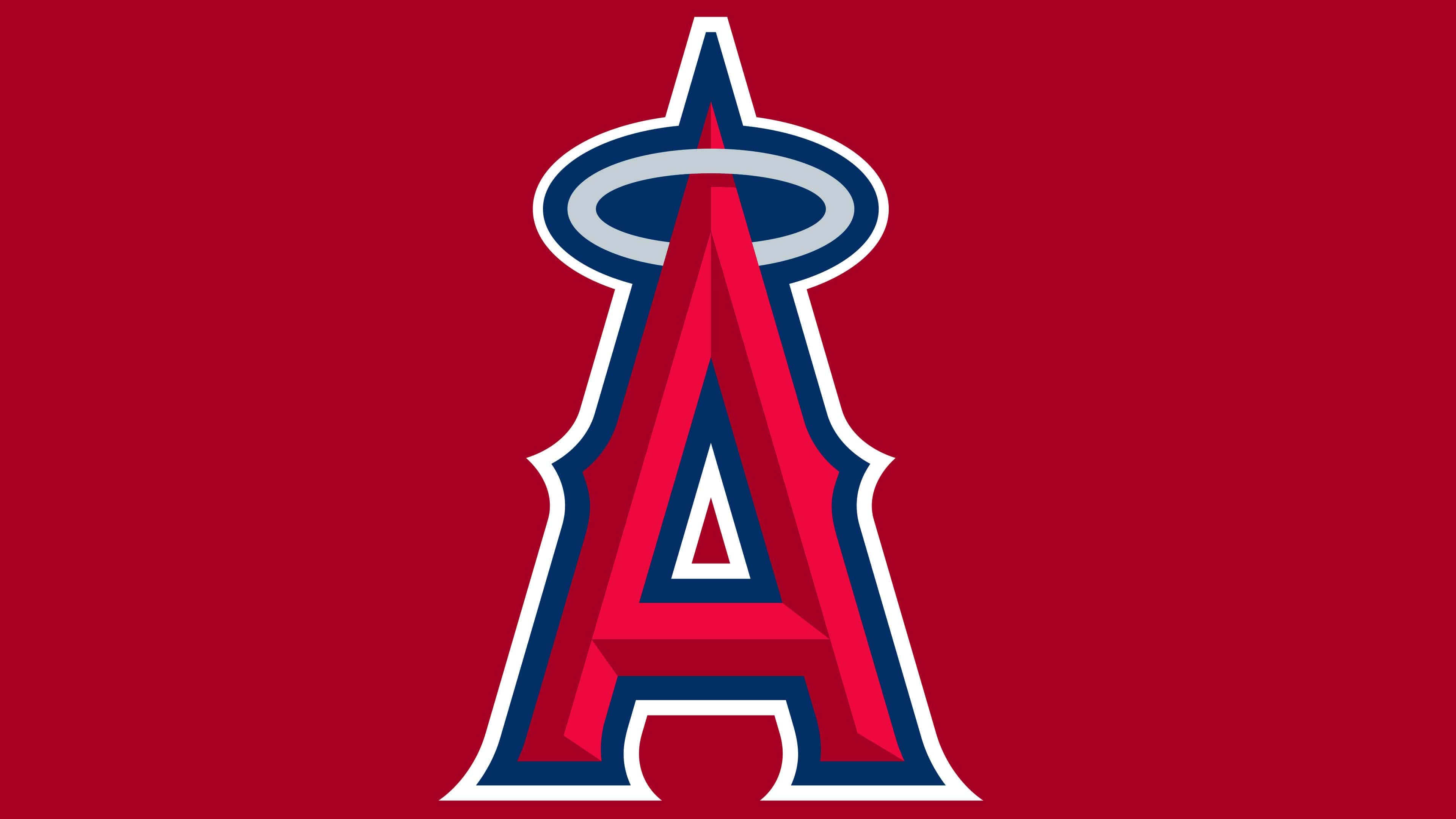
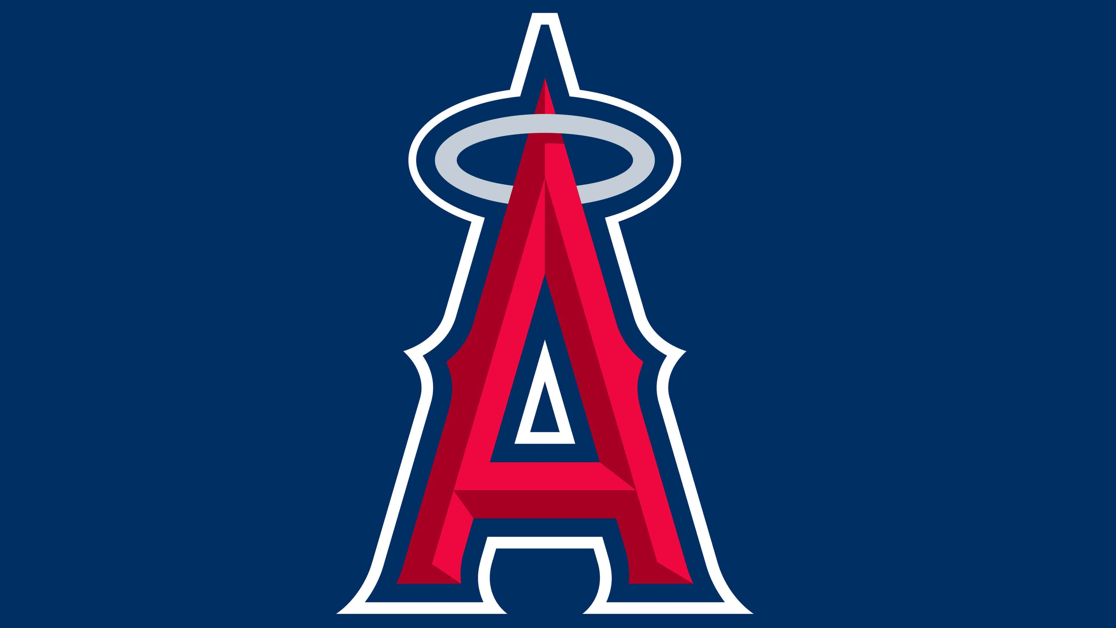
In 2005, the club returned to the name “Los Angeles Angels” and simplified its logo. After removing the diamond, only the large red letter “A” remained in the drawing. The Bruce Double Pica font was used, and dark shadows and a dark blue outline were added to make the letter appear more voluminous. Above the letter, as before, is a gray halo with a dark blue outline.
2016 – today
![]()
The current version repeats the previous one from 2005 to 2015. It was adopted after the approval of a shorter team name. Since then, it has not changed once, as it meets the main criteria of modernity, conciseness, and capacity. That is, despite the minimum of details, it conveys the maximum information.
The emblem contains the image of a large letter “A.” At the top of the massive letter is a halo, which remains a hint of belonging to the “angels.” Sharp protrusions are found in the middle of Old English symbols. In the lower area, there are small notches. Along with the halo, the entire letter is outlined by a dark blue stripe.
Font and Colors
The first two periods of the sports club’s career were dominated by a version of the logo with an azure rhomboidal background. In the center was a baseball and a monogram of the team’s name’s capital letters. The following versions include an administrative map of California, letters in a circle, flying bats, and a single letter, “A,” which has been in demand for three periods. The year of its appearance is considered 2002.
Two inscriptions, “Anaheim” and “Angels,” were initially to the right and left of the letter. The designers then removed them, along with the blue background of the inverted shield. Subsequently, the developers strengthened the shadows, forming a clear stripe in the middle of the legs to give them a 3D effect.
The iconic letter on the Los Angeles baseball players’ emblem was created in the custom Big A font. After the name was changed, the Bruce Double Pica font appeared.
However, the palette remained unchanged: crimson red, dark blue, and silver. The emblem also included azure, golden, blue, and white in previous years.
FAQ
What does the Los Angeles Angels’ emblem represent?
The Los Angeles Angels team is represented by a large letter A with a blue border. Its upper part is threaded into a blue ring, thus imitating a halo. Despite the presence of a shining circle, usually depicted above the heads of saints, the logo design is not at all angelic. The letter is painted in an aggressive red color and, in addition to sharp serifs, has triangular spikes on the sides.
Why did the “Angels” change the logo?
The baseball franchise often changed its name, and its logos had to be updated to match the dynamic branding. The last time it dropped the nickname Anaheim Angels, it was removed from all identity elements. Designers retained only the main part of the logo, the red letter “A” with a halo, and complemented it with a blue outline.
Who designed the Angels’ logo?
Professional designers worked on the Los Angeles Angels logo, refining and adapting the old design to modern trends.
When did the “Angels” rename to “Los Angeles”?
The club is based in the Los Angeles metropolitan area but plays its home games at Angel Stadium in Anaheim, where it moved in 1966. In 2019, it bought the stadium and is now obligated to stay on it at least until 2050. Despite this, the city of Anaheim added the word “Angels” to the lease, even though the team’s name had already dropped the word. Thus, the move to Los Angeles did not occur.