


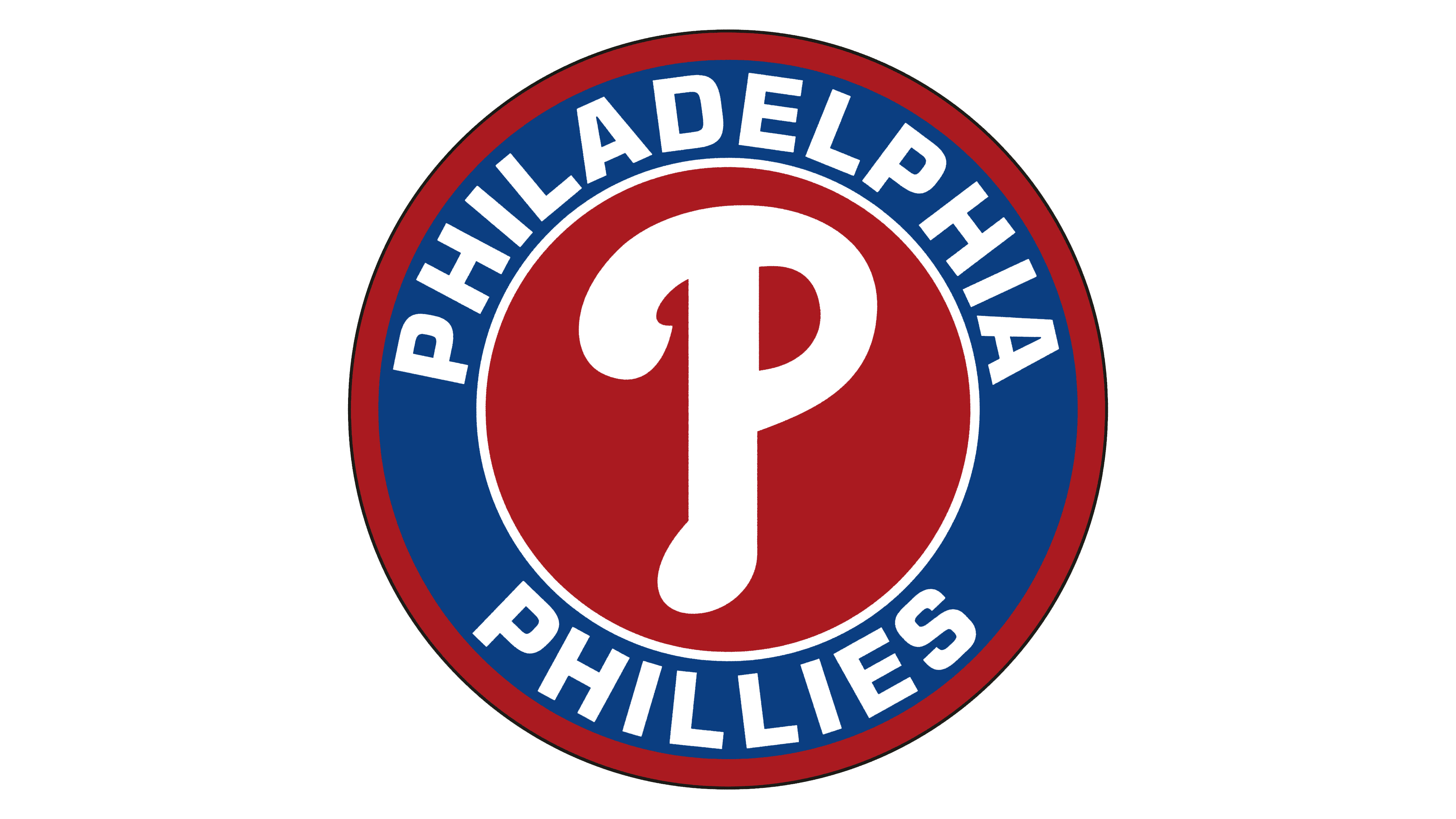
![]() Philadelphia Phillies Logo PNG
Philadelphia Phillies Logo PNG
The original emblem ensures recognition of Philadelphia’s baseball players. The Philadelphia Phillies’ emblem embodies national spirit, emphasizing their roots and confidence in their future.
The Philadelphia Phillies are a professional baseball sports club. Since 2000, it has been part of MLB. Until 1999, the club was a structural division of the NL, representing the Eastern Division. The team was established in 1883 and remains based in Philadelphia, Pennsylvania.
It’s the only franchise that has never changed its city or name. Its first owners were Al Reach and John Rogers. From 1899 to 1903, Rogers was the sole owner of the team. Then the Philadelphia Phillies sold it to James Potter, who, after two years, sold it to Bill Shettsline. But he owned it for only about four years.
Soon, the club was acquired by William Baker, who managed it until 1930. The next owners were Gerald Nugent (1931-1942), William B. Cox, and R.R.M. Carpenter (1943-1950). All shares were exclusively held by Robert Carpenter, who decided to change the stadium. However, players could only move in the 1970s. When Bob Carpenter retired, he transferred the ownership rights to his son Ruly. He, in turn, eventually conceded them to the Phillies Limited Partnership. This happened in 1981.
The team’s final name was formed a year after its foundation, in 1884. Since “Philadelphia” didn’t fit in newspaper headlines, journalists arbitrarily abbreviated it to “Phillies.” This version stuck and became official in 1890. Not even an attempt to give the franchise another name (in 1943, the Blue Jays) could overshadow it.
Over its 135-year history, the club has changed its logo nearly 16 times. The brand name has always been circular, except for the modern version that appeared in 2019. Its feature is the absence of any hint of region or base city, only a fragment of the abbreviated name.
Meaning and History
![]()
Over the franchise’s 130-year history (established in 1883), the “Philadelphia Phillies” have accumulated 16 official emblems. Most of them are quite diverse and bear no resemblance to previous versions. The reason lies in the radical rebranding and redesign associated with the team’s transition from one division to another, as well as the desire to establish its identity, choose a suitable name, and modernize its design.
What is Philadelphia Phillies?
The Philadelphia Phillies are representatives of the National League East. It’s a franchise from the Pennsylvania city of Philadelphia, the USA’s oldest sports team, which has rarely changed its nickname. It was established in 1883 but has only won two World Series titles to date. And in 2015, the “Phillies” became the first club in MLB history to lose 10,000 matches.
1900
![]()
The first “Phillies” logo featured a plain blue “P” letter, symbolizing the city of Philadelphia.
1901 – 1909
![]()
The color of the letter “P” changed from blue to black.
1910
![]()
After ten years, the new club logo features a green Old English “P”.
1911 – 1914
![]()
The club returned to depicting a large red printed letter “P.”
1915 – 1937
![]()
In 1915, the logo’s basis became a graphic depiction of a Philadelphian in the middle of a dark blue baseball field. The drawing is inside a red ring with the inscription “Philadelphia National League. Baseball Club” in white.
1938
![]()
After 22 years, the same emblem has become yellow, with barely noticeable blue outlines. Otherwise, the image and caption remain the same.
1939 – 1943
![]()
And again, the emblem featuring a Philadelphia baseball player changes its color palette. The main picture acquires several shades of gray and silver, but the ring remains white. The team name is done in yellow with a thin black outline.
1944 – 1945
![]()
This logo features a blue jay perched above the Phillies’ logo. The team name is red, and the dots above the letters “i” are replaced with red stars.
1946 – 1949
![]()
In 1946, the “Phillies” changed their logo again. Two baseball players are depicted on a red background. The first is catching a flying white baseball, and the second is attempting to hit another player’s throw. Below the image, the phrase “Fighting Phyllis” and a white baseball bat appear.
1950 – 1969
![]()
The “Phillies” logo changed. The main part of the picture features a signature red cap with a white letter “P,” surrounded by a thin blue circle with stars, a white baseball, and a small red “Phillies” inscription.
1970 – 1975
![]()
The eleventh club logo features a red “P” letter with a white baseball at its center. Also, the team’s full name is below.
1976 – 1980
![]()
In 1976, mascots Phil and Phillis debuted, dressed in children’s colonial blue garments. It’s evident that Phil is throwing a baseball and holding a bat, and Phillis has a game glove in her hand. Below the image, the word “Phillies” is written in red. Its design is the same as that of the previous logo.
1981
![]()
The red letter “p” returns to the logo, denoting the team’s name, with a baseball in the middle.
1982 – 1991
![]()
The letter “p” changes color from red to brown.
1992 – 2018
![]()
In 1992, the logo completely changed the concept. A white silhouette of the Liberty Bell is depicted against a blue background, outlined in red. In the foreground, the word “Phillies” is in red, with the letters “i” adorned with blue stars.
2019 – today
![]()
Today, the franchise uses an incredibly simple logo featuring just the word “Phillies” against the backdrop of the Liberty Bell. This image was taken from the previous version, which also featured a sign depicting a stadium with a red outline around its perimeter, along with the bell.
This choice reflects the team’s national spirit and the desire to convey its roots accurately, allowing it to hold firmly onto the past while confidently looking to the future. The main feature of the emblem is two stars that replace the dots on the letter “i.” The framing of “ll” is very effective.
Font and Colors
The Philadelphia club’s logos, featuring the letter “P”, were designed in several writing styles, depicting a Philadelphian throwing a ball, a blue jay, two athletes in the game, a baseball cap, and the Liberty Bell. The most commonly used attributes on a seal are the inscription and the emblem, which depict an attacking player.
The variety of styles allows for finding an option that instills confidence in the team and leads the athletes to victory. The emblems also differ in design, ranging from strict to cartoonish, realistic, and even line-drawn. Currently in use is a concise logo with minimal details: a cracked bell and a single-word inscription.
The word “Phillies” is written in italics in the handwritten text, but without the classic tilt to the right. The capital “P” cap is on the leg of the lowercase “H.” The two “ll” loops are placed as close together as possible. Instead of dots, each “i” has a five-pointed star, and “s” is depicted without the upper gap.
The team’s standard color palette includes blue (bell, stars), red (club name), and white (background, crack, and outlining lines).