


![]() Atlanta Braves Logo PNG
Atlanta Braves Logo PNG
The Atlanta Braves logo is associated with Native American roots. Although the image of the Indian has been removed from the emblem, this attribute best conveys the team’s unyielding will, its readiness to move towards the set goal, and its determination to make every effort. Victory is what matters most to the athletes. And this is exactly what the original symbolism reflects.
The franchise began in 1871 as the Boston Red Stockings, a founding club of the National Association that later shaped Major League Baseball (MLB). It quickly became competitive, winning four titles between 1872 and 1875, and joined the National League in 1876.
In 1883, the team adopted the name Boston Beaneaters and remained among league leaders through the 1890s and early 1900s. After a difficult 1912 season, it became the Boston Braves. In 1914, the club produced a dramatic turnaround, moving from last place in July to a World Series win over the Oakland Athletics.
In 1935, Babe Ruth played his final season with the Braves. Financial pressure led to relocation in 1953, when the team became the Milwaukee Braves. The peak came in 1957 with a World Series win against the New York Yankees, led by players like Hank Aaron.
The franchise moved again in 1966, settling in Atlanta as the Atlanta Braves. In 1974, Hank Aaron broke Ruth’s home run record, bringing national attention. In 1976, Ted Turner acquired the club and expanded its reach through TBS broadcasts.
From 1991 to 2005, the team dominated its division, winning 14 titles and the 1995 World Series against the Cleveland Indians. After a rebuilding phase from 2007 to 2017, young players drove a resurgence in 2018 and 2019, culminating in division titles.
In 2021, Atlanta won the World Series, defeating the Houston Astros. The following seasons kept the team competitive despite roster changes, including Freddie Freeman’s move to the Los Angeles Dodgers and a key trade with the Oakland Athletics for Sean Murphy.
Meaning and History
![]()
The logo of this club has been very ambiguous, changing 29 times. The reasons include the team’s relocation, franchise renaming, addressing ethnic issues, changes in ownership, adaptation to modernity, updates, etc. Over the club’s long existence (founded in 1883), this process was facilitated by many factors.
Additionally, several thematic blocks of versions exist: for example, versions with a letter designation, with text, and with an image of a Native American holding a prehistoric ax. They are executed in monograms, arched inscriptions, brass knuckles, portraits, and round signs.
What is Atlanta Braves?
The “Atlanta Braves” is a baseball team based in counties within the metro Atlanta area of the state of Georgia. It calls itself the oldest franchise, having begun in 1871 as the Boston Red Stockings. The club plays in the National League East and competes in Major League Baseball.
1883 – 1888
![]()
The team’s first name was the “Boston Beaneaters.” Like most clubs before the 1900s, the emblem was simply a sign of the city of Boston.
In the early years of baseball, teams’ identities were often closely tied to the cities they represented, reflecting civic pride and local traditions. An example of such a connection between the city and the club was the team’s initial name, the “Boston Beaneaters.” The name reflected local culture and paid tribute to a classic regional dish.
Branding was still emerging in that era, which lasted until the early 1900s, and logos were usually minimalistic and simple. The Beaneaters’ team emblem was no exception. Instead of elaborate patterns or flashy illustrations, the emblem was a simple and unadorned representation of Boston’s calling card.
1889 – 1896
![]()
Due to significant changes in visual branding, the team decided to replace the red color in its name with a dark blue shade. This change was not just an aesthetic decision; it reflected something deeper within the organization.
The red color, often associated with energy, passion, and intensity, was a defining element of the team’s identity. It resonated with fans and was synonymous with the team’s spirit and determination on the field. However, as the team evolved, so did its brand, leading to the choice of dark blue over red.
Though less aggressive than red, dark blue conveys a sense of stability, wisdom, and depth. This color is often associated with maturity and sophistication, reflecting a more measured and thoughtful approach. The team signaled a transformation in its philosophy and aspirations with this transition.
1897 – 1899
![]()
Seeking renewal and reconnection with the city’s rich history and culture, the well-known sports team introduced a new logo featuring a large Old English letter “B” in a bright shade of blue.
Boston’s deep roots in American history and its vibrant cultural fabric have always been a source of pride for its residents. Choosing the Old English font reflects respect for tradition, evoking the city’s colonial past and enduring connection to heritage. This classic style lends timeless elegance and links to the city’s rich history.
1900
![]()
In the early 1900s, there was a significant shift in the specific brand’s visual identity. The decision to retain the main design of the 1897 logo while changing its color demonstrates respect for tradition, although the brand seeks evolution. This combination of past and present resonated with both long-standing supporters and newcomers. The changes were subtle enough to maintain continuity with the previous logo but striking enough to attract attention and symbolize progress.
1901 – 1906
![]()
For five years, the club consciously reconnected with its past by reverting to the 1889 logo, which featured the name of the city of Boston. This move was both an aesthetic change and a statement reflecting the club’s enduring connection to the city and its fans.
1907
![]()
The new emblem was not just a cosmetic change. The red color and Old English font reflected both tradition and modernity, combining the club’s historical ties to Boston with a fresh and unique look. The name “Doves” and the accompanying logo symbolized a new era for the club, paying homage to its heritage while laying the foundation for a new sense of purpose and direction.
1908
![]()
The logo’s foundation is also a red letter “B,” but this time, it is executed in a different font.
1909
![]()
The classic red letter “B” was placed inside a black circle, resembling a baseball.
1910
![]()
The logo returns to Boston Dawz, with only the inscription “Boston” highlighted in red.
1911
![]()
The club changes its name to Boston Rustlers. The city of Boston is symbolized by a large dark-blue Old English letter “B”.
1912 – 1915
![]()
A year later, the team changed its name again, this time to the Boston Braves. For the first time, the logo featured a Native American in profile wearing a feathered headdress. The primary colors of the design are white and red.
The logo emphasized the team’s connection to history and culture, as well as their pursuit of victory and excellence. Choosing a Native American warrior as the team symbol reflected the name and the intention of conveying strength and determination to fans and opponents alike.
The feathered headdress symbolizes courage, bravery, and dignity, qualities of tribal warriors. The profile view highlights strength and resolve, important traits for a team aiming to showcase their competitiveness and determination on the field.
Red symbolizes passion, energy, and aggression. White adds purity and clarity, underscoring the team’s transparency and openness.
1916 – 1920
![]()
The logo from 1916 to 1920 features a profile image of a Native American head against a dark blue background. The head is depicted in red with white lines highlighting the facial details and feathered headdress.
The logo has clear contours and a detailed image, giving it a sense of expressiveness. The red of the Native Americans’ head contrasts sharply with the dark blue background, making the logo more noticeable and vibrant. The feathered headdress, rendered in red and white, adds uniqueness and recognizability to the logo.
1921 – 1924
![]()
The logo from 1921 to 1924 features a stylized letter “B.” The primary color of the logo is dark blue. The letter “B” is rendered in a large, expressive font with rounded elements, giving it visual strength and stability. The letter has rounded indentations, creating a unique and memorable appearance.
1925 – 1928
![]()
This logo used the same large dark blue “B” but in a different font.
1929 – 1935
![]()
On the fifteenth logo, the team again uses an image of an Indian on its emblem, but this time, it is colorful and cartoonish. The Native American has bronze skin, black hair, and a red, green, yellow, and blue feathered headdress.
1936 – 1937
![]()
The logo also changed when the team renamed itself from the Boston Braves to the Boston Bees. The club’s primary color became yellow, and the logo featured a large yellow letter “B” outlined in blue and white.
The large “B” logo symbolizes the team’s name, “Bees.” Yellow is associated with bees and honey, underscoring the new team name and its aim of fostering cohesion and teamwork, much like a hive. The blue-and-white outline adds clarity and contrast.
Yellow symbolizes energy, optimism, and activity, ideal for a sports team. The outline adds depth and expressiveness to the emblem.
1938
![]()
In the 1938 season, there were no significant changes to the emblem. The yellow letter “B” also symbolizes the city of Boston.
1939
![]()
After another year, the team’s primary color changed from yellow to red. Accordingly, the letter “B” becomes red, and a dark blue contour appears in addition to it.
1940
![]()
The final logo of the “Boston Bees” featured an Old English letter “B.” The choice of the Old English font for the emblem adds historical depth and respect for tradition, underscoring the team’s roots and heritage. The dark blue color symbolizes reliability, stability, and determination. Combined with the Old English font, the dark blue gives the logo a sense of solidity and gravitas.
1941 – 1944
![]()
The Boston Braves continue experimenting with fonts for the dark-blue letter “B.”
1945 – 1952
![]()
In 1945, the Boston Braves returned to using a Native American image on their logo. This decision was made in the post-war period when American society sought to return to its roots and traditions. The logo featuring the Native American symbol conveyed respect for the history and culture of indigenous peoples, as well as the team’s commitment to preserving their traditions and strengthening its image.
The emblem resembles previous versions:
- The Native Americans have bronze skin
- Dark hair
- A headdress with red feathers
- The drawing has a thin black outline.
The bronze skin color symbolizes the traditions and heritage of indigenous peoples. The red feathers represent strength and courage. The black outline adds clarity and expressiveness to the image.
1953 – 1955
![]()
The team moved to Milwaukee and changed its name to the Milwaukee Braves. The emblem with the Indian image is identical to the 1945 emblem.
1956 – 1965
![]()
This is the club’s 23rd logo, featuring a cartoonish depiction of a laughing Native American head with a mohawk and a white feather in his hair. The Native American’s head is rendered in red with black-and-white details for contrast and clarity. This logo served as the basis for several subsequent team emblems over the next 35 years, underscoring its popularity and significance.
The red color of the face symbolizes energy, passion, and strength. The white feather in the Native American’s hair symbolizes honor and respect. The laughter and smile on the Native American’s face reflect the spirit of fun and carefreeness that characterized the team and the time the logo was created.
1966 – 1967
![]()
Despite the club’s move to Atlanta and the name change to Atlanta Braves, the main logo remains the same; only the Indian’s skin color changes from red to light brown. Minor details, such as the mohawk and feather, were also edited.
1968 – 1971
![]()
The image of the Indian, identical to the 1966 logo, has the word “Braves” added in dark blue. The name is outlined in a thin red line, and the drawing is reduced to make room for the word.
1972 – 1984
![]()
In 1972, the Atlanta Braves radically changed their logo, coinciding with significant changes and developments in baseball and the sports industry. This period also saw the rise in popularity of sports in the USA and increased competition among teams. The logo features a profile image of a Native American head with a Mohawk and a feather. The head is white, with details like the mohawk and the red feather. The Native American head is set against a dark blue square. At the bottom of the logo is the inscription “Braves” in red, outlined in white. The new team logo symbolized renewal and a drive for success, reflecting the spirit of the time and the team’s aspirations to reach new heights.
The “Braves” inscription is rendered in an italic font with smooth lines, giving the logo a sense of dynamism and energy. The red inscription’s white outline makes it noticeable and easy to read, even against the dark blue square.
1985 – 1986
![]()
In 1985, some changes were made to the previous club logo. The Indian’s head grew, and the name shifted slightly higher onto a blue background.
1987 – 1989
![]()
The “Atlanta Braves” logo still contains a red-white image of the Indian and the team’s name. The only change was the darkening of the dark blue background.
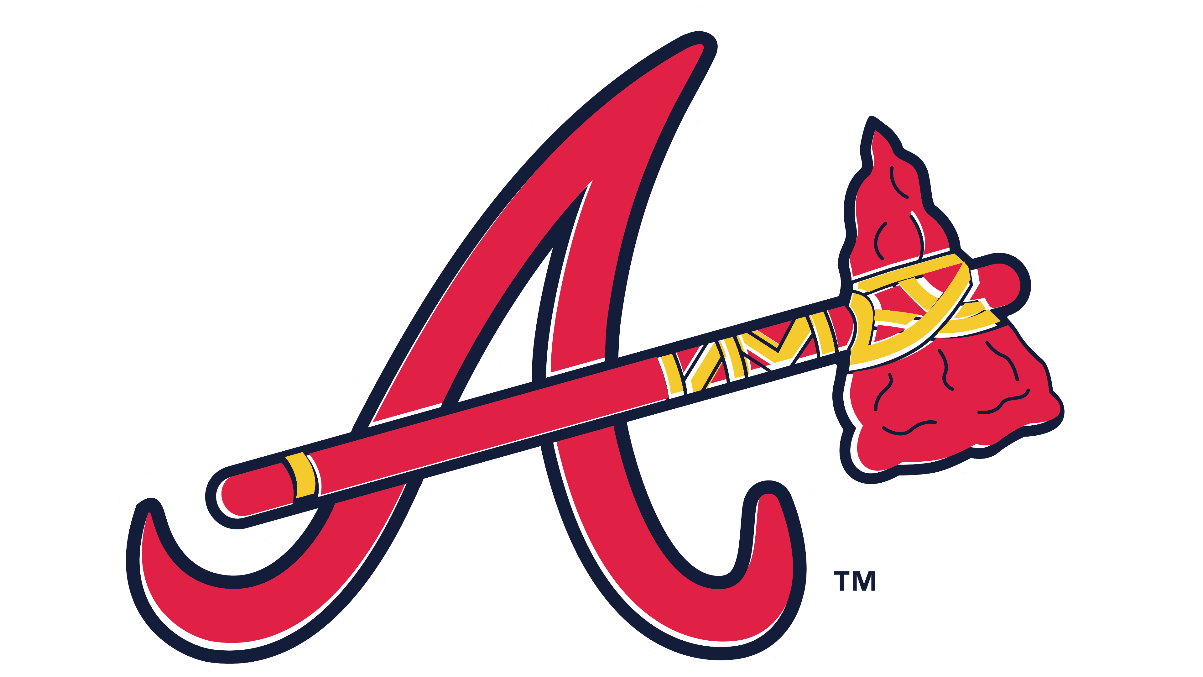
1990 – 2017
![]()
The club returns to using the team name based on its logo. Most of the logo is occupied by the word “Braves” in red, outlined in dark blue. Below it is an ancient red axe, symbolizing the team’s strength and its persistent efforts to improve its game.
2018 – today
![]()
The Atlanta Braves’ current logo continues the traditions established in 1990. It consists of two equal parts: textual and graphic. The textual part features a large, italicized “Braves” inscription set diagonally, with an upward tilt at the end of the word. The graphic part includes an image of an ancient tool used by ancestors.
The depiction of the ancient tool on the logo symbolizes strength and perseverance in achieving high goals. As a symbol, this tool represents the labor and effort required to transform ordinary material into a useful attribute. The “Braves” inscription symbolizes the team’s bravery and determination.
The logo emphasizes the importance of strength and persistence in sports and life. It reminds us that achieving goals requires effort and hard work. The symbolism of the tool and the inscription creates an image of a team ready to overcome challenges and succeed.
The inscription font is italicized, giving the logo dynamism and energy. The diagonal positioning and upward tilt at the end of the word highlight forward movement and the pursuit of excellence. The italic style creates a sense of lightness and grace.
The logo’s primary colors are red, blue, and yellow. Red symbolizes energy and passion, blue represents stability and trust, and yellow signifies optimism and joy.
Font and Colors
A signature element is the prehistoric hammer-wielder. It is located on the right side of the logo, under the word “Braves.” It consists of three parts. The first is the handle. It’s flat, with an oval curvature at the end and a yellow stripe at the base. The second is the stone blade or edge with a point and a “cutting” part. It features distinctive carved spots rendered as small strokes. The third is the rope connecting these elements. Each twist of it forms a specific pattern.
Text is another significant part of the logo. The inscription “Braves” is at the top and occupies half of the logo. It’s done in a handwritten style with sleek lines and curved transitions. All letters are connected except for the first, the capital one. A distinctive feature of the font is the absence of an upper gap at the “s.” That is, it doesn’t have a specific loop. The “E” is also very original: although it’s lowercase, it’s executed as a capital “E.” The brand palette includes dark blue, dark red, and white colors.