


![]() Oakland Athletics Logo PNG
Oakland Athletics Logo PNG
Although the Oakland Athletics franchise logo resembles a seal, the white elephant that adorned the emblem at its inception is still discernible. Designers retained it in the letter “A” by stretching the right side and curving it into a trunk shape. The double element in the shape of a hook represents the tusks of the powerful animal.
The history of the Oakland Athletics begins in 1901, when the franchise entered MLB as one of the eight founding teams of the American League under the name Philadelphia Athletics. The club remained in Philadelphia until 1954, when it relocated to Kansas City and became the Kansas City Athletics.
In 1967, the American League approved another move, and the team settled in Oakland. Political pressure from Missouri delayed the process, but the franchise remained in California, establishing a long-term base there.
Ownership shifted multiple times. Ben Shibe led the club early, followed by Connie Mack, who managed it for 32 years. Later owners included Arnold Johnson, Charlie Finley, Walter Haas, and, in 2005, a group led by Lewis Wolff, with John J. Fisher as the main stakeholder.
The name “Athletics” remained unchanged through all relocations, with only the city identifier updated. It traces its roots to a 19th-century athletic club and has become one of the brand’s most stable elements.
In 2002, the team recorded 20 consecutive wins, setting an American League record. Across its history, the franchise has won 9 World Series titles and 15 league championships.
Since 1993, the club has used a refined circular logo featuring a central “A,” surrounded by the full team name. The design relies on a balanced layout with gold outlines, maintaining continuity with earlier versions.
Meaning and History
![]()
Usually, the letter “A” alternated with an image of a white elephant. The first version of the Oakland Athletics logo is a graphically stylized name. The second is the result of a disagreement between Connie Mack, owner of the Oakland Athletics, and John McGraw, manager of the New York Giants. In 1902, the latter contemptuously referred to the team as “white elephants,” implying that they were not playing but wasting money. Connie Mack accepted the challenge and made the white elephant the emblem of his club.
Fourteen logos, an elephant, and the letter “A” are all attributes of the Oakland Athletics team. Since 1901, it has undergone numerous changes to its emblems. Such changes are mostly associated with the franchise’s relocation: it was first based in Philadelphia, then in Kansas City, and finally in Oakland, California. The symbolism is still divided into two major categories: one involving an elephant and one involving a single letter. If, in the first half of the sports career, the club did not supplement them with anything, then later additional elements appeared, more precisely revealing the image.
What is Oakland Athletics?
The Oakland Athletics are a Major League Baseball franchise and a nine-time World Series winner. Previously, it was based in Philadelphia and Kansas City. The move to Oakland occurred in 1968, and a year later, the team joined the newly formed Western Division of the American League. Its current home stadium is the RingCentral Coliseum.
1901
![]()
The club’s first logo, called “Philadelphia Athletics”, was a classic printed blue letter “A,” meaning “Athletics.”
1902 – 1919
![]()
The second club logo lasted for 17 years. It was the letter “A,” in dark blue, printed in an Old English font.
1920
![]()
Connie Mack chose a dark blue elephant as the logo for 1920.
1921 – 1923
![]()
The new artist who drew the next logo featuring the elephant made it more unusual by depicting the animal standing on its hind legs. Additionally, a light blue color was used instead of the usual one, complemented by white details.
1924 – 1927
![]()
This time, the elephant became more abstract, with a black-and-white theme. The elephant still stood on its hind legs.
1928 – 1929
![]()
Athletics again began to use the blue Old English letter “A,” adding a thin white-blue outline.
1930 – 1938
![]()
The club’s seventh emblem received a new design: the elephant was depicted as white with a blue outline, shown on all fours.
1939 – 1953
![]()
The 1939 logo has a nuanced depiction of a white elephant with a thin black outline. The animal was in motion and held a white baseball in its trunk. On its back was red fabric with the team’s initials, “A’s.”
1954
![]()
The last logo of the Philadelphia Athletics featured a white elephant with a blue outline balancing on a red-and-blue baseball. In the elephant’s trunk was a bat, and on its back was a piece of red fabric with the letters “A’s,” as before. On the baseball was a black outline of the state of Pennsylvania.
1955 – 1967
![]()
The club moved to Kansas and was renamed the “Kansas City Athletics.” The Kansas City Athletics emblem remained almost the same: an elephant with the letters “A’s” on its back, holding a bat and balancing on a baseball.
1968 – 1970
![]()
A large white baseball with two yellow-green seams and a green outline became the logo of the “Oakland Athletics.” On it were drawn green letters “A’s,” meaning “Athletics.”
1971 – 1981
![]()
The next logo of the “Oakland Athletics” was similar to the previous one. Its base was still a baseball, but it had turned yellow. The letters “A’s” remained in the center, but now the logo featured a pair of white tennis shoes, and above the letters, “The Swingin'” was printed.
1982 – 1992
![]()
The thirteenth logo of the Oakland Athletics was a simple white circle with a thick dark green outline. Yellow letters “A’s” were printed in the center, and Oakland Athletics was in a semicircle above and below.
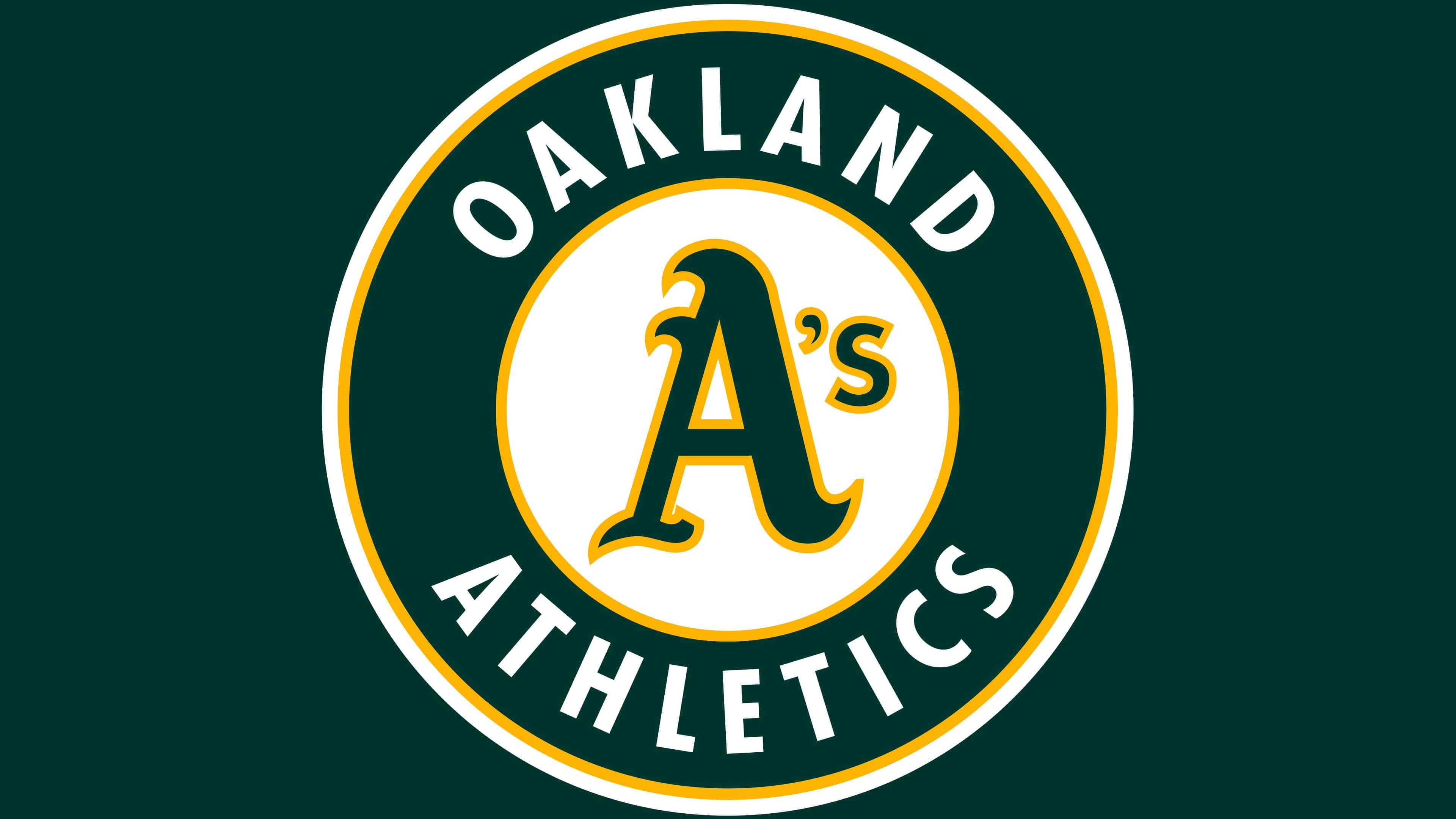
1993 – 2024
![]()
The current version features a large letter in the center of a white circle. But in addition to “A,” it also has a miniature “s,” written with an apostrophe. All central elements are outlined in yellow. Next is a wide dark green stripe with inscriptions. Above is the word “Oakland,” and below is “Athletics.” They are not separated and have an arch shape. A yellow line also runs along the outer edge.
The current version is a revision of the previous one with some minor adjustments. The middle has become narrow, while the green field, conversely, has become wide. The outline palette has also changed: in the previous version, it was green, and in the current one, it is yellow.
Font and Colors
At the beginning of their sports careers, baseball players chose the “A” logo, which, as it does today, conveys part of the name “Athletics.” Then, in 1920, an image of an elephant appeared as a simple outline, as if a child had drawn it. Gradually, its contours changed, improved, and acquired realistic features. Eventually, by 1954, the animal was balancing on the ball and holding a baseball bat in its trunk. This image highlighted the team’s high skill level.
The image of the elephant was used until 1967 and was replaced by a variation with the letter “A.” Designers combined it with the ball and added “s” through an apostrophe. The transformation of color and details continued until 1993, when the circle turned into a classic rondel.
The lettering in the Oakland Athletics emblem most closely resembles the condensed Gill Sans Bold font. These are smooth, elongated letters with serifs. The central letter “A” is made in a font specifically developed for the club. It is in an Old English style and has curves.
The emblem features all the corporate colors proposed in 1963 by franchise owner Charlie Finley: white, yellow, and Kelly green.