


![]() Minnesota Twins Logo PNG
Minnesota Twins Logo PNG
One of the oldest baseball clubs in Minnesota features a logo that reflects the brotherhood between Minneapolis and St. Paul. The Minnesota Twins logo represents a significant feature of the club: its connection to two cities and sports, and its commitment to its history.
“Minnesota Twins” is an American professional baseball team based in Minneapolis, Minnesota. The Twins compete in Major League Baseball (MLB) as a member club of the American League (AL) Central Division. The team was founded in 1901.
Originally, the team was called the Washington Nationals and the Senators. This is because, for the first half of their competitive career (almost 60 years), the franchise was in Washington. First, under the leadership of Ban Johnson and Fred Postal (1901-1903), Thomas Noyes bought the franchise in 1904. He owned the baseball club until 1912, when he sold it to Benjamin Minor. Eight years later, he transferred ownership to Clark Griffith, who owned the “Senators” until he died in 1955.
Calvin Griffith organized the relocation of the “Minnesota Twins” from Washington, D.C., to Minneapolis-St. Paul. The team was warmly received at its new location, which boasts several brilliant players. Carl Pohlad owned the team from 1984 to 2009. After his death, his heir, Jim Pohlad, took over all duties and still owns the franchise.
The “Twins” are named after the Twin Cities area, including Minneapolis and St. Paul, where they are currently based. Right after the move, the team was called Twin Cities Baseball. The name “Twins” originated from the region’s popular name, “Twin Cities,” as the team was often referred to as “Twin.”
Meaning and History
![]()
The “Minnesota Twins” have had many logos over the years. Starting as the “Washington Senators,” the club changed its name several times. Moreover, the debut logo is radically different from today’s. In the early versions, the predominant letter was “W,” a reference to the state of Washington. Now, a form of seal with a diagonal inscription in the middle is used.
What is Minnesota Twins?
The Minnesota Twins are a baseball club named after Minneapolis and St. Paul, which are considered twin cities because of their geographical proximity. It is part of the professional sports organization Major League Baseball and the American League Central Division. As of 2021, the team has won three World Series titles, four Western Division titles, and eight Central Division titles.
1901 – 1904
![]()
Originally, the team was called the “Washington Senators,” and their emblem was a classic dark-blue letter “W.”
1905 – 1935
![]()
The team’s nickname changed to “Washington Nationals.” Over the next 20 years, the emblem remained the blue letter “W,” which underwent minor modifications.
1936 – 1937
![]()
The dark blue letter “W,” representing Washington, was outlined in thick red.
1938 – 1947
![]()
Designers removed the red outline from the logo and enlarged the dark blue letter.
1948 – 1952
![]()
The dark blue letter “W” again, with a red outline, but now it has become thinner.
1953 – 1956
![]()
In 1953, the “Washington Nationals” first adopted a full-fledged logo. The dome of the US Capitol emerges from a white-and-red baseball. In the background – a white baseball bat with a red outline. A dark blue baseball cap with the small letter “W” is at the top of the Capitol dome.
Subsequently, the “Senators” used the same final logo as the “Nationals,” which depicted the US Capitol dome, a baseball, a bat, and the team’s cap.
1957 – 1960
![]()
The new emblem depicts a caricature of a US senator preparing to pitch, with the team name displayed behind a blue-and-red circle and the Washington Monument visible in the background.
1961 – 1975
![]()
When the team was renamed the “Minnesota Twins,” the logo also changed. Illustrator Ray Barton created the iconic image of “Minnie” and “Paul” in baseball uniforms, with the initials “MSP” (representing Minneapolis and St. Paul) shaking hands over the Mississippi River, on a light-blue drawing of the state of Minnesota in the late 1960s, accompanied by a white baseball. Nevertheless, Griffith decided to turn the drawing into the team’s official emblem. Barton was paid $15 for his work.
1976 – 1986
![]()
The tenth Minnesota Twins emblem is similar to the previous one, but there are some changes. Twins “Minnie” and “Paul” shake hands over the Mississippi River with the inscription “Win! Twins!” Additionally, the light blue color has darkened to a deep blue.
1987 – 2009
![]()
The 1987 Minnesota Twins logo features a red inscription of “Twins” with the word “win” underlined, set against a large red-and-white baseball. Above, Minnesota is depicted in black.
2010 – 2022
![]()
Now, the club has switched to a version based on a classic rondel: a transparent circle with a wide stripe, border, and central ring, in which the main element is located. To indicate the sport’s direction, the developers placed a baseball with two stripes in the characteristic “herringbone” pattern at the center. They are followed by two inscriptions: “Minnesota” at the top and “Baseball Club” at the bottom. They complete all lines along the edge – blue and white.
The word “Twins,” denoting the team’s original name, runs horizontally across the ball. It is made in dark red with lower shadows that make the inscription convex. The letters “T” and “s” extend beyond the inner circle, giving the Minnesota Twins emblem stylistic integrity. This logo was adopted in 2010.
2023 – today
![]()
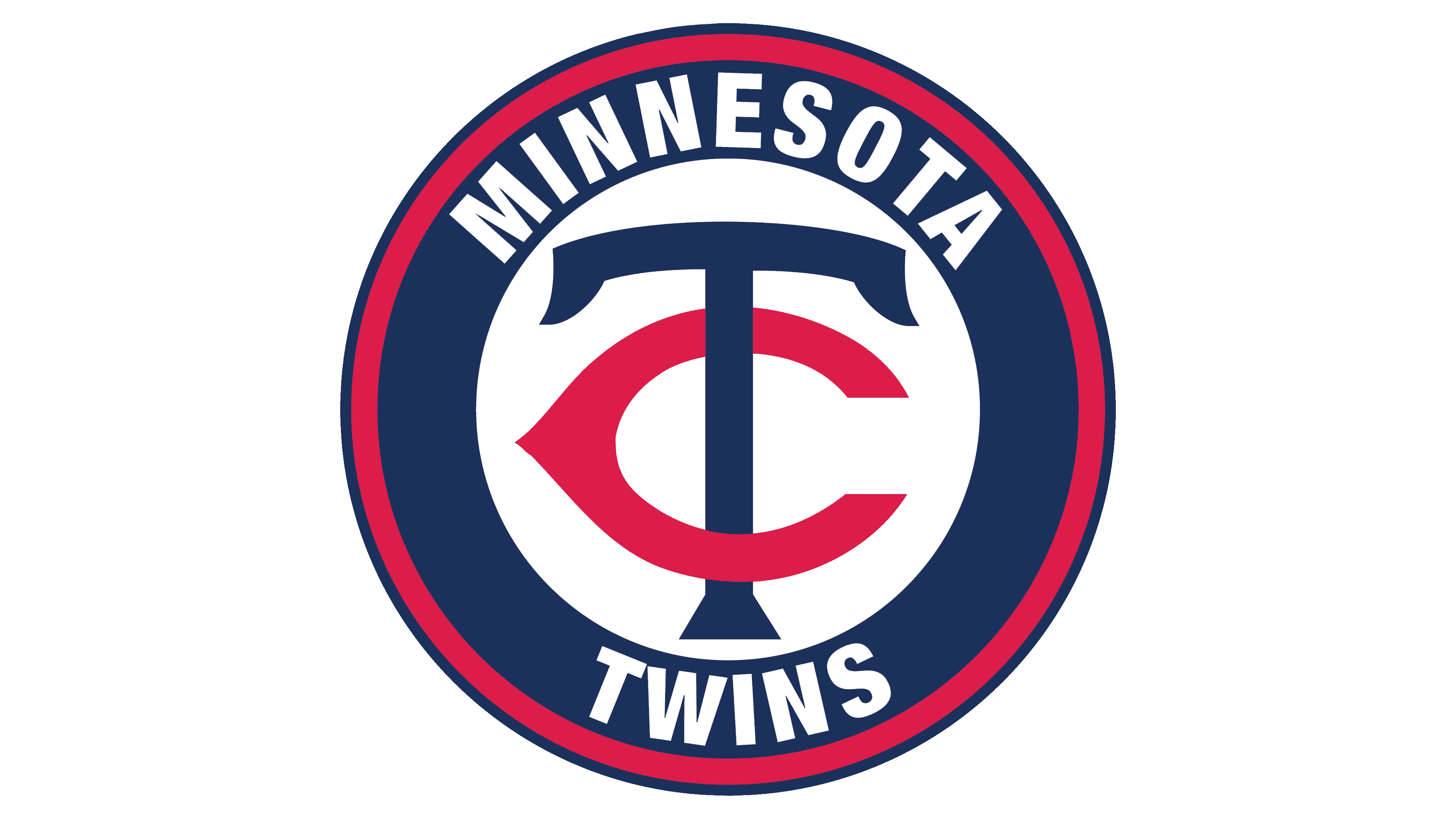
Sports clubs use logos that are somehow related to their official name. In 2022, the “Minnesota Twins” became an exception to the rules, placing the TC monogram on their coat of arms. The fans then had a valid question: What does the letter “C” have to do with it?
The abbreviation “TC” stands for “Twin Cities.” This term refers to the Minneapolis-St. Paul Metropolis, where the franchise moved from Washington in 1961. At the same time, he began using an alternative logo featuring the intertwined letters “T” and “C,” which would later serve as the basis for the official logo in 2022.
The modern monogram closely resembles the original version. It also contains a large dark blue letter “T” and a flattened red letter “C” in the form of a thymus. Their intertwining symbolizes the unity of the independent municipalities of St. Paul and Minneapolis. The abbreviation “TC” also reminds us that Calvin Griffith wanted to name the club Twin Cities Twins, but he was dissuaded from this idea.
The rebranding was announced in November 2022 at the Mall of America. The choice of location is very symbolic, as the former home of the “Minnesota Twins,” Met Stadium, was there. The new logo was introduced in the 2023 season.
Font and Colors
Before the modern version, there was a logo that directly reflected the essence of the club’s name. It depicts two athletes, one in the “Minneapolis Millers” uniform, the other in the “St. Paul Saints.” They shake hands on opposite banks of the Mississippi River. A baseball and an administrative map of Minnesota are used as the background.
According to the designers’ concept, two twin cities were envisioned to serve as an excellent platform for sports. Now, this option has moved from the main to the alternative. The “Minnesota Twins” also had other cartoon-style logos.
The modern logo features two distinct font types. The words “Minnesota” and “Baseball Club” are set in a strict serif font. All letters in them are uppercase. The central word, “Twins,” is set in a fancy cursive font with underlining and double shadows.
The emblem features colors of white, red, scarlet, and navy blue. The silver color is also used, though not among the official ones, and the Minnesota Kasota gold brand is absent.