


![]() Baltimore Orioles Logo PNG
Baltimore Orioles Logo PNG
The professional baseball club, nicknamed after Maryland’s official state bird, has incorporated its name into its emblem. Designers rendered the Baltimore Orioles emblem in a colorful, cartoonish style to appeal to fans of all ages.
The history of the Baltimore Orioles dates back to 1901, when the franchise debuted as the Milwaukee Brewers, one of MLB’s founding clubs. After one season, the team moved to St. Louis in 1902 and became the St. Louis Browns, spending more than five decades in the city under the shadow of the St. Louis Cardinals.
The Browns reached their peak in 1944, winning the American League but losing the World Series to the St. Louis Cardinals. In 1954, after a change in ownership, the franchise relocated to Baltimore and adopted the Orioles name, a reference to Maryland’s state bird.
Success followed in the 1960s. In 1966, the team won its first World Series, defeating the Los Angeles Dodgers. The 1970s brought further results, including a 1970 title and multiple American League championships under manager Earl Weaver.
In 1983, the Orioles secured another World Series win against the Philadelphia Phillies. A decline followed, highlighted by a 21-game losing streak in 1988. In 1995, Cal Ripken Jr. broke Lou Gehrig’s record with 2,131 consecutive games.
The team returned to the playoffs in 1996 and 1997 but lost both ALCS series. After another decline, the Orioles reached the postseason three times between 2012 and 2016, winning the division in 2014.
In 2018, the club embarked on a rebuild, focusing on younger players. By 2021, figures like John Means and Cedric Mullins signaled a gradual shift toward a new phase while maintaining long-standing visual symbols associated with the oriole.
Meaning and History
![]()
The seventeen logos the Baltimore Orioles franchise has used differ in many elements and styles. Some are dominated by monograms, others by round stamps with text, and others by a bird. This is because the club changed several owners, cities, and names. A logo redesign, from minimal adjustments to large-scale changes, accompanied each stage.
What is Baltimore Orioles?
The Baltimore Orioles are a baseball team owned by American lawyer Peter G. Angelos (as of 2021). It competes in the American League East and has performed quite successfully in Major League Baseball. Its home stadium is called Oriole Park at Camden Yards.
1901
![]()
In the early 20th century, baseball in the USA was gaining popularity, and teams were actively forming their identities. The “Milwaukee Brewers” were no exception. Using a simple, clear logo that reflected the city’s name conveyed the team’s commitment to clarity and transparency. This period was also characterized by a drive to create strong connections between sports teams and their hometowns. The first “Milwaukee Brewers” logo was simple and concise: it featured the inscription “MILWAUKEE” in blue. The logo with the “MILWAUKEE” inscription symbolized this connection, showcasing the team’s pride in their city and its residents. It was a tribute to the city and the people supporting the team. Using the city’s name in the logo emphasized the importance of local identity and attachment to their roots.
The emblem’s font was sans serif, with large, clear letters, ensuring good readability and recognition. The inscription was done in a semi-circle, giving the logo a sense of dynamism and movement.
The logo’s primary color was blue. This color is associated with trust, confidence, and stability, which was fitting for a team aiming to establish itself in the sports world.
1902 – 1905
![]()
In 1902, the team was known as the “St. Louis Browns,” and its emblem featured the city’s abbreviation in brown, “St. L.” The emblem’s city abbreviation and brown color reflected the team’s commitment to clarity and stability. The simplicity and conciseness of the design mirrored an era when teams aimed to identify with their location.
The logo’s font was geometric, sans serif, with large, clear letters. The letters had strict lines and angles, giving them an appearance of strength and reliability. The period after “St.” emphasized formality and precision.
The emblem’s brown color is associated with earth and stability, qualities important for a team aiming to build a strong foundation and achieve consistent results in sports.
1906 – 1907
![]()
The logo features an original and unique design used on the team’s uniforms during the 1906-1907 seasons. This period marked a time of change and new beginnings for the St. Louis Browns. The logo incorporates the letters “STL,” which interlock within a diamond shape, symbolizing a baseball field. The logo’s primary color is brown, which is characteristic of the St. Louis Browns during that period.
The font of the “STL” letters has elegant, flowing lines, giving the impression of handwritten text. This style emphasizes the design’s elegance and uniqueness. The interlocking letters add complexity and depth to the logo, making it visually appealing and memorable. The brown color of the logo symbolizes stability, strength, and reliability.
1908 – 1910
![]()
The new emblem is designed as a stylized brown fleur-de-lis. This symbol has deep historical roots and is tied to St. Louis’s French heritage.
The fleur-de-lis is one of the most well-known symbols in French culture, often associated with royalty and nobility. The team’s logo emphasizes pride in the city and its rich history, as well as the team’s aspiration for greatness and success.
1911 – 1915
![]()
The fifth logo featured a combination of “STL” intertwined letters in brown.
1916 – 1935
![]()
In 1916, the team changed its emblem again, removing the letter “T” and leaving “SL” in brown. The letters were blurred as if painted with watercolor. The “St. Louis Browns” used this logo until 1935, when they dropped the letters and the city name.
1936 – 1951
![]()
In 1936, when this logo was introduced, baseball had firmly established itself in American culture and society. Teams actively sought to create unique, memorable emblems that reflected their identity and connected them to the local community. This period’s “St. Louis Browns” logo features a complex heraldic shield. At the top of the shield is a statue of Saint Louis (after whom the city of St. Louis is named) on a horse with a raised sword. The upper part of the shield is adorned with eight brown stars on a white background, while the lower part has orange and brown stripes. In the center of the shield is a white baseball inscribed “BROWNS.”
The emblem, featuring the statue of Saint Louis on the shield, perfectly fits this trend of connecting with the team’s hometown, blending the city’s historical heritage with the team’s athletic achievements. The statue of Saint Louis on horseback emphasizes the city’s historical ties to its founders. The sword in the statue’s hand symbolizes the team’s strength and determination. The eight stars might represent significant events or achievements of the team at that time.
The font used for the “BROWNS” inscription on the baseball features geometric elements and angular lines, making it expressive and memorable. This font underscores the team’s determination and confidence.
The logo’s color palette includes white, black, orange, and brown. White symbolizes purity and honesty; black represents strength and determination; orange conveys energy and enthusiasm; and brown represents stability and reliability. These colors harmoniously blend to create a visually appealing and symbolically rich logo.
1952 – 1953
![]()
In the early 1950s, the “St. Louis Browns” updated their image, making it more modern and appealing to a wider audience. After 15 years of using the previous logo, the team management concluded that a complete change in visual style was necessary. The “St. Louis Browns” logo from 1952 to 1953 features a cartoonish depiction of an orange elf’s head. The elf is depicted with a mischievous expression, wearing a baseball uniform and holding a bat. The elf’s large, pointed ears emphasize its fantastical nature. The elf’s head is disproportionately large compared to its body, giving the logo a cartoonish and memorable appearance. The choice of a cartoon elf reflected the spirit of the time when cartoon characters and bright colors were popular in culture and advertising. This logo helped the team stand out from competitors and be remembered by fans thanks to its unique, cheerful image.
The elf in the logo symbolizes playfulness, cunning, and lightheartedness. This depiction reflects the team’s desire to be more accessible and fun for fans, appealing to adults and children alike. The choice of an elf hints at the magic and surprise that the team brings to the field.
Although the logo lacks text, the elf’s image is bright and memorable. The cartoonish style, with large elements and bright colors, draws attention and makes the logo easily recognizable.
The primary colors are orange and brown. Orange symbolizes energy, fun, and warmth, creating a positive impression of the team. Brown adds stability and reliability. Together, these colors create a harmonious and attractive visual image.
1954 – 1965
![]()
After moving to Baltimore, the team changed its name to the “Baltimore Orioles,” which required a new logo. The logo used for the first nine seasons depicts a smiling cartoon oriole, colored in black, orange, and white, climbing on a white baseball. Behind the baseball are two crossed bats, and in the center of the ball is the word “ORIOLES.” The cartoon style and bright colors were popular at the time and helped attract new fans. The new logo was part of a strategy to create a new team identity and strengthen their position in the baseball league.
Main elements of the logo:
- Oriole: The team’s symbol, reflecting the name and regional identity.
- Baseball ball: A sports symbol emphasizing the team’s association with baseball.
- Crossed bats: A symbol of the game, adding dynamism and movement to the logo.
The oriole symbolizes the team’s name, making the logo clear and recognizable. The oriole’s smile gives the logo a friendly, welcoming look, helping create a positive image for the team. The baseball and crossed bats indicate the team’s sport, emphasizing their affiliation with baseball.
The word “ORIOLES” is written in large sans-serif letters, making it easy to read and notice. The font style is simple, highlighting the main symbols and images rather than intricate decorative elements.
The primary colors are black, orange, and white. Black symbolizes strength and determination, orange represents energy and enthusiasm, and white signifies purity and honesty. Together, these colors create a bright, high-contrast image that is easy to remember.
1966 – 1988
![]()
In 1966, the team’s owners hired assistants to create an appealing bird character. The logo, dedicated to the team’s tenth anniversary, was designed by Stan Walsh, who also created the famous logos for “Hamms Bear” and “Snap, Crackle, and Pop.” The logo features a red oriole in a black cap and shoes, swinging a red bat within a red circle with the inscription “Baltimore Orioles.” Introducing a cartoon oriole character was part of a strategy to strengthen the team’s image and attract new fans.
The oriole in the logo symbolizes the team and adds a friendly, appealing element. The smiling bird with a bat conveys a fun, energetic athlete, helping draw attention and win fans’ affection. The circular logo, inscribed with “Baltimore Orioles,” emphasizes the team’s connection to Baltimore.
The font used for the “Baltimore Orioles” inscription is sans-serif and bold, making it easy to read and noticeable. The font style is simple and direct, highlighting the oriole and the bat as the main focus.
Red symbolizes energy, passion, and determination, while black represents strength and confidence.
1989 – 1991
![]()
The next Baltimore Orioles logo differed slightly from the previous one. In 1989, the team simply changed the colors to brighter shades of black and orange.
1992 – 1994
![]()
In 1992, the “Baltimore Orioles” team changed its logo by removing the circle and depicting a realistic orange oriole with black wings perched on the letter “i” in the word “Orioles.” Inside the oriole’s orange tail, the word “Baltimore” was written in white. Removing the circle and adding a realistic oriole symbolized the team’s move toward a new image and renewal. This step strengthened the “Baltimore Orioles” brand and attracted new fans.
The bird perched on the letter “i” adds dynamism and uniqueness to the logo. The oriole symbolizes energy, agility, and beauty.
The word “Orioles” is written in a large, elegant font that is easy to read and remember. The combination of black and orange colors creates a bright contrast, making the logo more noticeable. The white “Baltimore” inscription on the oriole’s tail is in a simple, clear font, emphasizing the city’s importance. Orange symbolizes energy, passion, and enthusiasm; black represents strength and confidence; white signifies purity and openness.
1995 – 1997
![]()
The logo from 1995 to 1997 features a bright orange, italicized “Orioles” inscription. Sitting on the letter “i” is an oriole bird, now facing to the right. The logo’s background is a baseball field diamond, colored yellow and green.
The font of the “Orioles” inscription has a free and flowing style, giving the logo a sense of dynamism. The orange inscription highlights the team’s name. The baseball diamond background symbolizes the playing field. The green color represents the grass on the baseball field, and the yellow represents sunlight.
1998
![]()
The emblem underwent minor changes for the 1988 season. The only difference was the bird’s design, which closely resembled that of a real orange-black oriole.
1999 – 2008
![]()
The fifteenth emblem of the Baltimore Orioles remained the same, with only improved color and more precise details of the original image.
2009 – 2018
![]()
In 2009, the Baltimore Orioles team changed its logo. The baseball field background was removed, and the red color was replaced with orange. The black-white-orange oriole remained, but its image became less vibrant than the previous logo.
Removing the baseball field’s background and replacing the red with orange emphasizes the team’s aim to modernize and refresh its image. The logo becomes more minimalist and memorable, thereby strengthening the brand.
The word “Orioles” is written in a large, elegant font that is easy to read and remember. Using black, white, and orange colors creates a bright contrast, making the logo more noticeable.
Orange symbolizes energy, passion, and enthusiasm; black represents strength and confidence; white signifies purity and openness.
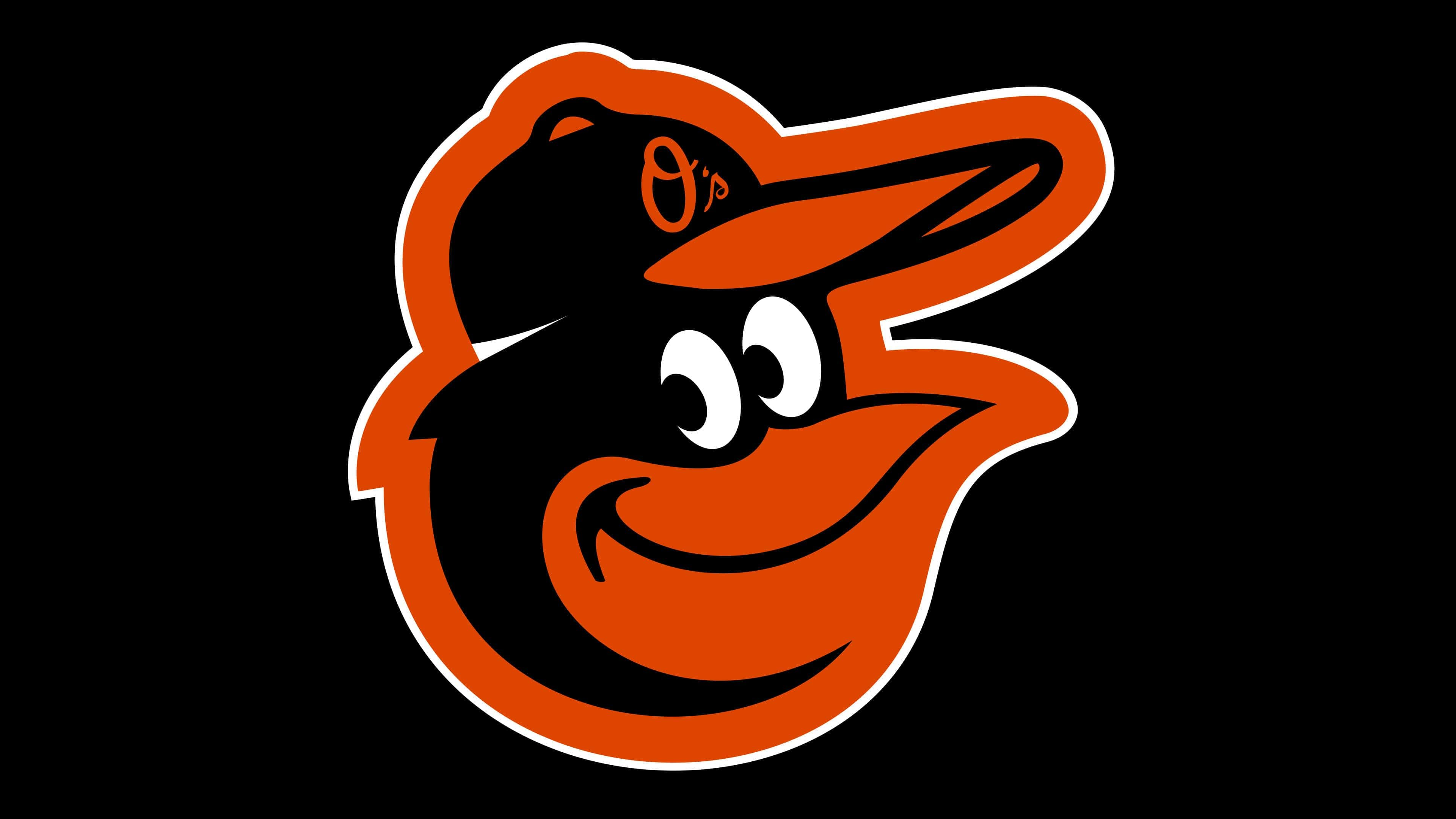
2019 – today
![]()
In 2019, the Baltimore Orioles introduced their latest logo. This logo is not a radical update but a reworking of the 2012-2018 version. The developers adopted an alternate logo previously used for promotional purposes as the club’s primary visual identity.
The logo features an anthropomorphic oriole, specifically its head, rather than a realistic depiction. The bird’s head is set against a white background and is shown in a semi-profile view. The oriole’s face is smiling, with the tip of its beak slightly curved. The expression is pleasant and friendly, symbolizing the team’s kindness and hospitality.
The logo also includes a dark-colored baseball cap with a light brim. On the brim, an embroidered capital letter “O” and a lowercase “s” lend the logo uniqueness and recognition. The font used for the letters is elegant and easy to read, making the logo attractive and memorable.
Orange symbolizes the team’s energy, enthusiasm, and passion. Black adds solidity and confidence to the logo, while white represents purity and openness. Together, these colors create a bright, friendly image that is easy to remember and attention-grabbing.
Font and Colors
Almost all Baltimore Orioles branding is associated with the oriole, whether in its name or in its drawn image. This is because the franchise is named after Maryland’s official mascot, and since 1954, it has been part of the logo. True, there were several periods initially when the oriole was not present on the logo at all. It appeared in the middle of the last century: it was depicted as a cartoon character with a baseball theme. Since that time, the bird has never left the emblem. A realistic image was approved in 1992.
If the modern version has no text (only two letters, “O” and “s”), early versions have an inscription. In some cases, a sans-serif chopped font is used; in others, a handwritten font with flowing symbols is used. The word “Orioles” is positioned diagonally, reading from bottom to top. All letters are supplemented with shadows, giving the font a more voluminous look. The signs are also handwritten, with the modern logo and thin outlines.
The team’s official color palette is black, dark orange, gray, and white. Previously, it also included dark blue, brown, brick red, green, and beige.