


![]() Cleveland Indians Logo PNG
Cleveland Indians Logo PNG
The emblems of these baseball players convey a candid smirk toward their opponents. The Cleveland Indians’ emblem consists of the letter “C,” reminiscent of a wide Indian smile. A single letter simultaneously expresses joy and defiance. It is painted red, replacing the representation of America’s indigenous population.
The Cleveland Indians trace their origins to 1894, when they were known as the Grand Rapids Rustlers. After relocating to Cleveland in 1900, the club adopted several names in quick succession: Lake Shores, Bluebirds in 1901, Broncos in 1902, and Naps from 1903 to 1914. The current name, adopted in 1915 after a public contest, has remained tied to the city ever since.
Ownership instability shaped much of the early history. Charles Somers controlled the team from 1901 to 1916 before financial trouble forced a sale to Jim Dunn. Over the following decades, the franchise passed through multiple hands, including Alva Bradley from 1927 to 1946 and Bill Veeck from 1946 to 1949. Ellis Ryan, Myron Wilson, William Daley, and Gabe Paul followed, often holding the club for only a few years.
The pattern continued later with Vernon Stouffer, Nick Mileti, Ted Bonda, and Steve O’Neil between 1966 and 1983. A period of greater stability began in 1986, when Richard and David Jacobs purchased the team for $35 million. In 2000, Larry Dolan acquired the franchise for $320 million and remained in control.
The visual identity changed repeatedly over more than a century, with over 15 logos in use. Most versions relied on the letter “C” or Native American themes, including the Chief Wahoo symbol. That emblem was later removed after sustained criticism from Indigenous organizations dating back to the 1970s. The modern mark features a red “C” with a custom-drawn design, echoing elements dating back to 1904.
Meaning and History
![]()
In nearly 120 years, the “Cleveland Indians” have changed 20 emblems. This relates to external factors, such as private moves at the start of their careers and shifts in symbolism. The reasons also include:
- The modernization of the logo.
- The renaming of the team.
- Even political disputes.
Chief Wahoo has been the franchise’s primary mascot and logo since 1940. Millions of fans are crazy about him, but some consider this symbol extremely racist. However, in 2014, uniform design expert Paul Lukas announced that Chief Wahoo would be removed from the main logo and replaced with the letter “C.” Nevertheless, Chief Wahoo remained on the home jersey, cap, and sleeves.
What is Cleveland Indians?
The “Cleveland Indians” was the former name of the professional baseball team now known as the “Cleveland Guardians” in the USA. The franchise was renamed in 2021 and entered the 2022 season under a new name. It represents the AL Central Division in the MLB and is the oldest participant in the major league. The club was formed in 1894. Its home stadium is “Progressive Field.”
1901
![]()
The printed letter “C” in the logo appeared in 1902. The letter, originally blue, symbolized Cleveland.
1902 – 1903
![]()
In the next season, the letter “C” on the “Cleveland Blues” logo turned red.
1904
![]()
In 1905, the team was renamed the “Cleveland Naps.” Simultaneously, the red block “C” was replaced with a blue version of the same letter.
1905
![]()
In 1905, the team’s name was changed to the Cleveland Naps. Simultaneously, the red block “C” was replaced by a blue script version of the same letter.
1906 – 1908
![]()
In 1906, the club introduced another variation of the font “C.” This time, the letter was more ornate and detailed.
1909
![]()
The final logo of the Cleveland Naps featured the same letter “C” in blue, but it was larger and less ornate.
1910 – 1914
![]()
1915 – 1920
![]()
In 1915, the team began to be called the”Cleveland Indians.” The franchise returned to the logo as a block “C,” this time executed in dark blue. The letter “C” symbolizes the city of Cleveland. Unlike the 1902-1904 logo, the overall shape was more square.
1921 – 1927
![]()
The dark blue letter “C” in the Cleveland Indians logo was quite elaborate, resembling the Bruce Double Pica font. It was a bit unusual compared to the strict design of the previous logo.
1928
![]()
In the late 1920s, the “Cleveland Indians” logo underwent another radical update: the era of Chief Wahoo began. The Indians introduced an image of a Native American. The first Chief Wahoo logo was a roughly drawn red Indian head with three black feathers.
1929 – 1932
![]()
Frankly, the previous image of the Indians did not resemble a real Native American, so in 1929, a modified logo was introduced. The logo depicted a chief in a white headdress with a red face and black outlines.
1933 – 1938
![]()
In 1933, the “Cleveland Indians” used a slightly more colorful and caricatured version of the logo. The logo depicted an Indian chief with a yellow face and black hair. He wore a green shirt and a headdress with white, beige, and red feathers.
1939 – 1945
![]()
The twelfth Cleveland Indians logo depicted a lifelike Native American with a red face and a black-and-white headdress against a red-and-white striped circle.
1946 – 1947
![]()
The cartoon image of Chief Wahoo officially appeared in 1946. Designers added a baseball player’s body to the unnaturally large head of an Indian with a red face and black hair. Americans called Native Americans “redskins,” so his face was red. Chief Wahoo held a white baseball bat in his hands.
1948
![]()
The large head and small body did not match, making the Cleveland Indians’ emblem comical, unserious, and absurd. On the 1948 emblem, Chief Wahoo looked straight ahead. The head of the red-faced Indian was decorated with a red feather sticking out of his black hair.
1949 – 1972
![]()
In 1949, some changes were made to the symbol. In particular, the nose became less prominent. The head turned to the left, its triangular eyes and toothy smirk making the logo more distinctive. Additionally, the logo was outlined in black. As a result, the “Cleveland Indians” got the most iconic logo, which lasted until 2014.
1973 – 1978
![]()
In 1973, designers introduced a full-color version of the logo featuring red, white, and blue. They placed the Native American inside a large white-and-red baseball. Chief Wahoo held a white bat in his hand. He is depicted in motion as if winding up for a hit. For the first time in history, the team’s full name appeared on the emblem, written in semicircles above and below it.
1979 – 1985
![]()
1986 – 2013
![]()
The 1949-1972 “Chief Wahoo” logo version was used from 1979 until 2013, when it was replaced. This image served as both a logo and a mascot.
2014 – 2024
![]()
The current version is the result of interethnic intrigues. Most of the population considered the “Cleveland Indians” logo racist because it previously depicted a smiling Indian with a feather. This version was natural, as it conveyed the club’s name. However, in 2014, the administration decided to update the team’s emblem and approved an alternative version, known as the “C.”
The current emblem is virtually indistinguishable from the one used in 1904. It was used briefly, and now the developers have decided to revive it. Thus, the era of “Native American Chief Wahoo” ended, and the era of “C ” began, which continues to this day.
Font and Colors
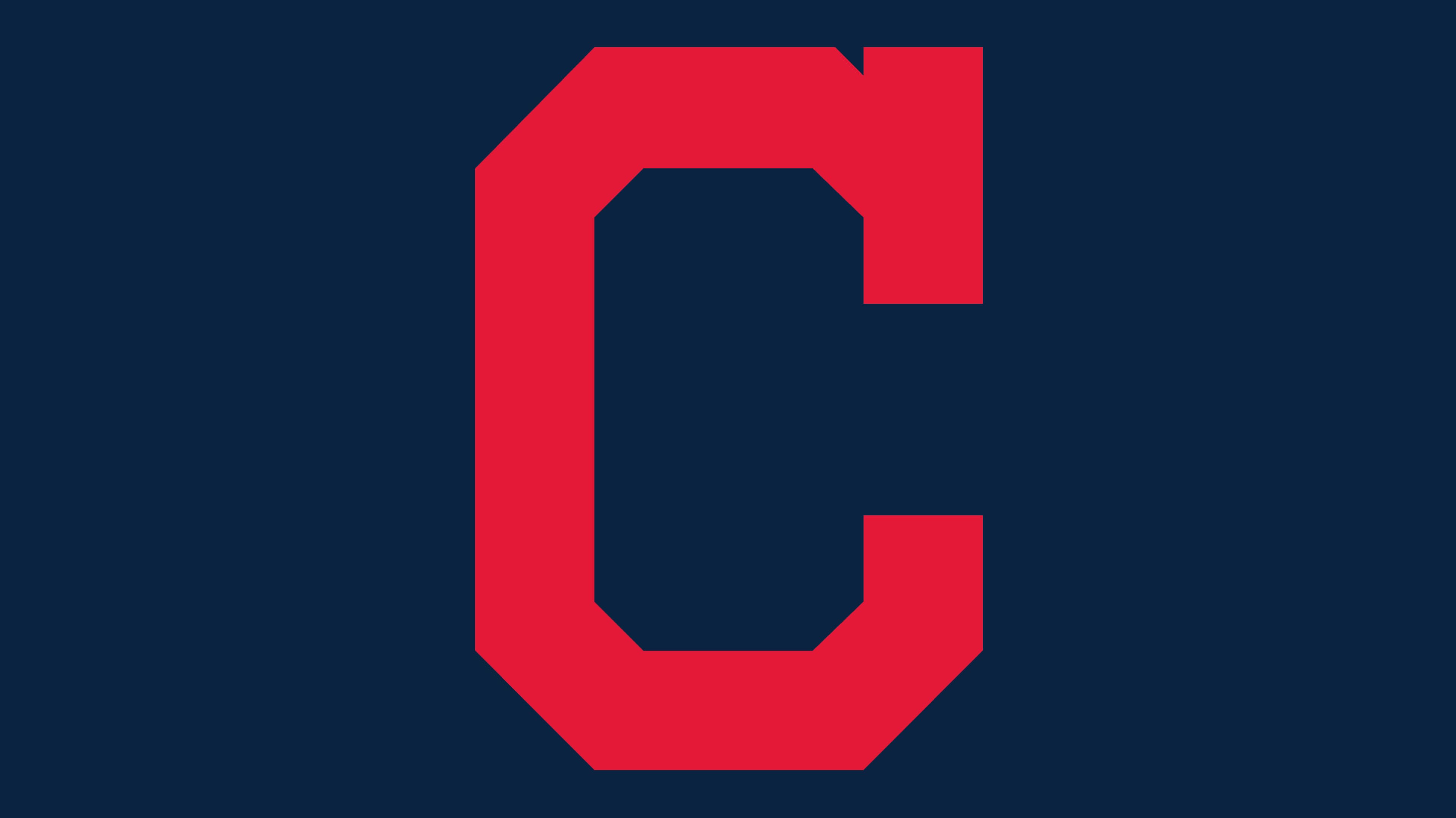
The logo features a graphic letter. It represents the capital letter of the franchise’s first word, “Cleveland.” This sign reflects two key factors: the team’s origin and its roots. Additionally, it is considered the emblem’s primary element.
The capital letter “C” comprises nine fragments, each a strict geometric figure. Those located vertically and horizontally are rectangles, and the corners are trapezoids. Unlike its predecessor (the 1904 version), it has a wider inner clearance and shorter front segments. Neutrality is the key task of the letter logo.

Although the emblem does not include expanded text, one can discuss the font because the letter “C” is part of a word. The symbol’s graphic design resonates with the classic Bruce Double Pica. However, it is most likely not a printed element but a custom symbol or an adapted glyph drawn from an existing font.
The current logo’s color palette is limited to a single color, red (#E31937), on a white background (#FFFFFF). In previous versions, dark blue #0F223E was also included; it remains part of the official range and is used on team merchandise. In addition, early emblems often featured gold, black, and brown.