


![]() New York Mets Logo PNG
New York Mets Logo PNG
The Mets uniform features the team’s iconic logo and emblem in bright colors. The visualization of the New York Mets logo pays tribute to the club’s history and demonstrates respect and commitment to the city. The simple, stylish design is easy to remember and recognize.
The history of the New York Mets began in 1962, after the New York Giants and the Brooklyn Dodgers left for California. The new franchise entered MLB under manager Casey Stengel, who had previously been linked to the New York Yankees. The debut season ended with a 40–120 record, one of the worst in the 20th century.
Despite the results, fan support remained strong, especially after Shea Stadium opened in 1964. In 1969, the “Miracle Mets” won the World Series, defeating the Baltimore Orioles. Pitcher Tom Seaver led the team and later entered the Hall of Fame.
In 1973, the Mets returned to the World Series but lost to the Oakland Athletics. A decline followed, highlighted by Seaver’s trade to the Cincinnati Reds in 1977.
The 1980s brought recovery. In 1986, the Mets won their second title, beating the Boston Red Sox in seven games after a key error in Game 6. Dwight Gooden and Darryl Strawberry were central figures.
In 2000, the team faced the Yankees in the Subway Series but lost. In 2006, it reached the NLCS and lost to the St. Louis Cardinals.
In 2015, the Mets returned to the World Series but lost to the Kansas City Royals. By 2022–2023, roster changes and investment under Steve Cohen did not lead to consistent results.
Meaning and History
![]()
George Weiss announced a media contest for logo ideas for advertising purposes. Many people responded. The franchise owner chose the variant he liked most. Its creator was Ray Gatto, a famous cartoonist. Using his idea, he added his own and asked Lon Keller, an artist from Spencer’s marketing service, to refine the concept. The final version of the logo appeared in 1962 and has hardly changed since: there have been only three minor modifications.
In the logo itself, each building and element has meaning. On the left is a church spire, a symbol of Brooklyn and the borough of churches; the second building from the left is the Williamsburg Savings Bank, the tallest building in Brooklyn; next to it is the Woolworth Building; in the far right corner is the United Nations building.
What is New York Mets?
It’s a baseball club based in New York’s largest borough, Queens. It was created in 1962 after the departure of the “New York Giants” and “Brooklyn Dodgers,” leaving the city without a National League franchise. Since 2020, the team has been owned by billionaire Steven A. Cohen, and since 2009, it has held its home competitions at “Citi Field.”
1962 – 1992
![]()
The first logo, which eventually became the prototype for all subsequent ones, depicted a white baseball with an orange outline. Inside was a view of Brooklyn. As mentioned, each building is positioned to correspond to real structures. In the foreground is a white bridge. In the lower-left corner, you can see two small orange letters, “NY,” and in the very center, “Mets” is in orange.
1993 – 1998
![]()
The team’s second logo underwent minor changes in the color scheme. Orange became darker and more saturated, as did blue.
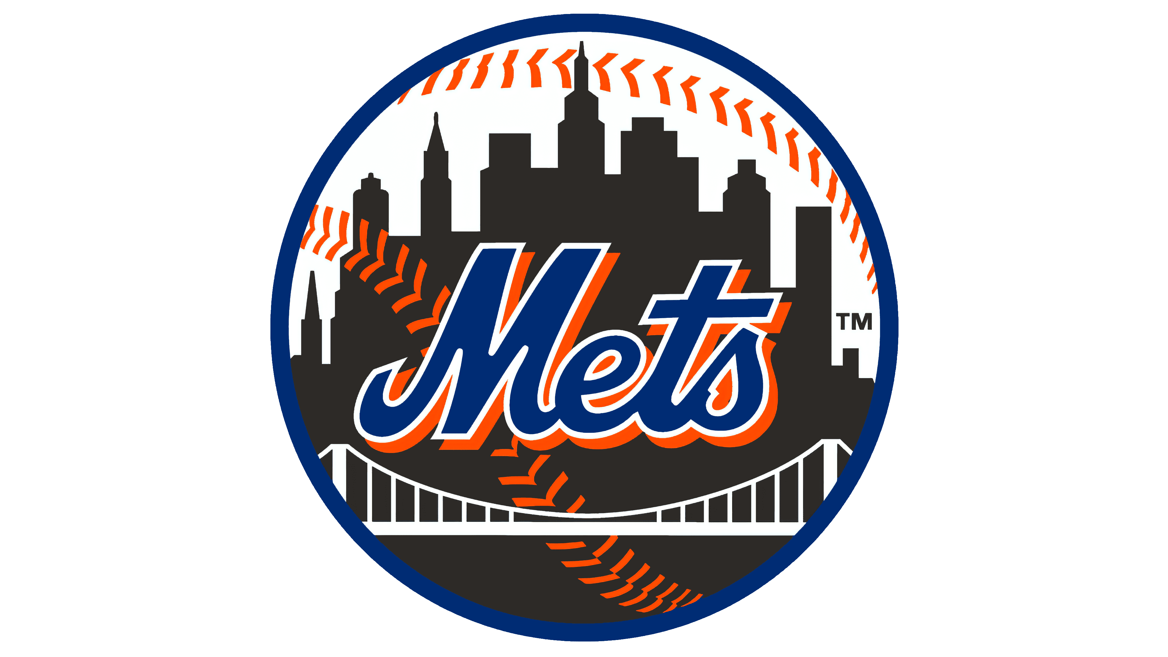
1999 – today
![]()
The club’s symbols, from its debut onward, feature outlines of iconic architectural landmarks and key New York skyscrapers. The spires of churches, the Williamsburg Savings Bank, UN buildings, Woolworth, and the Empire State are recognizable in blue shades. Against a stylized backdrop, a famous bridge is visible. It conveys the idea of uniting all corners of the city and symbolizes a reliable connection among them.
Above the white bridge, on the dark blue figures of the main skyscrapers from the five boroughs of New York, is the inscription “Mets.” The word is presented in calligraphic handwriting. The intertwined letters “NY” on the left have been removed. The bridge spans have widened. The shape of the baseball has been preserved, and two characteristic lines have run through it. A frame runs along the outer edge of the logo. The team’s signature colors have remained the same – a combination of Dodgers’ blue and Giants’ orange.
Font and Colors
In more than 60 years, the New York Mets have never changed their logo. It’s a source of pride, reflecting the spirit of New York through its legendary architectural landmarks. Adjustments were concerned with minor details that were practically unnoticeable.
The emblem depicts a baseball with two characteristic stitches: a fir tree and a skyline with towering skyscrapers. These are key buildings in New York. They speak of its grandeur and emphasize the enormous importance of the sports team for all city residents. At George Weiss’s request and Ray Gatto’s proposal, Lon Keller from Spencer Marketing Services designed the logo.
He used the most important objects from the boroughs of New York and depicted a bridge against their backdrop, which, according to the plan, unites all values into a whole. Above it, he placed the word “Mets” with a white frame – the name of the baseball club. It’s a symbol of the city’s unity.
Until 1993, the logo used two font types: the first word in the name and the second. The abbreviation “NY,” derived from “New York,” was on the left and set in a grotesque sans-serif with serifs. The word “Mets” remains on the emblem, representing connected cursive text. It is executed with round letters.
The team’s brand palette consists of blue, orange, and white. Each is used in the emblem: buildings are colored blue, the circle’s edges are traced on the baseball, the word is in orange, and the overall background, bridge, and border are white.
FAQ
Did the “Mets” change their logo?
Yes, the “New York Mets” changed their logo more than once. The first time was in 1993, when designers slightly darkened the colors. The next redesign occurred in 1999 when artists increased the thickness of the bridge in the foreground. All changes were so minor that they were almost unnoticed.
Which bridge is depicted on the Mets logo?
The white bridge crossing the Mets logo symbolizes all the city’s bridges and the borough connection. Unlike the buildings in the background, it doesn’t denote any specific architectural landmark.
Who created the Mets logo?
Artist Rufus A. “Ray” Gatto created the original version of the Mets logo. He is known for his baseball comics and sports cartoons. He won a contest sponsored by baseball team executives and received the promised $1,000 first-place prize, beating out more than 500 other participants.
Why do the “Mets” have orange uniforms?
Orange and blue were borrowed from teams that moved out of New York shortly before the “Mets” appeared. Blue (#1E90FF) originally belonged to the “Brooklyn Dodgers,” while orange was the foundation of the “New York Giants” uniform.