


![]() Cincinnati Reds Logo PNG
Cincinnati Reds Logo PNG
The brand identity reflects the team’s long history, its victories, and defeats. The Cincinnati Reds logo symbolizes the team’s affiliation with the city and emphasizes its sports profile.
The Cincinnati Reds are a professional baseball team founded in 1882. The club plays in the MLB and is part of the NL Central Division. Until 1889, the team was a registered member of the American Association. Today, the club is based in Cincinnati, Ohio.
Previously, there were two clubs with the same name in the city, but their careers were unsuccessful. The third franchise consists of new players. O.P. Caylor, the sports editor of the Cincinnati Enquirer, was an active advocate for the club’s creation.
Justus Thorner was the team’s first owner. He led the team until it joined the National League. For two years, John T. Brush managed the team until he sold it to August Herrmann in 1902. In turn, the new owner controlled the club until 1927, after which a series of owners quickly succeeded each other: 1927-1929 – C.J. McDiarmid, 1929-1933 – Sidney Weil.
The Cincinnati Reds stayed in the hands of Powel Crosley Jr. longer – from 1933 to 1961. Then its owners were Bill DeWitt (1961-1967), Francis L. Dale (1967-1973), Louis Nippert (1973-1980), William and James Williams (1980-1984), and Marge Schott (1984-1998). The rule was passed to Carl Lindner, who sold the team to Robert Castellini in 2006, the current owner.
The club’s name, Cincinnati Red Stockings, was derived from a tradition established in the city. After joining the NL, the team adopted an abbreviated name: Cincinnati Reds. In this form, the team existed until 1953, when it was renamed Cincinnati Redlegs. But just three years later, the club returned to its previous name.
Meaning and History
![]()
Over its more than 135-year history, the franchise has undergone several branding iterations. It has had 20 logos, most of which feature the letter “C,” the first letter in the team’s name. A graphic font was developed in 1913, which replicates the modern logo.
What is Cincinnati Reds?
It’s a baseball team from Cincinnati that joined the National League in 1890. It was founded in 1881 to join the new league, the American Association. Initially, its original owners wanted to create an organization that could compete with the NL. However, over time, the club left the AA. Currently, it plays for the NL Central.
1890 – 1899
![]()
Originally, the club was named “Cincinnati Red Stockings.” The team’s first logo featured a classic Old English red-letter “C,” symbolizing the city of Cincinnati.
1900
![]()
In 1900, the club changed its name to “Cincinnati Reds.” The logo used a classic print of the letter “C” in dark red.
1901 – 1904
![]()
The font of the letter “C” changed to a rounder and thicker one. The color remained red.
1905
![]()
A new font for the letter “C,” symbolizing the team’s location, Bruce Double Pica. The ends of the letter “C” almost touch, giving it an eye-like shape.
1906 – 1907
![]()
Another version of the Bruce Double Pica font, in which the dark red letter “C” has more curves and details.
1908 – 1911
![]()
Another version of the letter “C,” having forked ends, appeared in 1908. The color of the letter has not changed.
1912
![]()
The letter “C” now has a more elongated vertical shape but otherwise resembles its previous version, except for a white diamond on the back.
1913
![]()
For the first time, the team’s name was partially used on the emblem. Inside the letter “C,” the word “Reds” appeared in red.
1914
![]()
The letter “C” became rounder and bolder. The font in the team’s name changed to a more classical style.
1915 – 1919
![]()
Another new design appeared in 1915. The letters in the word “Reds” became larger, and the letter “C” acquired a more elongated and thinner shape.
1920 – 1938
![]()
The main letter “C” has even more closed ends, and a thin black outline is added. The word “Reds” remains unchanged.
1939 – 1952
![]()
On the Cincinnati Reds emblem, white outlines were added between the red and black, making the letter “C” more voluminous. The inner letters were reduced in size and made bolder.
1953 – 1958
![]()
In the 1950s, the team underwent a complete rebranding. The Cincinnati Reds logo featured a baseball player character in classic red-and-white uniforms, with a baseball in place of the front. He holds a white bat in his right hand, and the character is in motion. This is the first logo in over 70 years without a letter or team name. The character Mr. Redlegs was later slightly revised to include some details. The logo with the running baseball player in uniform, holding a baseball bat, lasted until 1967.
1959 – 1967
![]()
1968 – 1992
![]()
Artists decided to combine several logos from previous years. The logo’s background is a red letter “C” with the inscription “Cincinnati Reds” on it. In the foreground is a character, a baseball player in a classic red-and-white uniform, holding a baseball. The player is depicted in motion.
1993 – 1998
![]()
In the 1990s, there was a return to a more traditional emblem featuring the team’s name. The emblem consists of a white letter “C,” located on a red background. Inside the letter is the word “Red,” executed in white.
1999 – 2012
![]()
The team’s penultimate emblem is a reworked, more voluminous version of the 1993 emblem. Dark shadows were added to the letter “C” and the team’s name, giving the logo expressiveness.
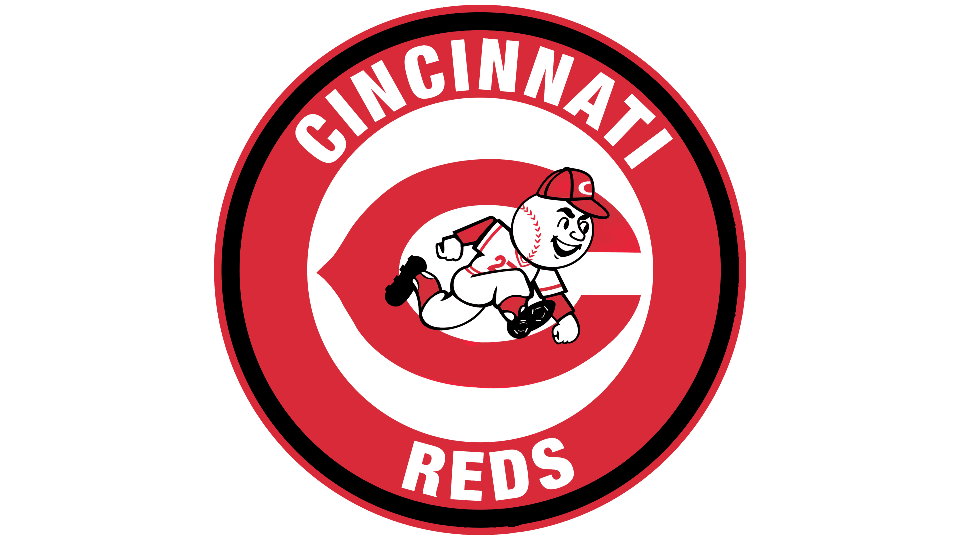
2013 – today
![]()
The current club logo is the team’s name placed inside a white letter “C,” symbolizing Cincinnati. “C” has a horizontally elongated, teardrop-shaped white form with black shadows at the bottom, making it appear voluminous. The mark serves as a border for the inscription “REDS,” located in the center (inside it). Dark shadows were added to all the word’s elements to create volume. The font is printed. The background for the letter “C” and the team’s name is red. It precisely repeats the contours of the details placed on it. The emblem is outlined with a thin red line.
Font and Colors
Throughout the Cincinnati Reds’ existence, the club has had 18 logos. They form blocks. The first part is associated with the letter “C.” In 1913, the letter first took on a horizontally elongated shape, with a fragment of the name in the middle. This is the second type of logo. The third variation is a combination of “C” and a ball. Thanks to their oval shape, they complement each other well, conveying a stylized team name.
The logo change primarily occurred for three reasons: renaming the club, improving the logo, and adapting it across various media. The most successful design is the “word in the letter” variant. Appearing at the beginning of the century before last, it is still used today. The emblem looks like the inscription “reds,” surrounded on three sides by the letter “C” on a red background.
Early versions feature two font types: smooth sans serifs and ornate serifs, reminiscent of Old English hieroglyphs. The modern emblem consists of a serif font. The letters have a light shading at the bottom, so they look voluminous.
The logo’s color palette is directly related to the franchise’s name – “Reds.” Therefore, it is natural that the list of primary colors includes red. There are also black and white. The main principles of color construction are simplicity and contrast, which effectively address classic shades.
FAQ
What does the word Reds mean in the Cincinnati Reds game?
The word “Reds” refers to the main color of baseball uniforms, first used in the 1880s. True, at that time, the club’s name sounded slightly different: Cincinnati Red Stockings. It had to be shortened as part of the rebranding, timed to coincide with the team’s entry into the National League.
When was the “Reds” logo created?
The very first “Cincinnati Reds” logo was created in the early 1880s when the team first appeared. It looked like a red letter “C” written in Old English style. The modern version of the “C” symbol appeared in 2013. The letter is now white with a black outline. It is complemented by the same white word, “REDS,” and placed in a red oval in the shape of a teardrop.
How did the “Cincinnati Reds” get their name?
Initially, the club was called “Cincinnati Red Stockings” because the media gave teams nicknames based on their uniforms’ colors. In 1890, the transition to the National League led to a change in image. Therefore, the phrase “Red Stockings” was shortened to “Reds.” In 1954, the club was renamed Redlegs, possibly because the old nickname was associated with communism. In 1961, the word “Reds” reappeared on the form.