![]() Wisconsin Timber Rattlers Logo PNG
Wisconsin Timber Rattlers Logo PNG
The Wisconsin Timber Rattlers’ logo reflects the traditions and atmosphere of minor league baseball games in the United States. It conveys nostalgia for classic baseball, maintaining the team’s bond with its fans.
Professional baseball in Appleton began in 1891 with the Appleton Papermakers in the Wisconsin State League. The club’s modern history began in 1958, when the Fox Cities Foxes became a farm team of the Washington Senators in Major League Baseball. The team moved to the Midwest League in 1962 and soon became known as the Appleton Foxes.
The Foxes frequently won Minor League Baseball championships, winning the Midwest League titles in 1964, 1966, and 1967. This was followed by successful seasons in the 1970s and 1980s, establishing the club as one of the best farm teams. In 1995, the Foxes moved to a new stadium in Grand Chute and changed their name to Wisconsin Timber Rattlers.
A new phase began in 2009 when the club joined the Milwaukee Brewers‘ system. The Timber Rattlers reclaimed the Midwest League championship in 2012 under local native Matt Erickson. In 2021, the team transitioned to High-A as part of Minor League Baseball’s restructuring.
Today, the Wisconsin Timber Rattlers continue playing as a Brewers affiliate, remaining a significant sports symbol in Wisconsin.
Meaning and History
![]()
What is Wisconsin Timber Rattlers?
A Class A baseball team competing in the Midwest League. The name references the region’s native rattlesnakes. Home games are held at Fox Cities Stadium and often feature theme nights. Fans enjoy fireworks, contests, and performances by local entertainers. Many MLB stars began their careers here, including Ryan Braun and Prince Fielder.
1995 – 2010
![]()
The first Wisconsin Timber Rattlers logo effectively conveyed the team’s character through its typography and color. Its structure combined decorative and simple typefaces, emphasizing the sports theme and the symbolism of the team’s name.
The main element, the word “Rattlers,” was set in a decorative black italic font with a red outline. The tail of the letter “S” curved and resembled a snake, referring to the rattlesnakes after which the team was named. Inside the tail was a baseball, linking the image to the sport.
Above the word “Rattlers” was the word “Timber.” It was rendered in a simple, strict sans-serif font.
The logo’s color scheme combined black and dark red. These colors were associated with Wisconsin’s natural landscape and emphasized the team’s aggressive, competitive spirit. The design combined a sports theme with a snake image and the region’s natural symbolism.
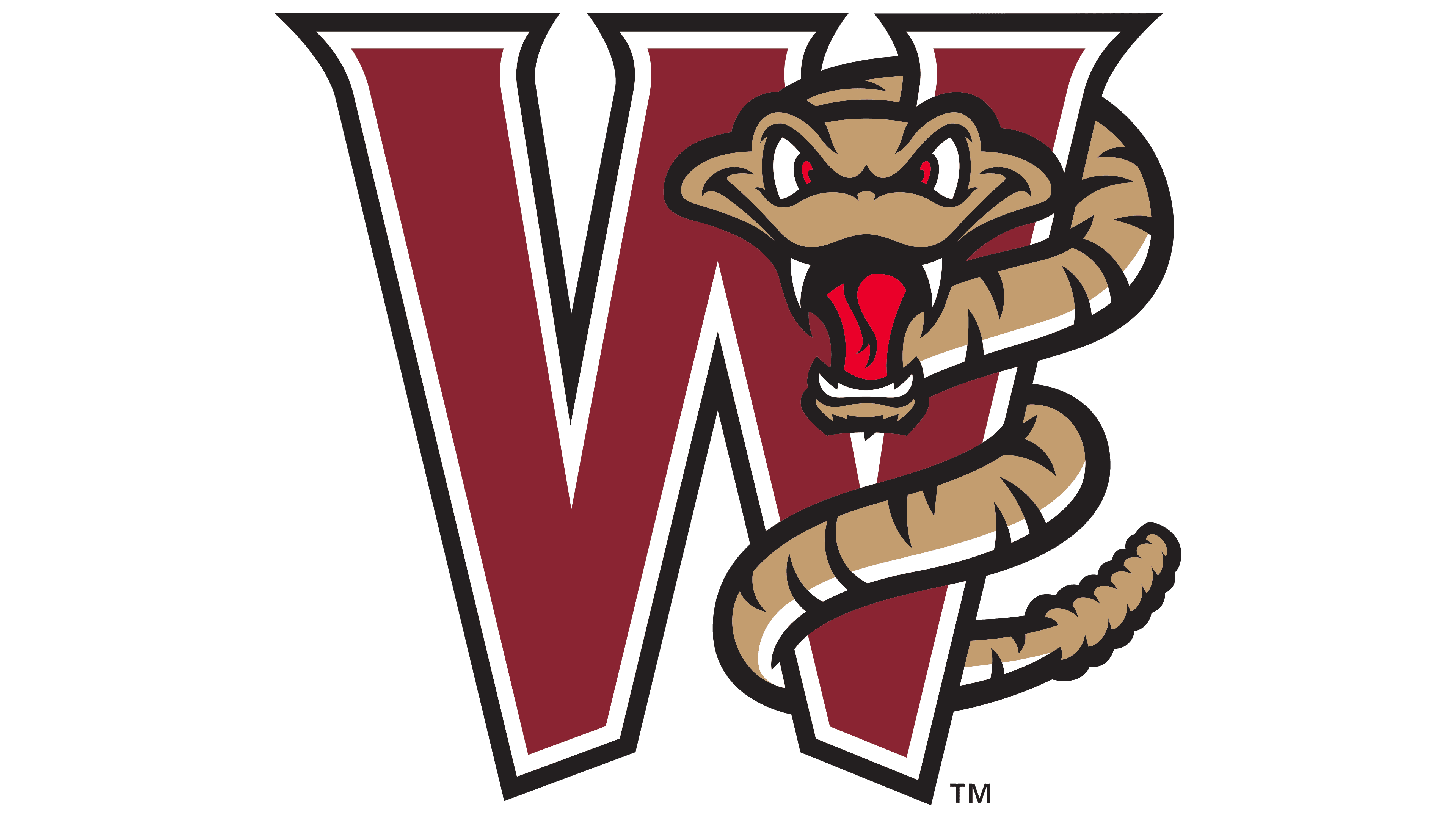
2011 – today
![]()
The sports design studio Studio Simon carried out the redesign of the Wisconsin Timber Rattlers. The design team created an updated visual style that emphasizes the club’s character and energy.
The main symbol was a rattlesnake depicted in the center. Its pose conveyed readiness to strike and emphasized the team’s fighting spirit. Red eyes and a forked tongue reinforced the sense of threat. Studio Simon used the snake as a symbol of speed, strength, and risk, qualities inherent to Wisconsin baseball players.
The word “Rattlers” was designed in a sharp white font whose shape echoed a snake’s movement and flexibility. The words “Timber” and “Wisconsin” were placed above on a maroon banner and rendered in gray and white. The entire structure formed a compositional hierarchy, with the team’s name dominating.