


![]() Milwaukee Brewers Logo PNG
Milwaukee Brewers Logo PNG
The Milwaukee Brewers logo conveys the determined nature of the baseball players, which is why the designers combined a glove with the team’s initials. The block’s glyphs combine into a powerful monogram that conveys the spirit of athletes and their focus on victory.
The Milwaukee Brewers are a professional baseball club that has played in the MLB since 2000. Previously, they were part of the AL (until 1997) and the NL (until 1999). Their location is Milwaukee, Wisconsin. The team was founded in 1969.
The franchise’s history began with the Seattle Pilots team. After one year of operation, it was declared insolvent. This event occurred six days before the start of the next season, forcing the club to relocate to Milwaukee on short notice. There was no time left to order new uniforms, so they had to replace the insignia on the existing ones.
The original franchise, the Seattle Pilots, was owned by William Daley and was losing money. After bankruptcy, it was transferred to the then-league commissioner Bud Selig, who managed it until 2005. He initiated the relocation. Later, he moved the team to the NL Central Division, with the Milwaukee Brewers joining it on November 6, 1997.
Selig independently managed the franchise from 1970 to 1992, then handed control to his daughter, Wendy Selig-Prieb. Eventually, she became the club’s acting head and held that role until 2005. But before that, on January 16, 2004, Selig announced that the team was up for sale.
In September of the same year, the Brewers announced a verbal agreement with Los Angeles banker Mark Attanasio. The official deal took place on January 13, 2005, and cost $223 million. In addition to Attanasio, the ownership group today includes Harris Turer, John Canning Jr., David Uihlein, and Steven Marcus.
The club received its second name in honor of Milwaukee’s brewing traditions, which have been famous since the 19th century.
Throughout its 45-year history, the Milwaukee Brewers baseball team has undergone several logo changes. The most famous version dates back to 1978. It was chosen as a result of a contest in which Tom Mindl, a graphic design student at the University of Wisconsin-Eau Claire, won. His logo had a twist, with the original letters “m” and “b”. As the 25th anniversary approached, the club decided to change its symbol, but the change did not please fans. The brand name was changed again.
Meaning and History
![]()
After relocating and changing its name, the team naturally embarked on a redesign. Before that, it had one emblem; afterward, seven. In total, the franchise has eight essentially different personal identification marks. The most successful version was the 1978 edition, which lasted fifteen years. In 2020, the team returned to this version.
Behind the team’s friendly image, the Milwaukee Brewers logo conceals their more important qualities: cunning, endurance, agility, foresight, and high reaction speed. This and more is reflected in the simple badge, based on the image of the baseball players’ talisman, designed to withstand attacks from opponents and unpredictable field conditions.
What is Milwaukee Brewers?
The team plays in the National League Central Division of Major League Baseball. The team’s first home was Sicks Stadium in Seattle. It then moved to Milwaukee, playing at Milwaukee County Stadium before settling at American Family Field. Since its founding in 1969, the club has been known as the Seattle Pilots but changed its name a year later.
1969
![]()
In the first year, the club was in Seattle and called the “Seattle Pilots.” The emblem features a red ship’s wheel, with a classic white baseball inside and the inscription “Pilots.” The wheel is adorned with two yellow wings on the left and right sides.
1970 – 1977
![]()
A year later, the team moved to Milwaukee and renamed the club the Milwaukee Brewers. Inside a yellow ring, the Beer Barrel Man player is depicted wearing a yellow cap representing a beer barrel and swinging a bat. Above the drawing is the inscription “Milwaukee,” and below it is the word “Brewers.” The team name is in dark blue.
1978 – 1993
![]()
The 1978 emblem was selected from more than 2,000 applications submitted by professional designers and amateurs in a contest held in November 1977. Tom Mindl, a student of the art history department at the University of Wisconsin-Eau Claire, designed the emblem and received the first prize of $2,000. The logo features blue letters “B” and “M”, the club’s initials, forming a baseball glove with a white baseball at its center.
1994 – 1997
![]()
On January 15, 1998, the Brewers unveiled their first new logo, featuring entirely new team colors. The design process began in 1992, when the Milwaukee Brewers approached the Major League Baseball design service to create a “new look” for the 21st century. The final material first appeared at the opening in 1994. Inside a black diamond with a brown-white outline are crossed letters “M” and “B.” Below them are two green crossed baseball bats.
1998 – 1999
![]()
The 1998 logo was not much different from the previous one. The initials “M” and “B” still represent the team’s full name. The main colors remain brown, black, green, and ever-present white, with the outline in white.
2000 – 2017
![]()
In 2000, the Brewers completely revamped the logo’s concept. The background became a black ring with a golden inscription, “Milwaukee,” inside which is a classic white baseball. The small barley branches on the ring are not depicted by chance, as they symbolize the team’s roots and the traditions of the Milwaukee brewing factory. The inscription “Brewers” is located at the top of the drawing.
2018 – 2019
![]()
The current version is completely different from the previous four. It features a stylized “M,” which, according to the developers, embodies both tradition and modernity. It denotes the team’s name and underscores the brewing industry’s importance in its support. To that end, a graphic sign depicting the Milwaukee Brewers’ base is mounted on the spike.
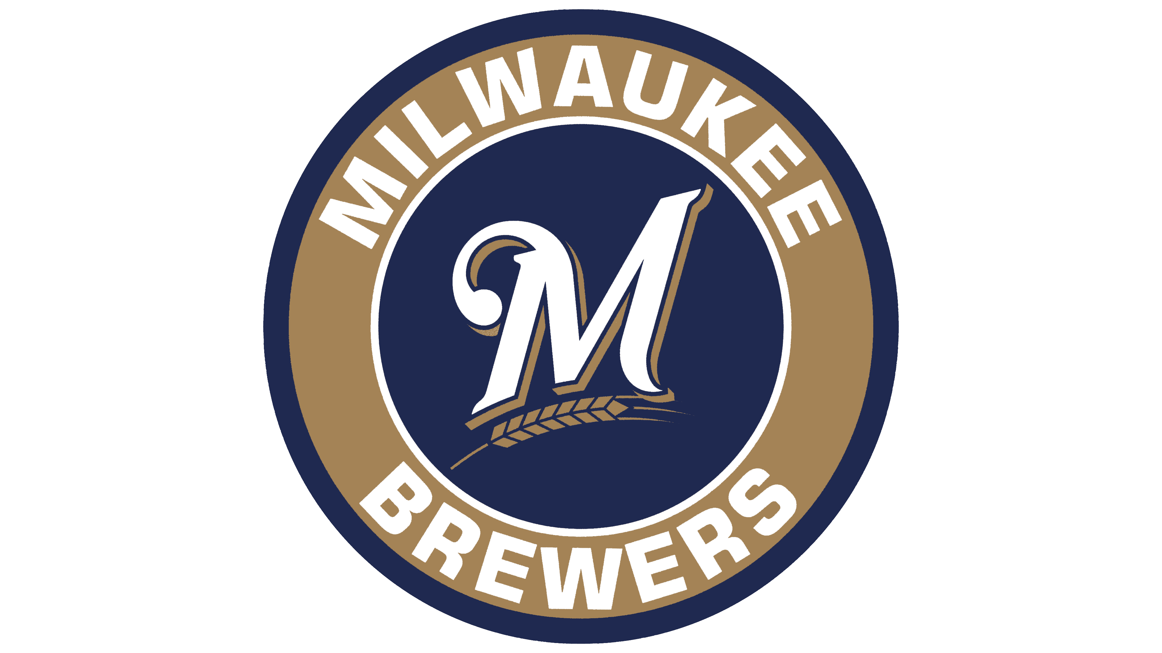
The team emblem features a large dark blue letter on a light background. Graphically, it’s presented as if handwritten. It has a triple border in white, muted gold, and blue. The font is simple, sans-serif. The elongated gold-blue barley ear occupies the entire space beneath the letter.
2020 – today
![]()
The club’s management considered creating a new team logo as early as 2015, but it was not until 2020 that the new logo could be implemented. In 2020, the team introduced a new official logo. The developers based it on the most interesting logo created in 1978. Its twist is the two stylized letters. They fit so well into the baseball context that they were loved by fans and made the emblem widely recognizable.
It features an unusual glove on which the “m” and “b” are harmoniously depicted. The index, middle, and ring fingers form the first letter of the club’s name, “Milwaukee.” The thumb, together with part of the clenched palm, conveys the initial symbol of the second word, “Brewers.” And the baseball serves as a space between the letters.
Font and Colors
Of the 2,000 options submitted during the contest, one logo was selected as the winner. Its author is Tom Mindl, a club fan and a student at the University of Wisconsin-Eau Claire. He drew it out of boredom during a psychology class. Initially, the sketch was rough, but Tom refined it to the required level.
In addition to the stylized glove with a ball and two letters, the modern emblem features a dark blue circular background with a triple border. The parts above and below the team’s name are part of the team’s name. Other variants contain crossed bats, diamonds, the capital letter “M,” ears, and a rondel with a horizontal inscription.
For the 25th anniversary, the management decided to present a “serious” logo, entrusting its development to specialists. As a result, in 1994, a version with crossed baseball bats and two key symbols, “M” and “B,” appeared. Designers also changed the palette, which became slightly darker. This version was often criticized as unsuccessful and uninspiring.

The logo features a classic serif font in a print style. The letters are spaced far apart, making them easy to perceive. The color palette consists of gold and two shades of blue (royal and dark).