


Peacock carried out a May logo update while carefully preserving its image. The name stayed the same, the connection with NBCUniversal remained, and the colored dots still recall the NBC peacock. The main adjustment concerns the form. The mark became more compact and better suited for screens, apps, the website, promotion, and sports broadcasts.
Peacock operates as NBCUniversal’s streaming service within Comcast. The platform launched in 2020 and, in its early years, relied on NBC’s television heritage. The name is connected with the NBC peacock, while the six colored dots beside the wordmark referred to the classic network mark.
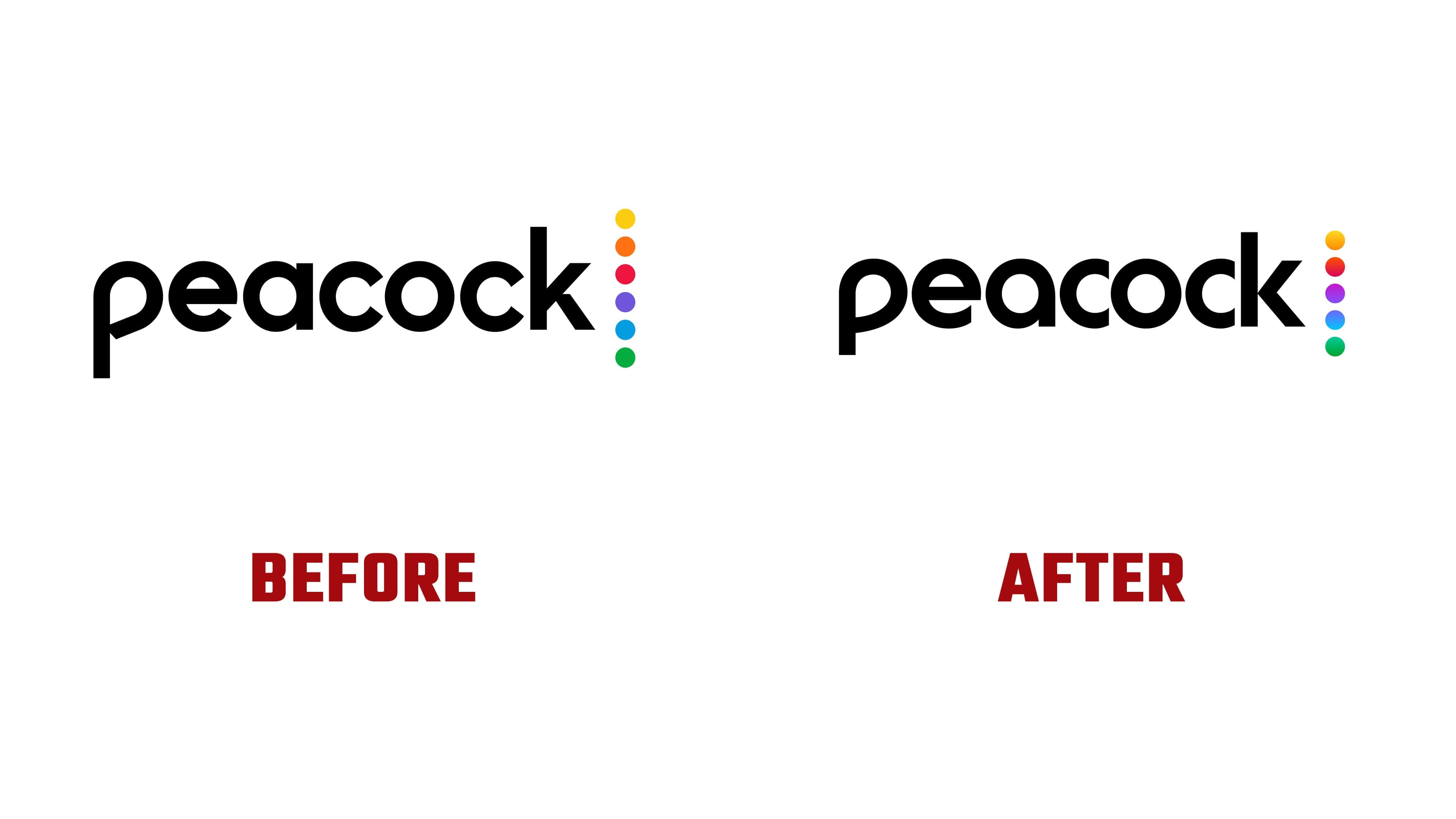
In May 2026, the company carried out a refresh rather than a full rebrand. The new logo appeared on peacocktv.com and in the iOS App Store on May 12. External catalogs noted the replacement on May 13. The updated mark was used during MLB Sunday Leadoff. The name, positioning, and brand platform remained the same. The adjustment focused on usability in digital environments.
The main change affected the wordmark. The letters became tighter and softer. The sharp cuts in the “p” and “k” were replaced with smoother forms for small sizes. The counter inside the “p” is now closer to the shape of a feather and slightly recalls a message bubble. Through this shape, the name looks friendlier and holds up better in compact formats.
The colored dots kept their role as the main accent. In the new version, there are five of them. The connection to NBC remains readable through transitions of yellow, orange, red, purple, blue, and green. The shorter row reduced visual fragmentation and helped the mark work inside the app icon, where space is limited.
The position of the dots was rebuilt. The top dot rises to the height of the letter “k,” while the lower one drops below the “p.” The colored block is tied more closely to the name and reads as part of the wordmark.
The app icon was brought into the same logic. The old dimensional effect gave way to a flat form, the letter “p” became larger, and the five dots fit more easily into the square. On a mobile screen, the mark looks calmer, holds together better, and maintains its connection to the main logo.
Peacock preserves its identity while carefully updating it. The brand remains within the NBC world while moving away from old television dimensionality. The flat form, compact name, and shortened color block suit a streaming platform where the mark works in the app, on the website, and in broadcasts.