“Pumpkin” updated its identity with “Kuba&Friends” and moved closer to the everyday experience of dog and cat owners. The American company works in pet insurance and wellness. It offers accident and illness insurance, as well as pet care plans. The brand was created in partnership with “Zoetis,” a major animal health company, and helps families pay for veterinary diagnostics, treatment, and emergency care.
The rebrand is tied to a market where pet insurance is still underdeveloped in the United States. According to “Transform,” in 2024, fewer than 2% of pets nationwide had a policy. “BP&O” cites a different figure, 4% of pet owners. For “Pumpkin,” the new look became a way to speak to pet parents in a warmer, less dry tone than an insurance company’s, while still feeling like a normal service.
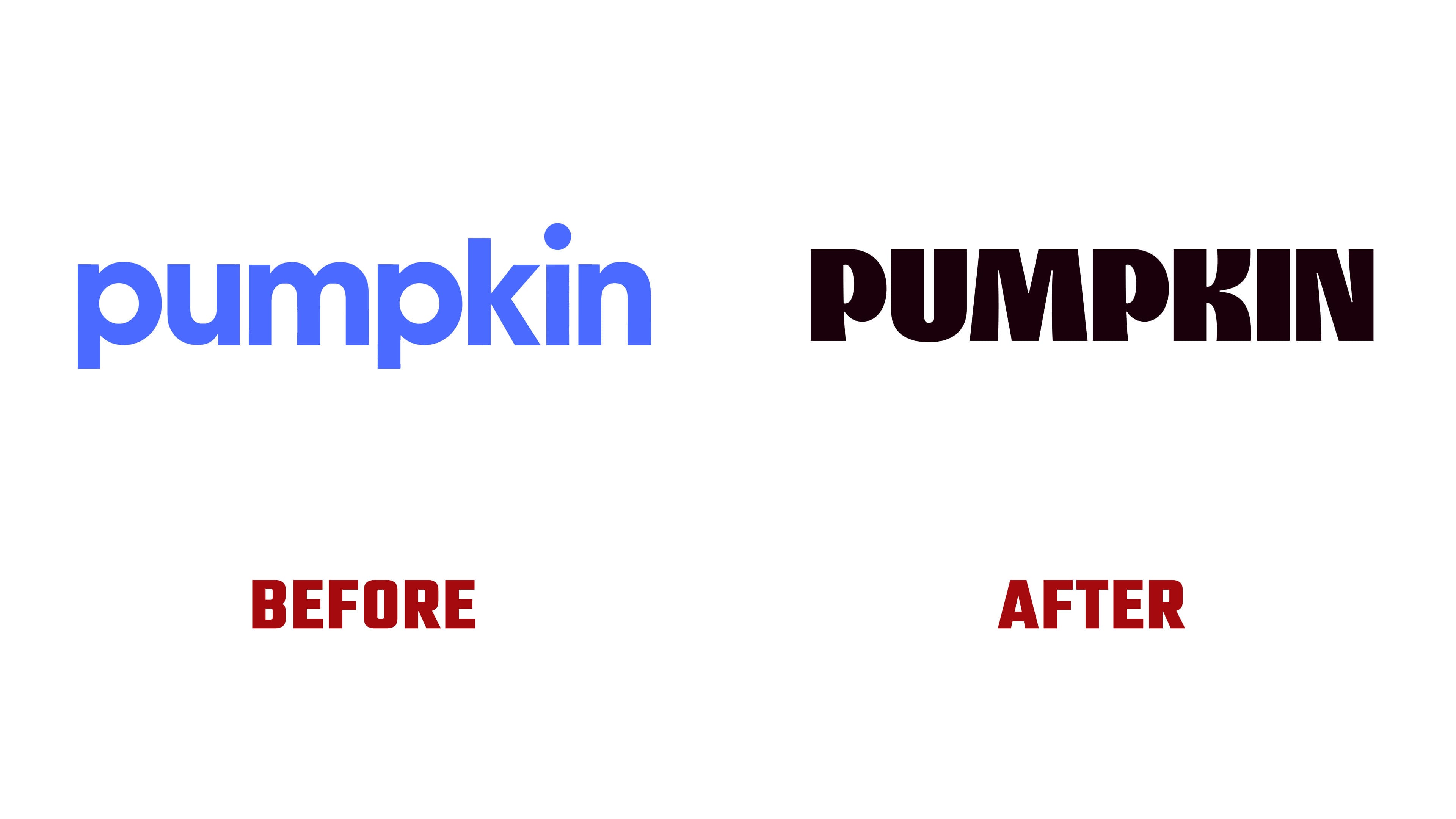
The old logo looked neutral. A geometric sans serif with little individuality could have suited a service in another category, from software to food. The new wordmark feels softer and more compact. The letters became rounded, plump, and slightly irregular. The name feels warmer, without moving into a lightweight children’s style.
The logo keeps a balance between insurance and the emotion tied to pets. “Pumpkin” does not look like a rigid financial company, nor does it turn into a toy or pet food brand. The large letterforms convey care, closeness, and friendliness, while the overall look maintains a business tone. The brand explores insurance through the bond between a person and their pet.
“Kuba&Friends” developed the strategy, tone of voice, identity, copywriting, custom typeface, illustrations, and social content for “Pumpkin.” The typography uses “Pumpkin Serif,” based on “Nib” by “Font Club Belgica,” and on the website, it is paired with “Rethink Sans.” The colors were named after the world of pets and care, including “Tennis Ball,” “Scrubs,” “Snout,” and “Claws.” The visual base consists of yellow-green, cream, blue, purple, and black tones.
The new “Pumpkin” mark aligns better with the topic of pet insurance. The logo shifts the focus from the policy as a document to pet care as part of family life. The brand’s communication became softer, without drifting into excessive cuteness, and keeps a reference to medicine and insurance.