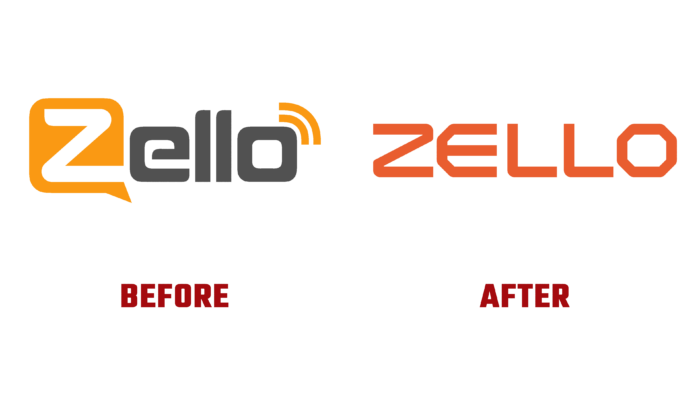
In 2011, Russian programmer Alexey Gavrilov (CTO) developed a unique program called Loudtalks, whose task was to provide mobile and conference communications. Its subsequent development led to the formation of a product called Zello – a program that is an Internet walkie-talkie. This is a personal free mobile radio. It belongs to the category of PTT-type network applications. The American Bill Moore (CEO) was involved in its development and promotion. The brand registration was carried out in Austin and NY, the US, as a direct messaging service that opens up opportunities for users to communicate through open channels using cell phones and computers; the application has gained immense popularity due to its security and simplicity of use. The platform has reflected the opportunities and perspectives in its new identity, created recently, taking into account the current changes taking place around the world.
The new visualization demonstrates an important feature of Zello – helping groups of people to be able to function at a time when all other types of communication do not work. All changes were built according to the developed strategy, taking into account the need for users, when they move quickly, to be able to interact remotely and to maintain high-quality communication with each other.
Branding allowed to focus on the main three attributes – simplicity, usefulness, and accessibility, which Zello provides verbally and visually. The dynamic interpretation of the capabilities and benefits of the application through various people-centric tools has become an innovation in this area. Original human-oriented illustrations and photographs were used, telling about the power of the human voice, ensuring the unity of all system elements. A verbal character was created that enhances all qualities – reliability, simplicity, durability, strength, and lightness. The verbal identity was based on the history of the brand and the desire to hone in on core messages. Combining the commonly seen chat symbol with the letter “Z” and building a text module using the Inter font of a single height, a modern, bold, strong, and understandable text logo was obtained. It is characterized by a complete personality, perceived as technical but trustworthy, in which softened angles are applied, making the brand visually accessible.
The treatment of textured icons helped communicate to users that the brand has a real existence in real current conditions. The rich color scheme reflects the concept of courage in motion, harnessing the full potential of today’s digital experience. Thus, the logo acquires versatility in the possibility of its visual display.


