


Ideogram changed its image with How&How after the release of model 4.0. The update is tied to a question often debated in generative AI. Where is the line between the algorithm’s work and the author’s contribution?
The company was founded in 2022 by Mohammad Norouzi, William Chan, Chitwan Saharia, and Jonathan Ho. Ideogram develops a visual intelligence model for products, AI agents, and creative teams.
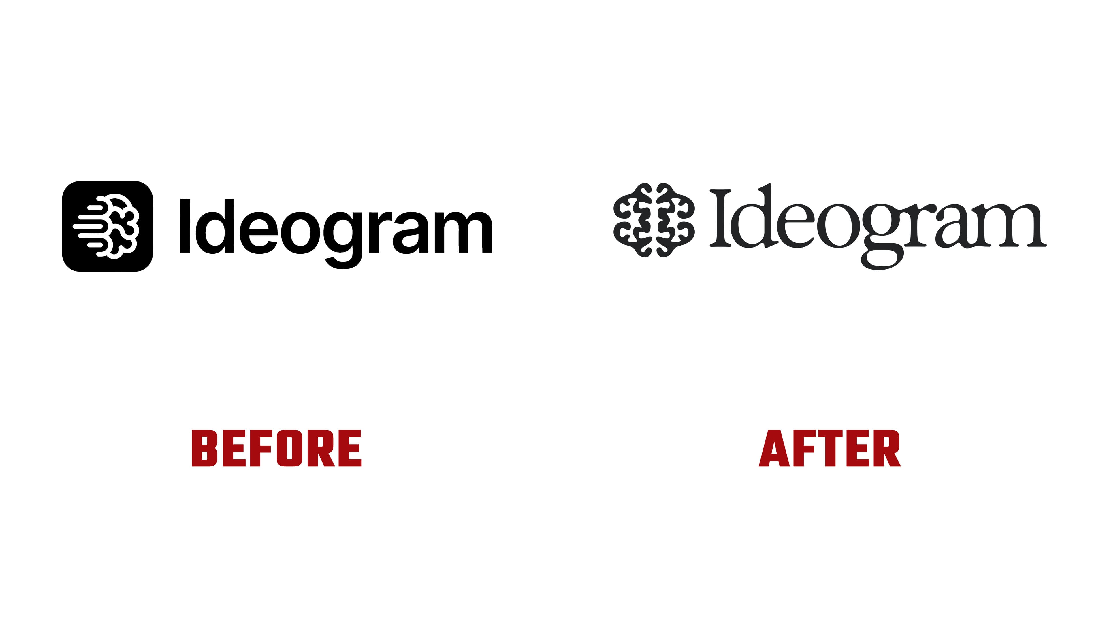
The previous mark matched the look of early AI startups. A brain inside a rounded square, speed lines, and neutral typography presented the service as a technical tool. The new logo keeps the brain and turns it into an emblem with a handmade shape and ornamental treatment.
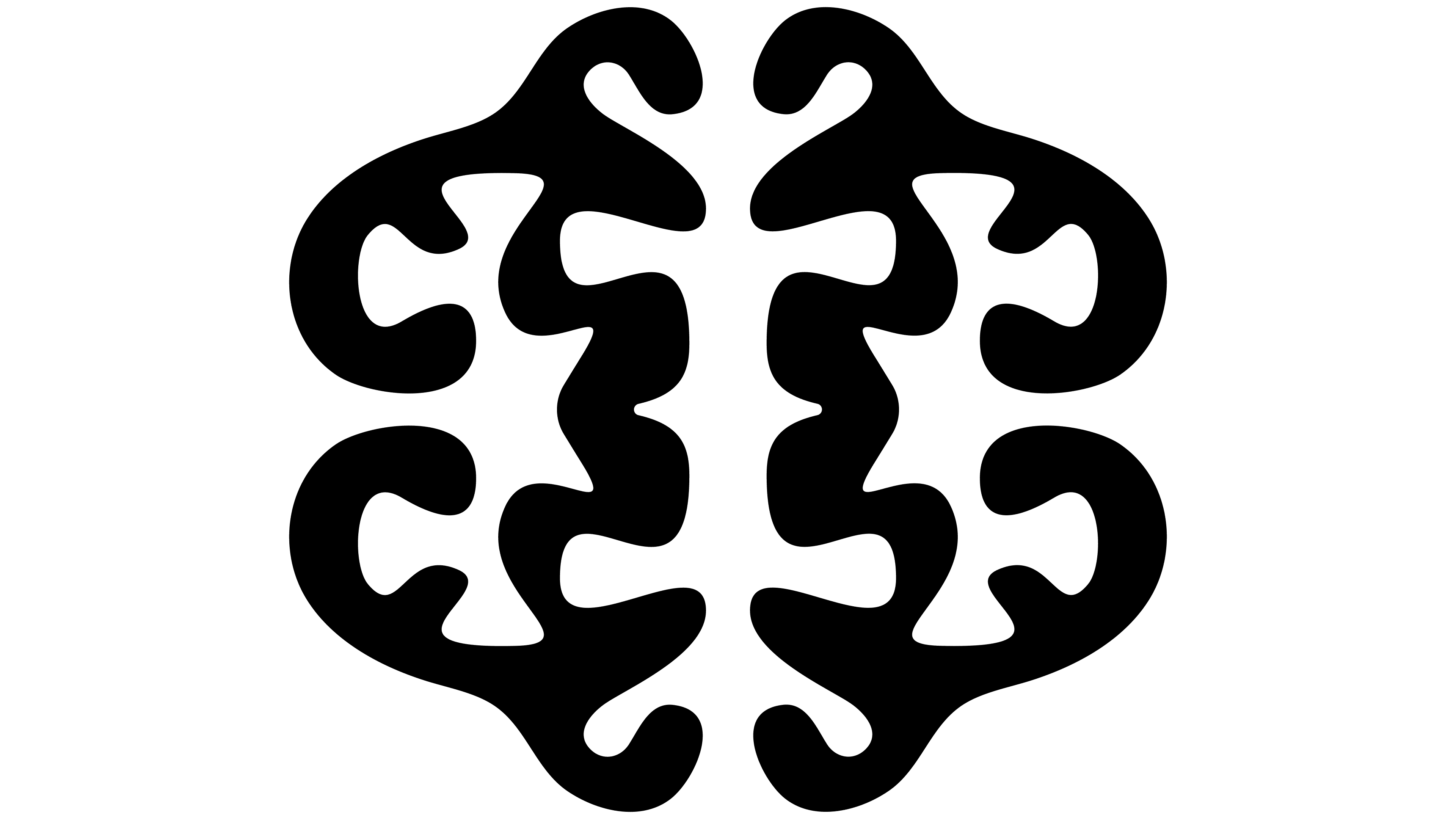
Inside the mark, the letter “I” appears. It is formed by the space at the center of the brain and connects the company with the idea of human thinking. The brand presents the machine alongside the person. Idea, taste, control, and technology work within one system.
The wordmark is set in Exposure. Serifs, soft transitions, and ligatures separate the brand from the standard look of AI services. A connection to publishing culture, design, text, and authorship has replaced the cold tech-oriented presentation. The light mark on a black background lends the product a mature feel for people who care about image quality.
How&How worked with a topic that sparks debate across the industry. The studio wrote openly about the internal discussion around the project. From the team’s perspective, AI strengthens craft, intuition, taste, and work with the brief. Ideogram’s turn to a branding studio became part of the idea. Even a generative platform needs a human perspective on identity.
After the update, the brand feels closer to creative teams. It has moved away from the image of a utilitarian service for quick images. The brain remains the primary symbol and is now associated with thinking, authorship, and control over outcomes.