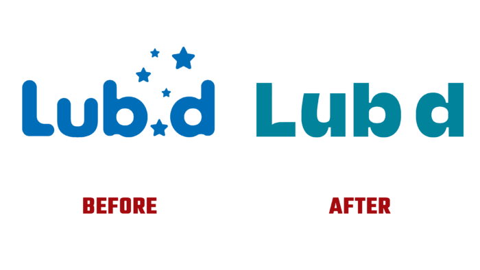
Lub d is a chain of affordable hostels located in Southeast Asia. The company was established in 2008 to create affordable hotel services that combine the conditions of a hostel with the distinct offers and quality of services of premium hotels. The peculiarities of the geographical location determined the choice of such a name. In Thai, làp dee means “good sleep.” Hostels are located in Bangkok Siam, Phuket Patong, Koh Samui, Philippines Makati, and Cambodia Siem Reap, where there are beautiful free beaches lost in the most exotic corners, local incendiary parties, and restaurants with a special assortment and unique cuisine. There are also the usual common dining rooms, areas for games, laundries, and even quarks for guests. This is reflected in the new brand identity created by Sydney of DesignStudio.
The new visual image of the brand revealed to everyone what distinguishes the company’s offerings from similar ones. At the same time, Lub d always knows how to captivate people, even taking them out of their lazy and sleepy comfort zone if necessary. Customers’ desire to spice up their journey was heard and acted upon with a playful and somewhat provocative strategy developed called Go Brave. This slogan created a brand that encourages every traveler to experience everything new that the company has to offer, create unforgettable experiences, and fill their stories with fascinating stories.
The visualization was based on bright and colorful, typical for this region. A well-thought-out identification system simplifies the selection process favoring the most daring proposals that leave the strongest impressions. An important unifying element for the entire identity is the Pad Type font, which successfully expresses the characteristic regional design features, using a set of characters to form a whimsical and playful language of visual identity. The newly created voice is brought to life by alternating three types of font weights throughout the brand – soft, medium, and very sharp. The latter option includes some features of local writing. To enhance the playfulness, illustrations by Steve Gavan are used with their mixture of surrealism and funny, humorous execution. All this ensures the formation of a unique identity with a pronounced individuality.


