Since 1991, the Miami Marlins baseball club, whose logo reflects the region’s popularity, has been the foundation of the International League of the 1950s. The color palette symbolizes Florida’s cultural diversity, while the graphics honor the region’s sports history, paying tribute to the Cuban “Sugar Kings.”
Miami Marlins: Brand overview
| Founded: | 1993 |
| Founder: | Bruce Sherman |
| Headquarters: | Miami, Florida, U.S/ |
| Website: | mlb.com |
The Miami Marlins are a professional baseball club from the USA that has been competing in MLB since 2000. They are part of the National League’s East division and are based in Miami, Florida, established in 1993.
Though the team’s founding is considered to be in 1993, it appeared earlier, in 1991. In 1993, it first appeared in the National League, marking the official documentation of its emergence in the baseball arena. The team’s founder is Wayne Huizenga, CEO of Blockbuster Entertainment Corporation. He acquired the club as an expansion franchise for 95 million dollars.
In 1998, the entrepreneur sold the team to John W. Henry, who controlled it until 2002 inclusive. Then, the “Miami Marlins” became the property of Jeffrey Loria. A few years later (in 2018), he concluded a deal to transfer the franchise to a group of individuals – Bruce Sherman, Michael Jordan, and Derek Jeter. They remain their owners to this day.
The name Marlins appeared with the club immediately. It’s an old name from the Major League. It’s a historical reference to the 1950s International League baseball and is associated with the popular fish. Even after the team’s rebranding, it remained unchanged even after Wayne Huizenga intended to use a different style and color – pink flamingo at the beginning of its career. The Major League insisted on the marlin image, suggesting a proprietary color palette.
Meaning and History
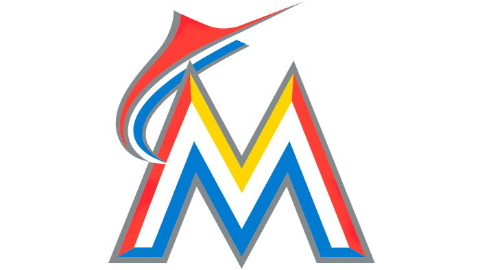
No matter how many times the logo was revised, the colors and main elements always remained unchanged, revolving around the silver shade of the ocean dweller. At the end of 2011, a large letter “M” appeared in the graphic symbolism, and the black details disappeared. In the 2012-2016 versions, the word “MIAMI” was already present, executed in dark letters of the same size, without serifs.
The Miami Marlins team is relatively young, as it emerged in 1993. According to Marlins representatives, they chose these colors for the logo because they symbolize Florida’s cultural diversity. The same style of drawing and font was previously encountered in Latin American culture and minor league teams in the 1950s. The executive director of the team, Jeter, also participated in the development of the logo. “We tried to capture the diversity of the Miami region,” he said in an interview. “We listened to our fans, and it took a lot of time to create the perfect multicultural logo.”
What is Miami Marlins?
It’s a professional baseball team competing in Major League Baseball. It’s part of the National League and competes in the Eastern Division. The club was founded in 1993. Its home stadium is LoanDepot Park. The franchise is notable as one of the two MLB representatives that have never won a divisional champion title. However, it was the first to win the World Series as a wild card.
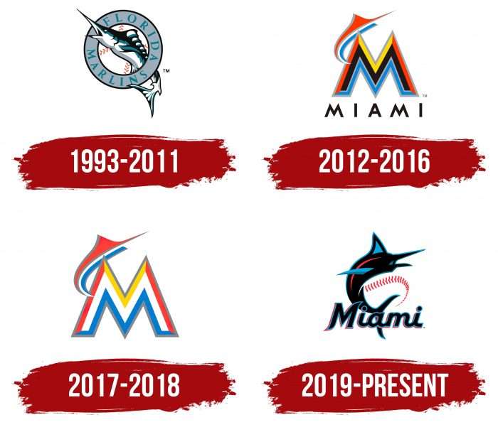
1993 – 2011
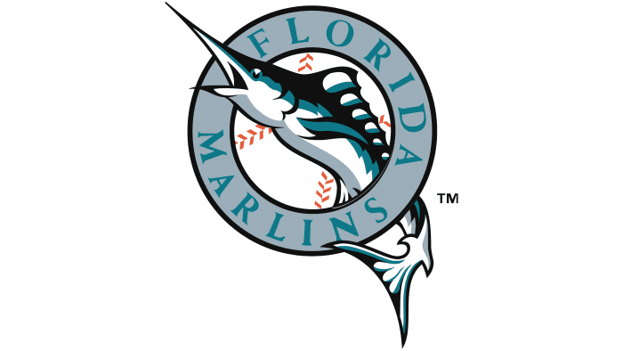
Until 2011, the team was called the “Florida Marlins.” Their first logo consisted of a mackerel swimming through a silver circle with the inscription “Florida Marlins.” In the background, you can see a classic white baseball. The logo presentation took place in July 1991.
2012 – 2016
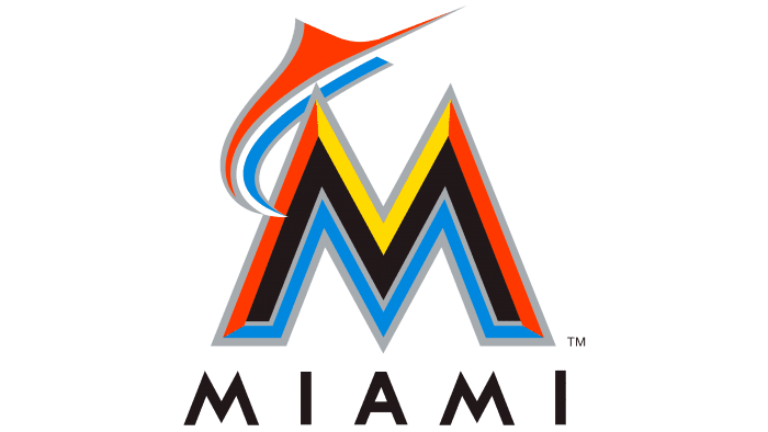
The team’s new name – “Miami Marlins.” This version of the logo was introduced in November 2011 and mainly consisted of a stylized printed letter “M.” As mentioned earlier, four colors were immediately used for the letter: orange, yellow, black, and blue. Also, the shape of a blue-orange fish “jumps out” from the letter “M.” Under the letter “M” is the word “Miami,” written in classic black print letters.
2017 – 2018
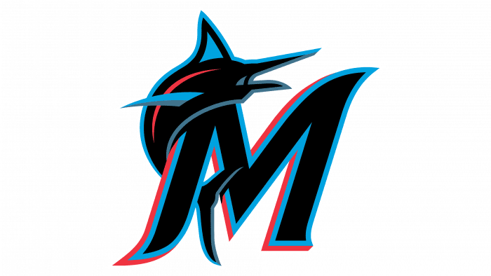
The third logo underwent only minor changes. The colors became brighter, and the black color was removed. Also, the word “Marlins” was completely removed from the logo.
2019 – today
What emblem is on the caps of the Miami Marlins?
The emblem on the Miami Marlins caps was updated in 2021. It now reflects the history of baseball and pays tribute to the Cuban “Sugar Kings,” who became the world champions among juniors in 1959. The patch features a white sugar bag with a red crown, the name, and the blue letters “MM.” The cap design matches the new uniform of the team: it will be used for the next three seasons.
According to Jeffrey Loria, the former owner of the franchise, the current logo reflects Miami’s primary palette – the colors of sunset and the ocean. These are orange, turquoise-blue, yellow, red, and black, like the dark southern nights. However, the choice was made in their favor because of the diversity of national cultures that filled Florida in the 90s. They also influenced the typography, which has something in common with Latin American traditions.
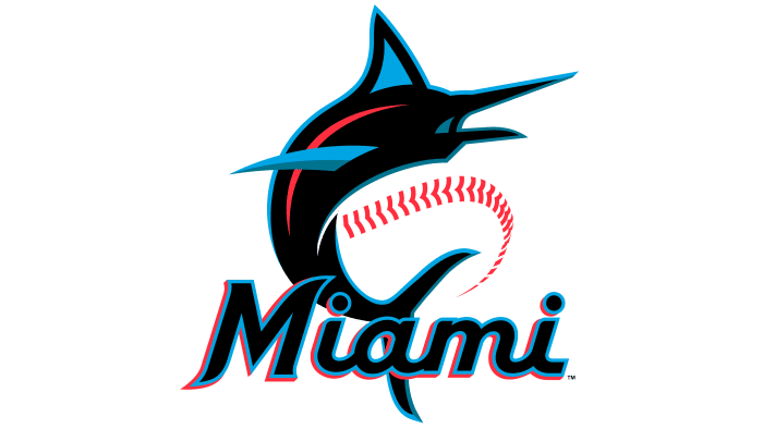
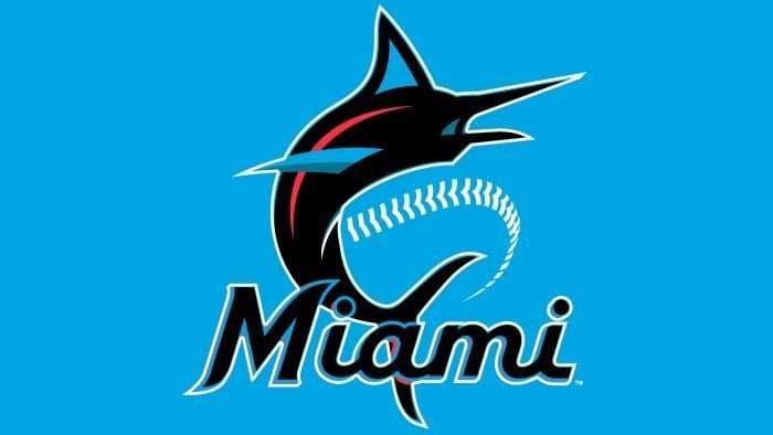
When changing the logo, CEO Jeter, who participated in its creation, noted that they wanted to convey the energy and diversity of Miami. We listened to the opinions of fans, revised color accents, and much more. As a result, on a white baseball, above the inscription MIAMI, a large marlin is drawn in a high jump; a red line resembles the path made by the majestic rare fish.
One fin is completely blue with a silver shimmer, the other – blue with a wide black border. The marlin’s body is dark, with a red glow in the form of a short stripe. The sharp nose, fin, and tail are outlined in blue. The inscription indicating the team’s name is made in black with a double line on the outer edge: one blue, the other red, like the reflection of the rays of the rising sun.
Miami Marlins: Interesting Facts
The Miami Marlins, first known as the Florida Marlins in 1993 and later renamed in 2012, are a young baseball team with a couple of big wins and a close tie to Miami.
- World Series Wins: They won the World Series twice, in 1997 and 2003, as a wild card team. They were the first MLB team to win this way.
- Name and Home Change: In 2012, they changed from the Florida Marlins to the Miami Marlins, and they moved to their new stadium, Marlins Park.
- Marlins Park: This modern stadium opened in 2012. It has a roof that can open and close because of Miami’s weather and used to have a bright sculpture that moved when they hit a home run.
- No-Hitters: Marlins pitchers have thrown six no-hitters, with the first one in 1996 by Al Leiter.
- Big Changes After Wins: After winning the World Series, the team often traded away many players to save money. This led to rebuilding and finding new, young players.
- Jose Fernandez: A very talented pitcher, Jose Fernandez won the Rookie of the Year in 2013. Sadly, he died in a boating accident in 2016.
- Bright Look: In 2012, along with their name change and new stadium, they also updated their logo and uniforms to brighter colors that match Miami’s style.
- Derek Jeter’s Leadership: Derek Jeter, famous for playing with the New York Yankees, bought the Marlins in 2017 and remained involved until 2022.
- Smart Moves: The Marlins use smart strategies to build their team, such as looking for new players in Latin America and using data to make decisions.
- Helping the Community: The Marlins do a lot for people in South Florida, such as providing educational programs, health care, and baseball lessons to children.
Even though they haven’t been around as long as other teams, the Marlins have made a big impact with their victories, how they find and train players, and their connection to Miami.
Font and Colors
Why do the “Marlins” have a crown logo?
The crown on the Miami Marlins team logo appeared recently – in 2021. It’s linked to the history of baseball. It’s a tribute to the Cuban “Sugar Kings,” who previously played in the minor leagues and facilitated the entry of Latin American baseball players into major tournaments. The design of the crown combines with the classic design of the Marlins logo, connecting the past with the future.
When did the “Florida Marlins” change their logo?
“Florida Marlins” changed its logo when it got a new name – “Miami Marlins.” The renaming occurred in 2012. Along with the rebranding, a serious redesign of the logo was required, which happened simultaneously. As a result, the identity featured a large letter “M” in a double format with a color gradient and a contour of a fish from the marlin family.
Miami Marlins team logos reflect the Atlantic expanses and depths. They convey the ocean’s proximity and the type of sports activity: they feature a marlin, a basketball, and the franchise’s name. From the very beginning, all elements are equal. The team has had four logos featuring the fast-moving fish.
A member of the ray-finned family has a long dorsal fin, a pear-shaped head, and a powerful elongated body. This “superfish” is formidable, strong, and swift, capable of reaching speeds up to 110 kilometers per hour. The marlin seems to jump out of the water against the backdrop of a baseball, which is guessed in the formed contour. Below, at the tail level, is the club’s italicized name.
When the franchise was called Florida Marlins, the logo used a classic font with serifs at the end of the letters. Then came the chopped grotesque – strict, smooth, without serifs. The modern version features a handwritten font with a slight tilt to the right – semi-connected, with streamlined symbols and smooth transitions.
The team’s leadership pays great attention to colors, so they precisely worked out the shades of the Miami coast’s sunset. The color palette includes Midnight Black, Miami Blue, Caliente Red, and Slate Gray on a white background. They harmoniously combine in the reflections of the letters and the dark body of the powerful marlin. Moreover, every one of these colors is present in the image of the fish.
Miami Marlins color codes
| Black | Hex color: | #000000 |
|---|---|---|
| RGB: | 0 0 0 | |
| CMYK: | 0 0 0 100 | |
| Pantone: | PMS Process Black |
| Red-Orange | Hex color: | #ff6600 |
|---|---|---|
| RGB: | 242 103 34 | |
| CMYK: | 0 75 90 0 | |
| Pantone: | PMS Warm Red C |
| Blue | Hex color: | #0077c8 |
|---|---|---|
| RGB: | 30 118 189 | |
| CMYK: | 100 34 0 2 | |
| Pantone: | PMS 3005 C |
| Yellow | Hex color: | #ffd100 |
|---|---|---|
| RGB: | 254 209 7 | |
| CMYK: | 0 10 100 0 | |
| Pantone: | PMS 109 C |
