


![]() Kolkata Knight Riders Logo PNG
Kolkata Knight Riders Logo PNG
The Kolkata Knight Riders logo reflects the cricket team’s athletic ambition and energy. Its design emphasizes the club’s pursuit of leadership, showcasing determination, strength, and a professional approach to the game.
Kolkata Knight Riders (KKR) was established in 2007, coinciding with the creation of the Indian Premier League (IPL) by the Board of Control for Cricket in India. Bollywood star Shah Rukh Khan, actress Juhi Chawla, and her husband Jay Mehta became team owners. Named after the 1980s show “Knight Rider,” the team chose gold and purple as colors. Regional star Sourav Ganguly became its first marquee player.
Despite a notable 2008 debut and a legendary match against the Royal Challengers Bangalore, the team’s early seasons were disappointing. Gautam Gambhir’s captaincy changed KKR’s fortunes, leading the team to two IPL championships (2012, 2014) and was marked by standout performances and strong leadership.
After Gambhir, the captains included Dinesh Karthik, Eoin Morgan, and Shreyas Iyer. Under Iyer, KKR won their third IPL title in 2024, matching the league’s record for fewest season losses. The team currently plays at Eden Gardens in Kolkata, drawing large crowds.
Meaning and History
![]()
What is Kolkata Knight Riders?
It is a famous cricket team competing in a popular Indian league, owned by a renowned actor. The club has won the league championship twice and is known for aggressive batting and skilled spin bowlers. The team also participates in international tournaments.
2008 – 2012
![]()
The Kolkata Knight Riders logo, used by the team from its founding in 2008 until 2012, featured a striking gold-and-black design. The composition featured a three-dimensional knight’s helmet with flames rising from its upper-right section. The fire surrounding the helmet symbolized passion, determination, and a victorious spirit, reinforcing the team’s pursuit of excellence.
The “Knight Riders” name was positioned to the left of the emblem and set in a custom-designed typeface with sharp angles and strong horizontal and vertical strokes. The text featured bold curves and decorative elements that conveyed dynamism and energy, matching the character of a sports team. The glyphs were heavy, with broad proportions, emphasizing the identity’s aggressive and confident style.
The color palette was deliberately chosen with cultural significance. Gold symbolized achievement, triumph, and the drive for victory. At the same time, black was associated with the image of the goddess Kali, highly revered in the region and personally significant to team co-owner Shah Rukh Khan. These two colors were also integrated into the design of the team’s kit, created by renowned Indian fashion designer Manish Malhotra, strengthening the connection between the brand, Indian culture, and Bollywood aesthetics.
The golden knight’s helmet served as a powerful visual metaphor for courage, honor, and combat, highlighting the club’s strategic focus on success and leadership. The logo and overall visual identity were closely tied to Red Chilies Entertainment, Shah Rukh Khan’s company, underlining the owner’s commitment to building a bold, memorable, and culturally resonant team.
The visual style of Kolkata Knight Riders between 2008 and 2012 demonstrated a vibrant blend of athletic aggression, cultural symbolism, and dramatic presentation, which helped strengthen the club’s position in the Indian Premier League.
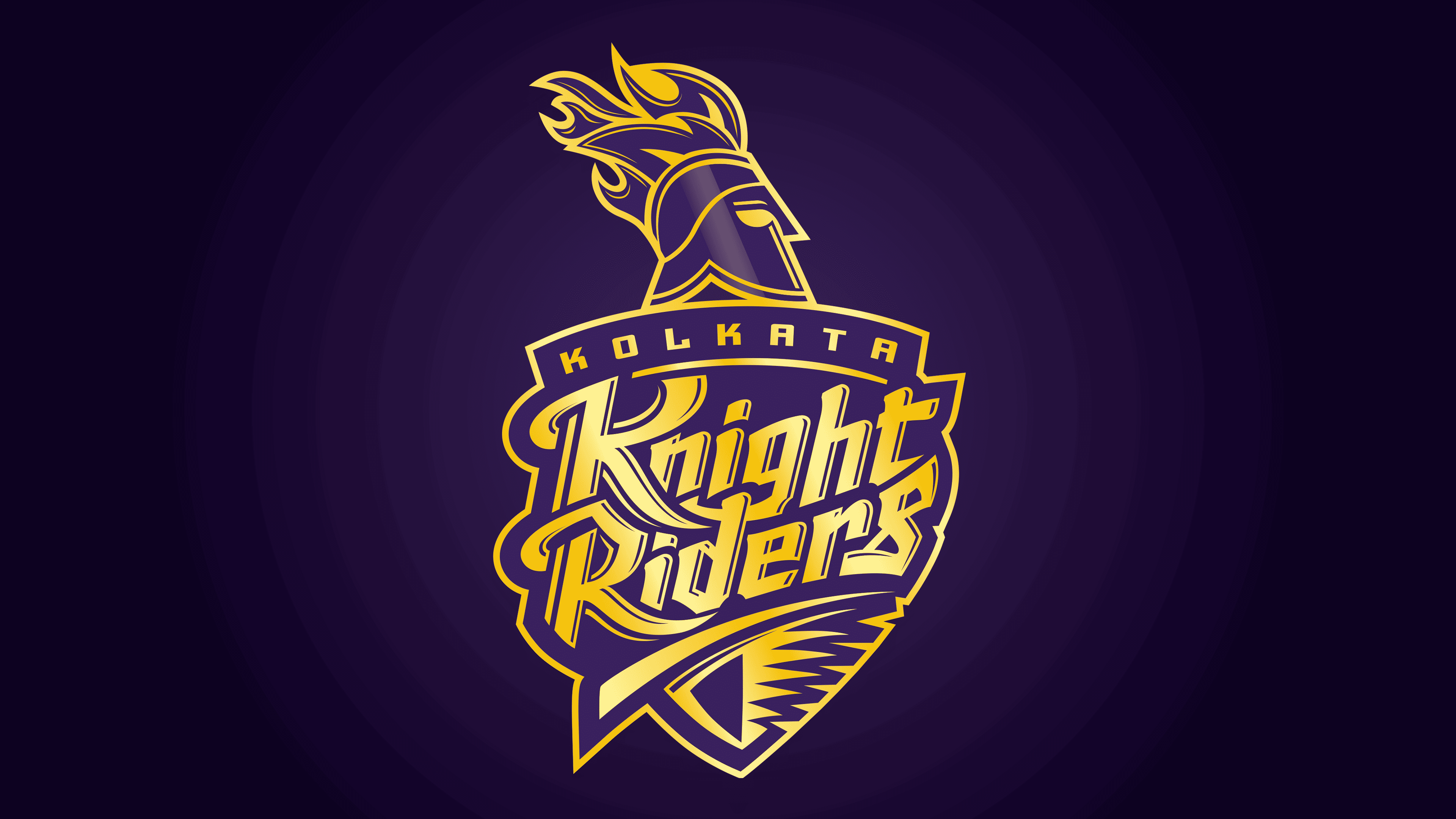
2012 – today
![]()
The updated Kolkata Knight Riders logo was unveiled on February 14, 2012, as part of the “New Dawn, New Knights” campaign ahead of the fifth IPL season. The design was created by the British studio Lambie Nairn (now part of the well-known agency Chermayeff & Geismar) under the creative direction of Sophia Luthman. The official presentation featured franchise owners Shah Rukh Khan, Juhi Chawla, and Jay Mehta, emphasizing the significance of the rebrand for the team.
The goal of the rebranding was to create a visual identity adaptable to multimedia and digital platforms, including television and merchandise. The symbolic knight’s helmet and team name were retained to preserve continuity and recognition, but the composition was simplified and flattened to meet modern design standards. The helmet was drawn in outline, shown in profile facing right, reinforcing the impression of forward momentum. Above it, enlarged stylized flames represented dynamism, strength, and fighting spirit.
The new purple-and-gold palette replaced the former black-and-gold. The purple tone reflected Shah Rukh Khan’s personal preference, associating it with luck, luxury, and royal elegance, in contrast to the black he considered inauspicious. The purple shield background, serving as a heraldic element, emphasized the team’s status and pursuit of excellence, while the gold lettering and outlines reinforced associations with success and nobility.
The typography was designed in a stylized, expressive typeface with pronounced sharp angles and decorative elements, conveying aggression and a sporting spirit. “Kolkata” was written in a compact, arched serif font that conveyed monumentality and solidity. “Knight Riders” appeared more prominently and expressively, symbolizing the team’s energy and emotional character. All typography was placed on a shield with marked asymmetry, enhancing the design’s dynamism.
Since the introduction of the updated logo in 2012, the team achieved its first major success, winning the IPL championship that same year, confirming the effectiveness of the chosen rebranding strategy. The Kolkata Knight Riders logo has since become a recognized symbol of the team’s winning spirit and professionalism on the international stage.
Font and Colors
The typography of the Kolkata Knight Riders logo is based on two stylistically distinct custom typefaces. The upper inscription, “Kolkata,” is set in a geometric sans serif characterized by clean lines and balanced glyph proportions. The strict, slightly condensed letterforms convey restraint and a modern approach, underscoring the team’s official status and its connection to the city.
The second inscription, “Knight Riders,” has a more elaborate and expressive character. It is rendered in a custom decorative typeface with elongated diagonal and vertical strokes, complemented by graceful curves and sharp terminals. These features create an energetic, dynamic appearance that metaphorically reflects the team’s spirit of competition, speed, and aggressiveness.
The color palette consists of two primary shades: deep, dark purple and glossy gold. The choice of dark purple is linked to traditional symbolism of royal authority and luxury, aligning directly with the club’s desired positioning within both the sporting and cultural hierarchy. Gold serves as an accent, emphasizing prestige, success, and the drive for high achievement. Its glossy finish enhances the sense of status and grandeur, visually echoing classic symbols of victory such as trophies and awards.