Citgo: Brand overview
Founded in Houston’s Energy Corridor area, Citgo specializes in the refining, transportation, and distribution of a wide range of energy and industrial products.
In 1910, the visionary Cities Service Company emerged with a vision to revolutionize the marketing and distribution of gas and petroleum products throughout the United States.
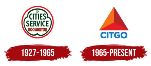
The turning point came in 1965 when Cities Service Company rebranded and became Citgo. This bold move paid dividends, making Citgo a beacon of innovation and excellence in the oil and gas industry.
In 1986, Citgo entered a new phase of its development when it was acquired by PDVSA, Venezuela’s state-owned oil company. This strategic move allowed PDVSA to gain a foothold in the lucrative U.S. market and Citgo to capitalize on the new parent company’s financial resources and global expertise.
Citgo continues to grow and evolve; it remains committed to providing high-quality products and services and making a positive contribution to the communities in which it operates.
Meaning and History
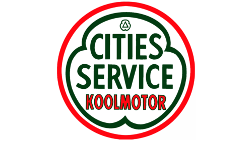
1927 – 1965
1965 – today
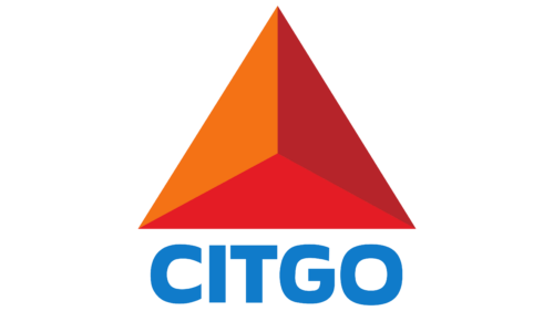
Citgo wanted to show its business orientation through the strict geometric shape of its logo, where the main figure is a triangle. There are four triangles in total: three are flat (orange, burgundy, and red colors), and one has the form of a three-dimensional pyramid. At the bottom, right in the center, is the name of the producer and seller of petroleum products. The letters are written in capital letters. The letters “I” and “T” are straight and strict, while “S,” “G,” and “O” are rounded and soft. None of the letters have additional strokes or serifs. The text is colored blue.
The combination of straight and rounded letters in the name seems to balance the situation. The 3D pyramid adds a twist, making you think of depth and layering without complicating the design. The blue color of the text creates a feeling of calmness and ease of perception. Despite the business nature of the name, it is not too strict and official.
Citgo color codes
| Star Command Blue | Hex color: | #107bca |
|---|---|---|
| RGB: | 16 123 202 | |
| CMYK: | 92 39 0 21 | |
| Pantone: | PMS 3005 C |
| Pumpkin | Hex color: | #f47215 |
|---|---|---|
| RGB: | 244 114 21 | |
| CMYK: | 0 53 91 4 | |
| Pantone: | PMS Bright Orange C |
| Fire Brick | Hex color: | #b6242a |
|---|---|---|
| RGB: | 182 36 42 | |
| CMYK: | 0 80 77 29 | |
| Pantone: | PMS 1795 C |
| Cadmium Red | Hex color: | #e41c25 |
|---|---|---|
| RGB: | 228 28 37 | |
| CMYK: | 0 88 84 11 | |
| Pantone: | PMS Bright Red C |
