


 Clatronic Logo PNG
The Clatronic logo visualizes practicality and convenience, demonstrating that the technology will work without unnecessary effort. With no unnecessary embellishments, the style is simple and communicates that the key is functionality and reliability in every moment.
Clatronic is a German company specializing in small and major home appliances. Established in 1959 by Ernst Klatte and Elektrogeräte GmbH in Borgholzhausen, Germany, the brand’s name is a fusion of its founder’s surname, “Klatte,” and the term “electronics.” Clatronic International GmbH is the parent company of the Clatronic brand.
The company offers a range of kitchen appliances, personal care items, and consumer electronics. Among the typical Clatronic appliances, you’ll find kettles, irons, toasters, food processors, vacuum cleaners, and even larger items like refrigerators; instead of focusing on luxury or cutting-edge designs, Clatronic focuses on creating simple, cost-effective, mass-market household items.
Clatronic’s manufacturing strategy involves contracting with factories primarily in China and other parts of Asia to keep production costs to a minimum. Despite being a German company, CLATRONIC International operates mainly in German-speaking nations through alliances with local retail partners.
The company enjoyed a golden period from the 1970s through the 1990s, during which it emerged as one of Germany’s largest household appliance brands. However, its market share has recently declined due to intensifying competition. Currently, Clatronic employs around 100 administrative and sales personnel in Germany and generates annual revenue estimated at tens of millions of Euros.
Though Clatronic might not be as prominent as it once was, it still retains brand recognition across Europe as a company providing budget-friendly housewares, a reputation built over six decades.
Meaning and History
What is Clatronic?
This is a manufacturer of consumer electronics and small household appliances. The product range includes food processors, vacuum cleaners, coffee makers, toasters, and other home appliances. The products are designed for everyday convenience, combining functionality with affordable pricing, and have gained recognition in international markets.
1982 – today
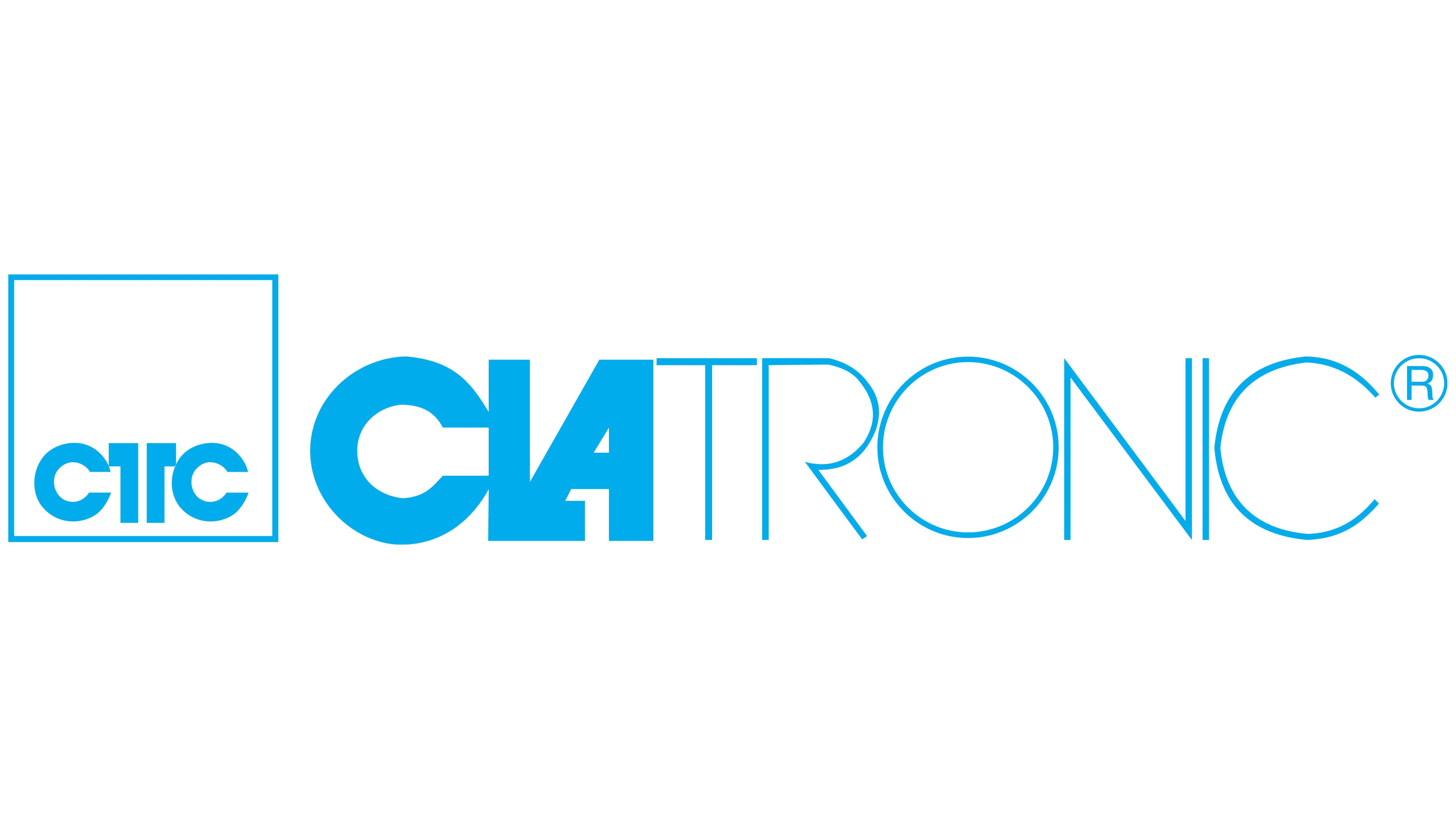
The Clatronic logo consists of two parts with distinct design styles. On the left is a square with a white interior and a blue outline. At the center of the square is the large inscription “CTC,” featuring clean, straight letterforms. The letter “T” is visually divided by a vertical line, creating a symmetrical effect.
The company name “CLATRONIC” is set in a modern sans-serif typeface on the right. The text is divided into two visual sections through the weight of the letters. The first part, “CLA,” is set in bold to emphasize the beginning of the name, while the second part, “TRONIC,” is drawn with thinner lines to create a sense of lightness and openness. The tight letter spacing creates an interesting visual overlap among some elements. The diagonal stroke of the letter “A” smoothly transitions into the lower corner of the adjacent letter “L,” visually uniting the elements into a single composition.
The use of blue in both the square with the abbreviation and the logo’s main text is associated with stability, reliability, and trust. The choice of a clean, contemporary font reflects the technical focus of the company’s work.
The name Clatronic is directly associated with the production of household appliances and devices. The “CTC” abbreviation inside the square reinforces a sense of order and structure. The contrast between thick and thin lines in the word “CLATRONIC” clearly conveys the blend of durability and lightness characteristic of the company’s products.