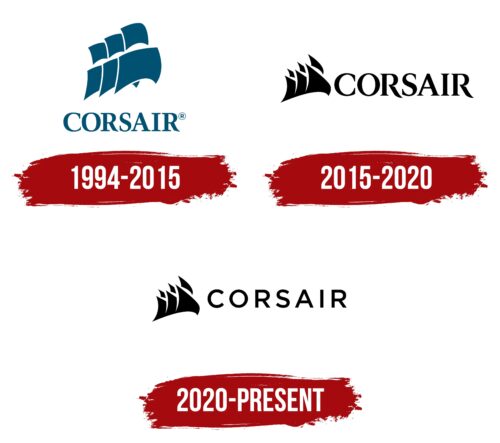
The Corsair logo is a symbol that allegorically conveys the meaning of the company’s name in the production of computer equipment. Although at first glance, it seems as if they are not related, this impression is deceptive. A hidden thread is still present. It is like computer cables connecting two worlds: the real and the digital.
Corsair: Brand overview
| Founded: | January 1994 |
| Founder: | Andy Paul, Don Lieberman, John Beekley |
| Headquarters: | Milpitas, California, U.S. |
| Website: | corsair.com |
Meaning and History
At the time of launch, the company had a different name – Corsair Microsystems, which was approved in 1994 during the official registration. Later, the name was changed to Corsair Gaming. However, the rebranding did not affect the range of products produced, which still included various computer-related items.
To enliven the identity and add creativity and originality, designers proposed an unusual logo. It is unsuitable for a digital equipment manufacturer but perfectly resonates with its name, as the black sailboat symbolizes pirates, i.e., corsairs. The fact is that the term originated from the Latin word “cursus,” meaning “course.” This meaning perfectly matches the concept of a company engaged in future technologies. Therefore, the sails inflated by the wind look like thin plates, resembling memory boards and other small modules, carrying into the boundless ocean of computer developments.
What is Corsair?
Corsair is an American computer hardware manufacturing company producing modules, power supplies, mice, keyboards, USB drives, and other devices. It has been in existence since 1994 in California, with its headquarters in Milpitas.
1994 – 2015
The key element of Corsair’s emblem is the sails. They consist of six different-sized sheets arranged in two levels. Naturally, the perspective of placement on one plane is taken into account, so the elements in the foreground are larger than those in the background. This adds credibility and movement to the logo, turning an ordinary object into a dynamic one. The wind-filled sails move the “ship” on which they are located. Under such a ship, the company is implied, so there is no hull beneath the sails, allowing the viewers to draw the correct conclusions and arrive at the obvious creative parallel.
Below, the brand name is written in large upper-case letters. The letters are complemented by expressive serifs, adding authority and a business-like demeanor to the emblem. The lines used for the glyphs are uneven in thickness: thinner in some places and thicker in others. This approach to typography has turned the static inscription into an expressive element, linking the past with the future.
2015 – 2020
The era of black sails began. Moreover, the designers slightly changed their shape. They narrowed the right side, widened the left side, and in some places, even cut off a part to make the forward movement effect more evident. The dark-colored logo gained more contrast, effectively attracting attention rather than repelling it. The adjacent inscription also underwent changes. The designers chose a different font for it – also with serifs but sharpened at the ends. The letter “R” acquired an elongated right leg, which is figuratively curved and extends beyond the word “Corsair.”
2020 – today
The sails remained unchanged: narrow, cut-off, dynamic, connected at the bottom, and with sharp angles. However, the developers chose a different font – a slab serif. The disappearance of serifs automatically made the inscription practical and modern since flat elements began to dominate among logos. The fact is that flat elements look advantageous on any information carrier, including electronic and digital ones. The absence of serifs means the absence of noise in the image.
Font and Colors
Each Corsair logo has its font, unlike the previous one. The inscriptions are made with typefaces reminiscent of Trump Mediaeval, Minion Pro Subhead Bold, Royal Romain Bold, Metropolis Semi Bold, or Montserrat Regular. The palette is restrained and has always consisted of two colors: white and black or white and dark blue.
Corsair color codes
| Black | Hex color: | #000000 |
|---|---|---|
| RGB: | 0 0 0 | |
| CMYK: | 0 0 0 100 | |
| Pantone: | PMS Process Black C |


