The EMC logo is interesting and full of analogies. The emblem reflects the company’s team as a group of outstanding programmers with unconventional thinking, which has allowed the firm to take a leading position in the industry.
EMC: Brand overview
| Founded: | 1979 |
| Founder: | Richard Egan, Roger Marino |
| Headquarters: | Hopkinton, Massachusetts Round Rock, Texas, United States |
| Website: | dell.com |
EMC is an American software development company founded in 1979 in Hopkinton. The main focus is data storage. Until 2016, the company had 100 representative offices in 50 countries. In 2016, EMC was acquired by Dell Corporation. The merger became the largest in the IT field in the last 40 years. The combined company employs 140,000 people, with a profit of $76 billion.
Meaning and History
The logo history is brief, but the transformations that took place have significantly changed the visual symbol. The main transformations are related to the change in the corporation’s name. The owners of both companies that became Dell-EMC possessed extraordinary thinking and embedded important messages in their emblems, which intrigue and provoke thought. The unconventional approach to visual identity made the branding memorable.
What is EMC?
EMC is a company that specializes in the development of software, network, and storage devices for data storage. The developer’s portfolio includes systems such as Symmetrix, Atmos, VMAX, and Data Domain. After merging with Dell and forming Dell-EMC, the corporation’s products became available to customers in 180 countries worldwide.
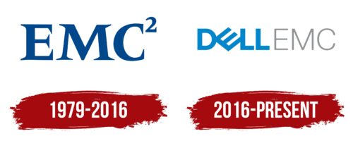
1979 – 2016
The first logo features the capital letters EMC, arranged in a square, resembling a mathematical formula. Calculations, logic, and systems of computation are necessary for storing and structuring data, making a choice appropriate for the company’s field of activity.
The impression is reinforced by the letters with serifs. These elements symbolize attention to detail, rigor, and individuality. The letters E and M stand for the founders’ surnames: Egan and Marino, while C has a double meaning:
- Company.
- Initial letters of the surnames of two employees who later left the firm. Since there were two of them, C is represented in a square.
The logo composition completely replicates Einstein’s formula – E=mc², simplifying the recognizability and memorability of the emblem.
The saturated color of the inscription symbolizes development and the absorption of competitors. After 2000, the company acquired five companies and created two joint ventures. In 2012, it ranked second in Fortune’s ranking among computer organizations.
2016 – today
In 2016, EMC was acquired by Dell. The new owner changed the merged company’s name to Dell-EMC, included it in the Dell Technologies holding, and transformed the logo. The prefix Dell appeared in front of the letters EMC in the emblem.
The two parts of the name are written in different fonts, emphasizing the distinction between the two brands. Designers also used color separation.
In the word Dell, the letter E is turned sideways. The idea was developed by the branding agency Siegel+Gale. The company’s founder, after whom it was named, dreamed of changing the world with his products, “turning it upside down.” The rotation of the symbol made the sign one of the most memorable in IT.
The first part of the name Dell-EMC appears fresh and confident. The blue color and bold glyphs indicate a leading position. The EMC inscription became less bright. The lines appear thin, almost vanishing. This approach demonstrates the brand’s retreat to the background and predicts its gradual complete absorption.
The subtle representation of EMC is also related to the change in the joint venture’s focus, which now concentrates on cloud servers with increased security. Data storage systems in their previous form have remained in the past.
Font and Colors
The main colors of the logo are blue and gray. Light blue is associated with calculations, calmness, and stability, reflecting the aspirations for the future, dreams, and plans of the company. Semi-transparent gray symbolizes painstaking work, lengthy calculations, and program code – everything that remains invisible to the user. The two parts of the inscription represent different sides of the coin in the technological world: the first – presentable appearance and pleasant interface, and the second – constant routine work necessary for the stable functioning of the system.
The font of both parts of the word is straight and smooth, demonstrating flawless software operation without bugs or complexities and an efficient system of commands and convenient data storage.
EMC color codes
| Green Blue | Hex color: | #0287cc |
|---|---|---|
| RGB: | 2 135 204 | |
| CMYK: | 99 34 0 20 | |
| Pantone: | PMS 7461 C |
| Spanish Gray | Hex color: | #939597 |
|---|---|---|
| RGB: | 147 149 151 | |
| CMYK: | 3 1 0 41 | |
| Pantone: | PMS Cool Gray 7 C |


