Enel: Brand overview
Enel S.p.A., a prominent player in Italy’s energy sector for more than five decades, has changed the way electricity and gas are produced and distributed. Founded in 1962 as Ente Nazionale per l’Energia Elettrica (National Electricity Authority), the company has evolved into a global leader in electricity generation and distribution.
In 1992, Enel embarked on a journey of transformation, moving from a traditional business model to a joint stock company.
The pioneering liberalization of the electricity market in Italy in 1999 brought competition, efficiency, and innovation to the sector.
The privatization of Enel led to a change in the ownership structure: private investors acquired a significant stake in the company, reducing the role of the state. However, the Italian state, primarily through the Ministry of Economy and Finance, remains the largest shareholder, retaining a significant portion of Enel’s share capital.
Enel’s amazing growth has gone beyond the borders of Italy, bringing the company to a leading position in the global energy market. Today, Enel is present on different continents: in Europe, North and South America, Africa, and Asia, which confirms its status as a global leader in the industry.
Enel has diversified its energy portfolio through strategic investments, partnerships, and acquisitions, introducing renewable energy sources and sustainable development practices.
Meaning and History
1963 – 1982
1982 – 1991
1991 – 1997
1997 – 2016
2016 – today
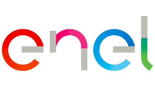
The bright logo of the Italian company indicates its involvement in the energy sector and its connection with the southern region. That is why the logo is multicolored: red, orange, pink, blue, green. It conveys the basic colors of the sunny region, expresses inner energy, and reflects authenticity. Although the letters look unfinished, this does not affect their legibility: the word “Enel” is easily recognizable. The font is lowercase, chiseled, and geometric, with a good balance of angles and curves. The letter “n” is missing its left part, and the letter “l” has a lower bend.
The missing parts of the letters “n” and “l” make you think like a puzzle that is fun to solve. And with all these colors, you can feel the warm sunshine and cool breezes, as if the logo itself is a little piece of the sunny south. This cool combination of tradition in the colors and innovation in the shapes tells a whole story.
Enel color codes
| Red | Hex color: | #f30000 |
|---|---|---|
| RGB: | 243 0 0 | |
| CMYK: | 0 100 100 5 | |
| Pantone: | PMS 172 C |
| Cerise Pink | Hex color: | #f32a84 |
|---|---|---|
| RGB: | 243 42 132 | |
| CMYK: | 0 83 46 5 | |
| Pantone: | PMS 213 C |
| Rich Electric Blue | Hex color: | #0197dd |
|---|---|---|
| RGB: | 1 151 221 | |
| CMYK: | 100 32 0 13 | |
| Pantone: | PMS Process Blue C |
| Medium Sea Green | Hex color: | #2bb459 |
|---|---|---|
| RGB: | 43 180 89 | |
| CMYK: | 76 0 51 29 | |
| Pantone: | PMS 354 C |
| Medium Gray | Hex color: | #bcbcb4 |
|---|---|---|
| RGB: | 188 188 180 | |
| CMYK: | 0 0 4 26 | |
| Pantone: | PMS 413 C |


