Eneos: Brand overview
Eneos Corporation, formerly called JXTG Nippon Oil & Energy Corporation or NOC, has shaped Japan’s energy industry. Founded in 1888 as Nippon Oil, it has evolved into a vertically integrated company with a rich history. A merger with Nippon Mining in 1999 formed Nippon Mining Holdings, allowing Eneos to expand its global presence in petroleum products. Subsequent merger with TonenGeneral Sekiyu in 2010 led to the formation of JX Nippon Oil & Energy Corporation, which strengthened its market position. The restructuring in 2017 into JXTG Holdings and subsequent rebranding in 2020 into Eneos Corporation were important milestones in the company’s journey.
Eneos Corporation holds leading positions in the exploration, importation, and refining of crude oil, as well as the production and marketing of a variety of petroleum products. In addition, the corporation is actively pursuing renewable energy projects and utilizing advanced technologies to ensure long-term success. Eneos has become synonymous with trust and reliability in the Japanese market, operating an extensive network of gasoline stations throughout the country under the Eneos EneJet brand.
As the country’s largest oil company, Eneos remains committed to innovation and ensuring a bright future for the energy sector both domestically and globally.
Meaning and History
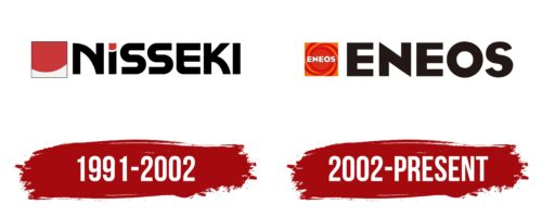
1991 – 2002
2002 – today
Japan’s largest oil production and refining company chose a simple logo. It concentrates the energy that its products provide. This is mainly conveyed by two colors – red and orange, twisted into a spiral. In its center is the white name of the company. This arrangement is symbolic: it means that the products of this manufacturer give really powerful energy. All the elements are placed in a square. To the right is the name, made in black volumetric letters in geometric style. Bold font speaks of its reliability.
The spiral of red and orange colors seems to move like a spinning wheel or mini-tornado of energy. It’s hypnotizing in a good way. The square shape is like a picture frame but for energy. Everything is neatly packaged in it. The voluminous black letters on the right counterbalance the wild spiral as if to say, “Yes, we’re energetic, but we’re also solid, and we’re not going anywhere.”
Eneos color codes
| Mango Tango | Hex color: | #ed6c00 |
|---|---|---|
| RGB: | 237 108 0 | |
| CMYK: | 0 54 100 7 | |
| Pantone: | PMS Bright Orange C |
| Racing Red | Hex color: | #d72e15 |
|---|---|---|
| RGB: | 215 46 21 | |
| CMYK: | 0 79 90 16 | |
| Pantone: | PMS Bright Red C |
| Licorice | Hex color: | #231815 |
|---|---|---|
| RGB: | 35 24 21 | |
| CMYK: | 0 31 40 86 | |
| Pantone: | PMS Black 4 C |


