Engie: Brand overview
Founded in 2008, Engie SA (formerly GDF Suez) has become one of the leaders in the global energy industry. Headquartered in La Défense (Courbevoie, France), Engie offers a wide range of services in the generation and distribution of electricity, natural gas, nuclear power, renewable energy, and oil.
Engie traces its roots to the merger of two long-standing energy companies, Gaz de France and Suez. Gaz de France, founded in 1946 as a state-owned natural gas company, had a large presence in France and beyond. Suez, founded in Belgium and with more than 150 years of experience, provided critical services in a variety of sectors. In 2008, these two energy giants merged, creating Engie and establishing a strong presence in the energy industry.
The historic merger propelled Engie to the forefront of the energy sector. With an ambitious expansion strategy covering both upstream and downstream, Engie has become a true giant.
Building on its extensive experience in power generation and natural gas, the company has positioned itself as a major player in renewable energy. From wind and solar power to hydroelectric projects, Engie has become a leader in renewable energy.
Over the past decade, Engie has diversified its portfolio by offering different energy solutions. In addition to traditional electricity and gas services, Engie offers energy efficiency solutions, energy consulting, and smart energy solutions.
Present in more than 70 countries in Europe, North America, and Asia, Engie is at the forefront of the international energy world.
Meaning and History
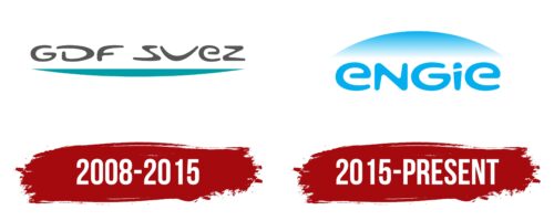
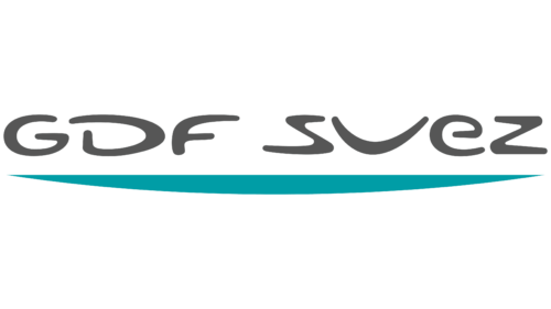
2008 – 2015
2015 – today
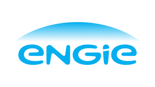
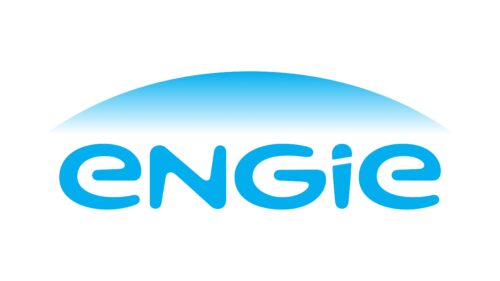
The Engie logo epitomizes the company’s wide range of activities with a broad spectrum of work areas. This approach is conveyed by the dome, slightly blurred at the bottom. This blurriness is necessary for better readability of the text below it so that the contours of the upper and lower elements do not merge. The font is unique because it is highly customized to the project. For example, the lowercase letter “e” looks like an uppercase “G,” only inverted. In general, this logo combines letters from opposite registers.
The blurred dome gives the logo a sense of floating, as in a dream or futuristic movie. The letter “e” looks like an inverted “G.” It’s like a hidden message that can only be noticed by looking closely. The combination of uppercase and lowercase letters gives the logo a fun yet professional feel.
Engies color codes
| Spanish Sky Blue | Hex color: | #03afef |
|---|---|---|
| RGB: | 3 175 239 | |
| CMYK: | 99 27 0 6 | |
| Pantone: | PMS 801 C |
