Enron: Brand overview
Created in 1985 through the merger of Houston Natural Gas and InterNorth, Enron quickly grew from a regional energy company to a global force in energy, commodities, and services. Unfortunately, the company’s unethical actions and accounting fraud led to its bankruptcy on December 2, 2001.
With a history dating back to 1947, Houston Natural Gas was originally a modest player in the energy industry. In 1985, Houston Natural Gas merged with InterNorth to form the iconic Enron Corporation.
Under Kenneth Lay’s leadership, Enron embarked on a bold path of expansion and diversification. It ventured into trading in electricity, natural gas, communications, and even pulp and paper products, utilizing innovative financial instruments and trading strategies such as derivatives.
Throughout the 1990s, Enron attracted the attention of analysts and the media with its impressive financial performance. Revenues and profits grew rapidly, which brought the company widespread publicity.
In 2001, events exposed the disturbing reality behind Enron’s financial facade. Subsequently, the U.S. Securities and Exchange Commission (SEC) investigated Enron’s financial affairs.
On October 16, 2001, Enron announced a staggering third-quarter loss of $618 million and a significant reduction in shareholders’ equity.
On December 2, 2001, Enron, once one of the largest corporations of its time, filed for bankruptcy, causing shock throughout the world.
Meaning and History
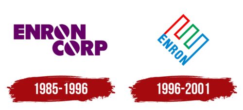
1985 – 1996
1996 – 2001
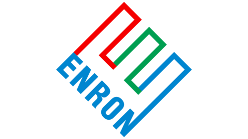
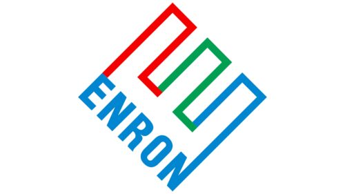
The encrypted letter in the logo serves as both a mystery and a foundation. A close look at the diagonal design reveals a large letter, “E,” which is the initial letter of the name of the former energy, raw materials, and services company. It consists of three slanted rectangles of different colors: red, green, and blue. The basis for them is the inscription “Enron” in uppercase font. The glyphs are smooth, sans-serif, bold. The red line, although it starts from the letter “E,” does not merge with it. On the other hand, the blue bar at the letter “N” actually makes a whole with the glyph since it is also blue.
The fact that the colors don’t blend into each other is quite interesting. The red stripe stands out on its own as if it’s doing its own thing. The blue stripe is the opposite; it’s completely in line with the N. Each color tells its own little story. It’s a puzzle that can be solved just by looking at it.
Enron color codes
| Red | Hex color: | #f50000 |
|---|---|---|
| RGB: | 245 0 0 | |
| CMYK: | 0 100 100 4 | |
| Pantone: | PMS 172 C |
| Pigment Green | Hex color: | #009f51 |
|---|---|---|
| RGB: | 0 159 81 | |
| CMYK: | 100 0 49 38 | |
| Pantone: | PMS 3405 C |
| Green Blue | Hex color: | #0086d0 |
|---|---|---|
| RGB: | 0 134 208 | |
| CMYK: | 100 36 0 18 | |
| Pantone: | PMS 3005 C |
