Equinor Logo

Equinor LogoEquinor Logo PNG

The Equinor logo is designed in a minimalist style, resembling a compass arrow. Its shape conveys a sense of stability and direction, and the simplicity of the lines makes it a memorable element of visual identity. The design evokes associations with confidence and clear, forward movement.

Equinor: Brand overview

Equinor began in 1972 when the Norwegian government founded Statoil (Den Norske Stats Oljeselskap A/S) to capitalize on newly discovered oil reserves in the North Sea. Initially state-owned and led by CEO Arve Johnsen, the company quickly developed major fields such as Statfjord and Gullfaks, eventually expanding internationally into regions like the U.S., Africa, and Asia. During the 1990s, Statoil pioneered carbon capture technology at the Sleipner field and entered strategic partnerships globally, including involvement in Azerbaijan. Partial privatization occurred in 2001, and in 2007, Statoil merged with Norsk Hydro’s oil and gas division to solidify its market position. Facing fluctuating oil prices, the company streamlined operations and embraced efficiency while increasing U.S. investments, notably in North Dakota’s Bakken formation. Under CEO Eldar Sætre’s leadership, Statoil was rebranded as Equinor in 2018, signaling a strategic shift toward renewable energy and diversified operations. Major projects like Johan Sverdrup bolstered production, and under CEO Anders Opedal, the company achieved record profitability, expanding further in Brazil and increasing its focus on renewable energy projects into 2024.

Meaning and History

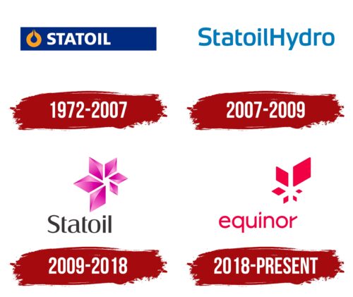
Equinor Logo History

What is Equinor?

This Norwegian energy company has evolved from a local oil organization to a significant player in the global energy market. It specializes in developing offshore oil and gas fields and possesses deep expertise in the challenging conditions of the North Sea. The organization is renowned for its technological proficiency in offshore hydrocarbon production, including deepwater and Arctic fields. Its projects span various regions worldwide, from Brazil to Tanzania, and include managing a network of refineries, ports, and gas stations in Scandinavia.

1972 – 2007

Statoil Logo 1972

The Statoil logo is designed in a clear and formal style. The brand name is rendered in large white letters that stand out confidently against a deep blue background, emphasizing the company’s stability and reliability. The typeface is simple and geometric, giving the text a solid and composed appearance.

To the left of the wordmark is the company’s symbol, a yellow stylized drop resembling a drop of oil and a flame, reflecting Statoil’s focus in the energy sector. Over time, this emblem became closely associated with the brand, reinforcing its identity as a key player in the industry.

The color scheme of blue and yellow is traditionally perceived as professional and dependable, well-suited to a major corporation with a strong and established reputation.

2007 – 2009

StatoilHydro Logo 2007

The updated version of the logo, introduced in 2007, presents a lighter and fresher appearance. The company removed additional symbols, leaving only the text, and adopted a new, more expressive shade of blue. The color feels soft and natural, highlighting the brand’s modern identity.

The typeface underwent a complete transformation, now featuring a style that blends smooth curves with straight lines, without serifs. Rounded forms in certain letters are balanced by sharp angles and clean strokes, giving the logo a straightforward and contemporary feel. The text is easy to read and visually clear, with no complex elements, presenting the brand as confident, neat, and approachable.

2009 – 2018

Statoil Logo 2009

The updated Statoil logo introduced a bold and unconventional approach, especially for a company in the oil and gas sector. Replacing traditional industry symbolism, the new emblem features a vivid fuchsia-colored geometric figure resembling a blooming flower. The petal-like shapes are arranged to convey lightness and dimensionality, giving the symbol a sense of motion and evolution.

The color palette is distinctive shades of fuchsia and pink, creating a vibrant, modern image that contrasts sharply with the typically reserved aesthetics of the energy industry. Below the emblem, the brand name is presented in a restrained black tone, set in a soft typeface with smooth, clean curves.

The result is a logo that balances professionalism with openness, reflecting the company’s desire to evolve, embrace change, and pursue bold, forward-thinking decisions.

2018 – today

Equinor Logo

The Equinor logo is designed in a modern, light style, seamlessly combining form and color. At its center is a geometric symbol composed of six rhombuses, resembling stylized flower petals or flames. Varying in size and arranged to suggest constant movement, the figure conveys a sense of transformation and energy, key themes that reflect the company’s dynamic nature.

The logo features a rich red hue with a slight fuchsia tint, symbolizing determination, strength, and innovation. This color choice reinforces the brand’s forward-looking and energetic identity.

The brand name appears below the symbol in a smooth, lowercase sans-serif typeface. The fluidity of the letterforms conveys openness and calm. A unique detail using a rhombus instead of a traditional dot over the “i” visually links the wordmark to the emblem, enhancing the sense of cohesion.

The overall composition of the logo appears balanced and effortless, aligning with the image of a contemporary company focused on energy and innovation.

Font and Colors

The company’s logo has undergone several transformations, reflecting its evolution and shifts in visual identity. Initially, the design focused on bold, heavy letterforms reminiscent of Frutiger Cyrillic, conveying a sense of tradition and solidity. Over time, the typography became lighter and more refined, incorporating qualities in typefaces like Solitas and Canossa.

Early versions featured a classic combination of deep blue and yellow, emphasizing seriousness and stability. This was followed by a move toward a softer palette, introducing a sky-blue tone that was subtle and unobtrusive. Later, the company took a more decisive turn, adopting a striking contrast of black and vivid fuchsia to signal a bold, forward-thinking direction.

The most recent redesign introduced an intense red color, capturing the company’s current character: ambitious, confident, and ready for dynamic change.