Exelon: Brand overview
Over the past two decades, Exelon Corporation has established itself as a pioneer in the U.S. energy industry. Headquartered in Chicago, Illinois, Exelon is the largest parent company by revenue and the largest regulated electric utility serving more than 10 million customers nationwide. Since its founding in 2000, the company has played a key role in shaping the U.S. energy world.
Exelon Corporation was born from the October 2000 merger of two prominent electric utilities, Commonwealth Edison (ComEd) and PECO Energy Company. This strategic alliance unlocked the potential of both companies, creating a powerful entity in power generation, transmission, and distribution.
The 2005 acquisition of Public Service Enterprise Group significantly expanded Exelon’s presence in the Mid-Atlantic region, further strengthening its position in the industry.
Exelon’s strategic investments in nuclear power have positioned the company as a leader in the energy sector. The 2012 acquisition of Baltimore-based Constellation Energy Group made Exelon the largest nuclear power operator in the United States.
Since its founding, Exelon has been steadfast in its commitment to providing high-quality energy solutions that benefit its customers and the environment.
Meaning and History
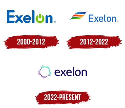
2000 – 2012
2012 – 2022
2022 – today
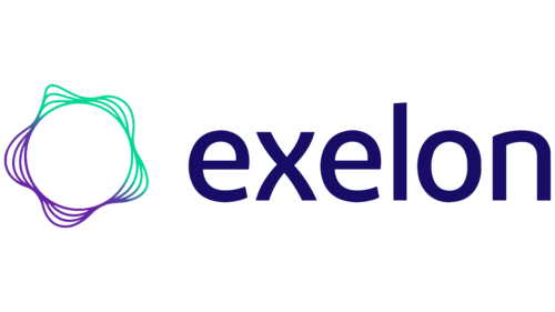
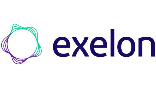
An American producer and distributor of electricity has chosen an abstract logo consisting of circular lines. In fact, they represent electric waves and a coil of wires through which electricity is delivered to consumers. The icon is located on the left side of the emblem and is colored in two shades – green and purple. On the right side is the name of the supplier, written in lowercase font with rounded letters at the top. Even the letter “x” has wavy legs, which gives it a softness. The only letter that lacks fluidity is the “l.” The text is colored in a rich cobalt blue.
The circular lines of the logo create a sense of constant movement as if electricity is flowing through them. The combination of green and purple is a great way to show that the company is both eco-friendly and innovative. The cobalt blue color of the company name stands out but does not draw attention.
Exelon color codes
| Dark Navy Blue | Hex color: | #180d66 |
|---|---|---|
| RGB: | 24 13 102 | |
| CMYK: | 76 87 0 60 | |
| Pantone: | PMS 2745 C |
| Grape | Hex color: | #6824a5 |
|---|---|---|
| RGB: | 104 36 165 | |
| CMYK: | 37 78 0 35 | |
| Pantone: | PMS 527 C |
| Shamrock | Hex color: | #00d898 |
|---|---|---|
| RGB: | 0 216 152 | |
| CMYK: | 100 0 30 15 | |
| Pantone: | PMS 3405 C |
