Galp: Brand overview
Galp Energia, SGPS, and S.A. have become dominant forces in the oil and gas industry, solidifying their position as Portuguese energy powerhouses. Galp, headquartered in Lisbon, operates an extensive network of more than 100 companies covering the entire energy sector.
Galp Energia was formed in 1999 through the strategic merger of three well-known Portuguese energy companies, Petrogal, Gás de Portugal, and Transgás.
Petrogal, Galp Energia’s parent company, has a rich history in oil exploration and production since its founding in 1954.
Gás de Portugal, with its strong infrastructure network and expertise in natural gas distribution and sales, supports Galp’s diversification efforts and provides reliable energy solutions to the people of Portugal.
Transgás, specialized in natural gas transportation and logistics, has made a significant contribution to the development of Portugal’s energy sector.
Under the leadership of an experienced management team, Galp Energia has taken a leading position in the energy industry through technological innovation, operational excellence, and sustainable development. The company maintains its status as the leading oil and gas supplier in Portugal, supplying gas and maintaining a robust retail network of petroleum products.
Meaning and History
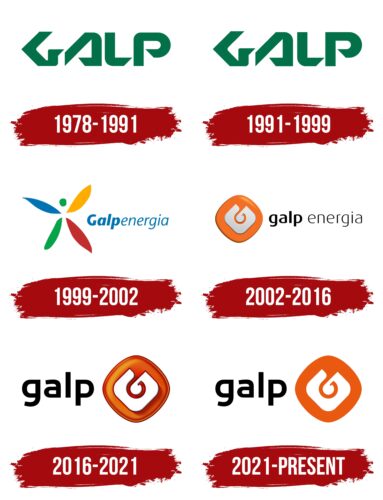
1978 – 1991
1991 – 1999
1999 – 2002
2002 – 2016
2016 – 2021
2021 – today
The Portuguese company has an allegorical logo filled with meaning. This is because the company has more than 100 subsidiaries involved in all aspects of oil production, from extraction to delivery. The emblem is also linked to history, as the company started out with gas streetlights. The emblem depicts a lantern hook with a stylized flame and an element resembling a well pump. They are enclosed in an orange rhombus with rounded corners, within which there is another white rhombus of smaller size. On the left side is the company name written in black lowercase letters.
The orange rhombus seems to brighten the diverse activities of the company but does not draw attention to itself. The smaller white diamond inside looks like a gem, a hidden treasure, showing that there is more than meets the eye. The stylized flame and pump element give the impression that the company always has a supply of energy. The black letters are simple and clear, making it easy to memorize the name without fuss.
Galp color codes
| Persimmon | Hex color: | #e95a10 |
|---|---|---|
| RGB: | 233 90 16 | |
| CMYK: | 0 61 93 9 | |
| Pantone: | PMS 1655 C |
| Black | Hex color: | #000000 |
|---|---|---|
| RGB: | 0 0 0 | |
| CMYK: | 0 0 0 100 | |
| Pantone: | PMS Process Black C |


