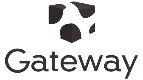
The Gateway logo is unique and does not resemble the emblems of other IT companies. The sign focuses on the audience for which the company works. The emblem brings the manufacturer closer to customers and evokes a sense of trust.
Gateway: Brand overview
| Founded: | 1985 |
| Founder: | Ted Waitt, Mike Hammond |
| Headquarters: | Irvine, California, U.S. |
| Website: | gatewayusa.com |
Gateway is an American company specializing in producing personal computers and laptops. Since 2007, it has belonged to Acer Inc. After the acquisition, it temporarily ceased to exist and was revived in 2020. Before the merger, it had 25 thousand of employees. It exported products worldwide. Currently, the brand is produced in China and sold in the US through Walmart.
Meaning and History
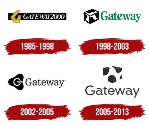
Throughout its existence, the company has developed its unique style, used not only in the logo but also in packaging, naming, and even the location of the head office. Multiple changes to the sign have formed the main elements of the composition. With each update, the logo became more harmonious. By 2005, it had acquired ideal proportions, which were preserved until the company’s acquisition by Acer and the temporary suspension of Gateway’s activities until 2020.
What is Gateway?
Gateway is a manufacturer and supplier of computers, servers, and various PC accessories, founded in Iowa in 1985. The company also engaged in software production and equipment maintenance. It currently belongs to Acer.
1985 – 1998
The company started its journey as TIPC. However, after introducing custom-built computers to the price list, it changed its name to Gateway 2000. The name reflected the path to computerization and technological development for residents of small settlements with whom the Waitt brothers worked.
The idea of the path is reflected in the logo twice: with a black stripe and a brown road bend, personifying the letter G. On the black asphalt highway, the name Gateway 2000 is placed forward toward the future.
The intricate canvas of the highway reflected the idea of remoteness, distant settlements, and villages, to whose inhabitants the company helped move towards technical progress.
1998 – 2003
2002 – 2005
2005 – 2013
Over time, Gateway associated its identity with cows. The logo consists of a black inscription and a white cube with black spots reminiscent of the coloration of animals. The unusual solution is inspired by the desire to cover the segment of residents of small towns, ranches, and farms.
Pride in their country. After all, the Holstein breed, whose coloring is used in the emblem, was developed in the United States. The animals are widespread in small farms and are associated with American farming. Using their coloration is a message: the brand is as American and “native” as the familiar animals found in every home.
An attempt to show that the company’s computers and laptops have reached such a technological level that they have become practically alive.
The desire to convey the message: the brand’s product will become a reliable friend capable of solving important life tasks.
The analogy with cows, which produce a lot of milk, indicates the high productivity and growing income of the corporation. It also hints at the childhood of founder Ted Waitt, who spent a long time living and working on his parent’s farm in Iowa.
The cube is a symbol of artificial intelligence and a prototype of the packaging of goods, which were delivered in boxes with spots.
Font and Colors
The combination of black and white creates contrast, representing Gateway as a unique brand against a common background. White reflects innovation, discoveries, and development. Black represents a reliable foundation and many years of experience. Interestingly, it is the corners of the cube that are painted in a dark shade, showing the stable, resilient position of the brand in the market.
The logo font resembles DINNeuzeitGroteskStd-Ligh but with a unique twist in the lower part of the glyph “a,” which seems to point the way forward. The thin light letters of the inscription symbolize high technology, the company’s narrow profile, and its individuality.
Gateway color codes
| Raisin Black/span> | Hex color: | #2e2828 |
|---|---|---|
| RGB: | 46 40 40 | |
| CMYK: | 0 13 13 82 | |
| Pantone: | PMS Black C |
