Gazprom: Brand overview
Gazprom, Russia’s renowned energy powerhouse, has firmly established its position as a global leader in the gas industry. From its legendary headquarters in St. Petersburg’s Lakhta Center, Gazprom has grown to become the world’s largest listed gas company and the most profitable company in Russia.
Gazprom was officially founded in 1989, shortly before the collapse of the Soviet Union. As a state-owned enterprise, Gazprom controlled the production, transportation, and distribution of natural gas throughout the Soviet states.
Utilizing its vast natural gas reserves, Gazprom quickly became a leader in the global energy market. The company’s natural gas supply capabilities and extensive pipeline network allowed it to establish strong relations with neighboring countries and expand its presence abroad.
For more than a decade, Gazprom has been a prominent player in Russian business, as evidenced by its impressive market capitalization. In January 2022, the company achieved significant success, overtaking Sberbank and becoming the largest company in Russia by market capitalization.
Despite delisting from international markets in 2023, Gazprom remains committed to meeting the world’s energy needs and contributing to the sustainable development of the industry.
Meaning and History
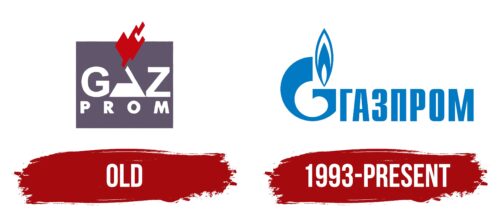
Old
1993 – today
The Gazprom logo is textual, but in shape, it resembles a gas burner or a lighter with a flame. This is achieved through the creative use of the first letter of the English version of the name – “G.” The designers took advantage of its matching structure. On the right side is the company name written in Cyrillic letters. These letters are geometric, even, blocky. The emblem is colored in blue.
The blue color resembles the color of the natural gas flame, which makes it interesting. The letter “G” looks as if it can catch fire at any moment, which corresponds quite well to the name of the gas company. The Cyrillic letters are simple yet modern as if they are about business.
Gazprom color codes
| Star Command Blue | Hex color: | #0179c2 |
|---|---|---|
| RGB: | 1 121 194 | |
| CMYK: | 99 38 0 24 | |
| Pantone: | PMS 3005 C |


