Gorenje: Brand overview
| Founded: | 1950 |
| Founder: | Ivan Atelšek |
| Headquarters: | Velenje, Slovenia |
| Website: | hisense-europe.com |
Originating from Gorenje in Slovenia, Gorenje is a home appliances manufacturer with a rich history dating back to 1950. Its initial production centered around wood-burning stoves. However, by the 1960s, Gorenje had broadened its scope to include a comprehensive range of major and minor home appliances.
Now, Gorenje is renowned for crafting various home and kitchen appliances such as ovens, washing machines, refrigerators, and cookers. Manufacturing facilities stationed in Slovenia and Serbia give life to these appliances, which are then distributed under brand names like Gorenje, Mora, and Asko, reaching customers all across the globe.
What sets Gorenje apart is its focus on simplicity coupled with efficiency. Its appliances, known for their affordable price tags, enjoy significant popularity, especially within Eastern Europe. The company also strongly emphasizes energy efficiency, eco-friendly manufacturing practices, and the creation of Internet-connected smart appliances in response to recent technological advancements.
Gorenje, boasting a workforce of approximately 10,000 employees worldwide, generates annual revenues surpassing €1.2 billion. In 2018, it became part of the Hisense Group following the Chinese company’s acquisition of a 95% stake.
While it might not dominate the global market, Gorenje maintains a significant presence in the European appliance industry, operating for over seven decades.
Meaning and History
What is Gorenje?
Established in 1950 by Ivan Atelsek, Gorenje is a Slovenian powerhouse producing domestic appliances. Operating from Velenje, Slovenia, it now holds the position of the fourth most significant manufacturer of home appliances in Europe. The company’s notable brands, which include Gorenje, Mora, Atag, Pelgrim, Etna, Körting, and Sidex, are fabricated at the central manufacturing facility in Velenje, as well as the Mora Moravia kitchen appliance factory in Marianske Udoli, Czech Republic, and the refrigerator-freezer facility in Valjevo, Serbia. Besides home appliances, Gorenje’s product repertoire extends to ceramics, kitchen, and bathroom furnishings, and it also offers services in energy, ecology, and commerce. Represented in over 90 countries, primarily in Europe, Gorenje has solidified its standing as a global trailblazer in home appliance manufacturing.
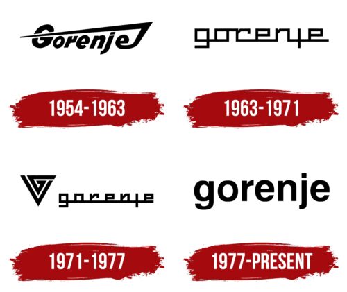
1954 – 1963
1963 – 1971
1971 – 1977
1977 – today
Gorenje color codes
| Black | Hex color: | #000000 |
|---|---|---|
| RGB: | 0 0 0 | |
| CMYK: | 0 0 0 100 | |
| Pantone: | PMS Process Black C |


