Halliburton: Brand overview
From a humble company founded in the 1920s, Halliburton has grown into a global leader in the oil and gas industry, changing the landscape through pioneering fracking technology and other revolutionary advances.
Halliburton was founded by Earl P. Halliburton in 1919 in Duncan, Oklahoma, and became one of the leaders in oil well cementing.
In the 1920s, Halliburton changed the oil well cementing industry with its innovative methods. By pioneering methods to improve cementing processes, the company ensured improved well integrity and increased production to unprecedented heights outside of Oklahoma.
During the 1930s and 1940s, Halliburton expanded its presence across the country and beyond, offering a wide range of oilfield services.
As global demand for oil and gas grew, Halliburton seized the opportunity to expand its operations. Through strategic partnerships and acquisitions, the company became present in more than 70 countries and quickly became one of the most influential oilfield services providers in the industry.
With two headquarters in Houston and Dubai, Halliburton is a global powerhouse providing comprehensive energy solutions to meet the ever-changing energy world.
Meaning and History
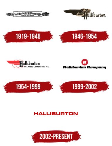
1919 – 1946
1946 – 1954
1954 – 1999
1999 – 2002
2002 – today
An international oilfield services company from the USA stakes on impeccable service, which is directly evidenced by its corporate logo. The logo is very simple and contains nothing but the company name. The font used resembles the commercial font MicroSquare Bold Extended from FontSite Inc. or free Criovision Bold from Criovision Agency. The bold letters are colored red and aligned in one horizontal row. They are geometric, embossed, moderately rounded, and angular. This combination provides excellent visibility and legibility of the text.
The red letters emphasize the text, drawing attention like a stop sign. The shape of the letters is also neat – they resemble building blocks, simple but strong. The clear design makes the text easy to read and gives an immediate idea of what the company does.
Halliburton color codes
| Racing Red | Hex color: | #cc0000 |
|---|---|---|
| RGB: | 204 0 0 | |
| CMYK: | 0 100 100 20 | |
| Pantone: | PMS Bright Red C |


