Hotpoint-Ariston: Brand overview
| Founded: | 1911 |
| Founder: | Earl Richardson |
| Headquarters: | Peterborough, England, United Kingdom |
| Website: | hotpoint.co.uk |
Hotpoint-Ariston, a home appliances manufacturer, is a subsidiary of the Haier Group. The brand emerged in 2001 following the consolidation of American brand Hotpoint and Ariston, an Italian brand. Its extensive product range includes major household appliances such as refrigerators, washing machines, dishwashers, and ovens.
The company enjoys substantial market penetration in Europe, particularly in the UK and Italy, the home countries of the Hotpoint and Ariston brands. Hotpoint-Ariston is strategically positioned as a high-tier mass-market brand, set above entry-level alternatives but below Haier’s upscale offerings.
The brand greatly emphasizes innovation, energy efficiency, and contemporary aesthetic design in its product development. Some of its well-received product series are Active Care, Ultima, and Nuova Simonelli’s range of appliances.
To strengthen its foothold in Europe, Haier fully acquired Hotpoint-Ariston in 2020 by purchasing the stake held by Merloni. With over 100 million products installed worldwide, Hotpoint-Ariston boasts a substantial service network to support its large customer base.
Meaning and History
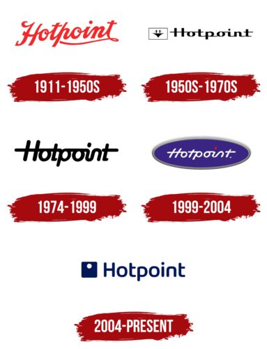
1911 – 1950s
1950s – 1970s
1974 – 1999
1999 – 2004
2004 – today
Hotpoint-Ariston color codes
| Royal Blue | Hex color: | #011959 |
|---|---|---|
| RGB: | 1 25 89 | |
| CMYK: | 99 72 0 65 | |
| Pantone: | PMS 2758 C |


