Imperial Oil: Brand overview
Imperial Oil Limited, also known as Compagnie Pétrolière Impériale Ltée, has played a key role in shaping Canada’s oil landscape. Since its founding in 1880, Imperial Oil has been a driving force in the country’s oil and gas industry, consistently providing quality products and services to its customers.
Imperial Oil’s journey began in London, Ontario, where a group of visionary stakeholders, including prominent Canadian businessmen, laid the foundation for the company’s success. Initially focused on refining and marketing locally produced oil, Imperial Oil quickly gained momentum and positioned itself for future accomplishments.
A major milestone in Imperial Oil’s history was the establishment of its first refinery in Petrolia, Ontario.
Recognizing the untapped potential of crude oil and natural gas reserves in Alberta and Saskatchewan, Imperial Oil embarked on a strategic project outside of Ontario.
A pioneering distribution agreement between Imperial Oil and U.S. oil giant ExxonMobil in 1898 was a watershed moment for both companies. Over time, ExxonMobil’s controlling interest in Imperial Oil has enabled a fruitful partnership that has fostered growth, access to advanced technology, and shared expertise.
Imperial Oil’s commitment to innovation and investment in the development of the Canadian oil sands, particularly in the Athabasca region, has enabled Canada to become a significant player in the global oil market.
Imperial Oil remains a leader in the Canadian energy industry, with a prominent position among the top producers of crude oil, diluted bitumen, and natural gas. With extensive refining capabilities and a strong supply and retail network, Imperial Oil continues to provide Canadians with reliable access to petroleum products.
Meaning and History
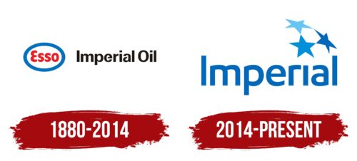
1880 – 2014
2014 – today
The high importance of the Canadian Oil Company to the country is emphasized by the stars. These stars are depicted high up on the right side of the inscription and are colored in three shades of blue: light, neutral, and dark. The stars are connected by two rays, making the hexagon between them clearly visible in the negative space. One of them replaces the dot above the lowercase letter “i.” The company name is in lowercase font with flowing letters. The only capitalized letter is the first “i,” which goes well with the last “l,” as they are very similar. These glyphs look like pillars.
The stars give the feeling of outer space, like looking at the night sky. The hexagon in the center seems like a hidden message or easter egg, making you look at it twice. In the design, the letters “I” and “l” look like columns. They seem to support the whole name, like columns in a building.
Imperial Oil color codes
| Bright Navy Blue | Hex color: | #0168ba |
|---|---|---|
| RGB: | 1 104 186 | |
| CMYK: | 99 44 0 27 | |
| Pantone: | PMS 285 C |
| Rich Electric Blue | Hex color: | #008fda |
|---|---|---|
| RGB: | 0 143 218 | |
| CMYK: | 100 34 0 15 | |
| Pantone: | PMS Process Blue C |
| Bleu Celeste | Hex color: | #67c4f3 |
|---|---|---|
| RGB: | 103 196 243 | |
| CMYK: | 58 19 0 5 | |
| Pantone: | PMS 306 C |


