Infineon: Brand overview
| Founded: | 1 April 1999 |
| Headquarters: | Neubiberg, Germany |
| Website: | infineon.com |
Infineon Technologies, a German-based enterprise, specializes in the manufacturing of semiconductors. The company was established in 1999 as a spin-off from Siemens, its parent company. Its headquarters is in Neubiberg, a town near Munich, Germany.
Infineon holds the distinction of being among the world’s top ten semiconductor corporations. Its areas of specialization encompass power semiconductors, sensors, security chips, and automotive microcontrollers. The principal segments of the company’s business operations are Power & Sensor Systems, Automotive, and Industrial Power Control.
The company caters to various industries, including automotive, industrial, chip card/security, renewable energy, and consumer electronics. With a global workforce surpassing 50,000 and over 40 manufacturing locations worldwide, Infineon has a substantial presence in Europe, Asia, and the Americas.
Its product portfolio includes vehicle microcontrollers, radars, sensors, renewable energy ICs, and security chips. Major automobile brands such as Volkswagen, BMW, Ford, and Toyota source chips and components from Infineon.
As of 2021, the company’s annual revenues stood at approximately 11 billion euros. Infineon is listed on the Frankfurt Stock Exchange and is a component of the DAX index. It maintains strategic partnerships with high-profile companies such as Tesla, NXP Semiconductors, and Denso Corporation.
Meaning and History
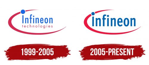
1999 – 2005
2005 – today
Infineon color codes
| Medium Persian Blue | Hex color: | #0266b3 |
|---|---|---|
| RGB: | 2 102 179 | |
| CMYK: | 99 43 0 30 | |
| Pantone: | PMS 285 C |
| Red | Hex color: | #ed1840 |
|---|---|---|
| RGB: | 237 24 64 | |
| CMYK: | 0 90 73 7 | |
| Pantone: | PMS 185 C |
