Jet: Brand overview
Jet, a renowned European gas station brand, has had a unique and inspiring journey that has unfolded over the years. Envisioned to revolutionize the fuel industry, Jet became part of the American conglomerate Phillips 66 while remaining true to its original mission.
In the 1950s, one visionary group of people began to make changes to the fuel distribution system, offering exceptional fuel products and unrivaled customer service. This marked the birth of Jet and its commitment to excellence.
Jet’s commitment to innovation has fueled its expansion across Europe, introducing self-service fueling stations that have revolutionized the fueling industry and gained widespread popularity.
Understanding the changing needs of its customers, Jet responded by introducing mini-supermarkets at its gas stations, providing the convenience of refueling and shopping.
In 2018, Jet reached a major milestone as it was acquired by Phillips 66, a renowned energy company based in the US.
Under the ownership of Phillips 66, Jet is thriving as Europe’s leading fuel brand. Focused on superior customer service, Jet remains at the forefront of innovation and sustainability with a commitment to providing exceptional services and products.
Meaning and History
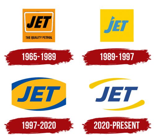
1965 – 1989
1989 – 1997
1997 – 2020
2020 – today
The Jet logo consists of three parts. The company name is in the center, which means that it is the main focus around which the energy revolves. The text is slanted, blue, bold, and geometric. The large letters are in upper case and have no serifs – they are smooth and crisp. The text is complemented by two drop-shaped yellow elements resembling brush strokes. Their lines are long and curved, resembling a sickle, and only one end is pointed.
The blue and yellow colors blend well together, like the sky and the sun on a bright day. The yellow brush strokes look like swift sweeps, making you think of something fast, like a jet airplane. The whole slanted text creates a sense of movement as if it is ready to take off at any second.
Jet color codes
| Jonquil | Hex color: | #f7c801 |
|---|---|---|
| RGB: | 247 200 1 | |
| CMYK: | 0 19 100 3 | |
| Pantone: | PMS 116 C |
| US Air Force Academy Blue | Hex color: | #244c8f |
|---|---|---|
| RGB: | 36 76 143 | |
| CMYK: | 75 47 0 44 | |
| Pantone: | PMS 7686 C |


