The Kensington logo conveys the idea of comfort and protection. Its appearance is associated with accessories that simplify everyday tasks and ensure device security. This visual solution emphasizes practicality and attention to detail, keeping what is most valuable safe.
Kensington: Brand overview
Kensington, an American enterprise known for its electronics and accessories, primarily specializes in computer and mobile device accessories. The company was established in 1979 and currently has its headquarters in Redwood Shores, California.
The company initially entered the market with floppy disk boxes but eventually broadened its product range to include computer and mobile accessories. Kensington has garnered recognition for its ergonomic computer mice, trackballs, keyboards, and mouse pads.
In addition to these, Kensington has also developed a variety of accessories for mobile devices. This includes laptop locks, docking stations, styluses, protective cases, screen protectors, and stands. The company’s main product segments are ergonomics, desktops, mobility, and home office accessories.
Kensington’s primary strength lies in its human-centric design and engineering of digital lifestyle products. It sells its products across over 75 countries worldwide. Recently, the company has focused on producing accessories for tablets like iPads and 2-in-1 laptops.
In 2008, ACCO Brands acquired Kensington. Despite this, Kensington still operates independently within ACCO’s brand portfolio. Kensington’s reputation for innovation is substantiated by its patented technologies, such as the SmartFit adjustability and VeriMark fingerprint protection systems.
Meaning and History
What is Kensington?
This American computer accessories and peripherals manufacturer is known for its ergonomic and safe work solutions. The product range includes mice, keyboards, docking stations, laptop locks, bags, and ergonomic stands. A key feature is the development of a universal security lock, which has become a global standard used by many manufacturers of laptops and electronic devices. In addition to workspace organization solutions, the company offers professional presentation equipment, including control panels and laser pointers.
Before 2003
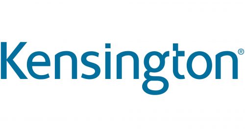
2003 – today
The Kensington logo is presented solely as a text rendering of the company’s name. The inscription combines uppercase and lowercase letters, achieving a natural visual balance. The typeface is simple and functional, without decorative elements, conveying a sense of technology and practicality. The primary color of the logo is a rich blue.
The typeface contains distinctive accents. For example, the letter “t” features an unusual rectangular indentation instead of a traditional horizontal bar at the top. The lower part of the letter “g” is slightly angled upward, pointing directly toward this space. This design of the letters evokes the idea of connecting various devices, reflecting the company’s product focus—computer mice, keyboards, docking stations, and other accessories.
The overall execution of the logo is minimalist, allowing for easy recognition. The name Kensington references a district with a refined, classic appearance, symbolizing the company’s stability and reliability. The blue color of the text creates associations with trust and high quality, aligning with the characteristics of its products.
The Kensington logo combines a strict style with original graphic details, forming a distinctive image closely connected to its field of activity.