 Kodak Motion Picture Film Logo PNG
The Kodak Motion Picture Film logo is filled with nostalgia. It transports the user to the times of black-and-white movies. The emblem invites the viewer to the movie theater, where the lights will soon dim, and another masterpiece will appear on the screen.
Kodak Motion Picture Film: Brand overview
| Founded: | 1989 |
| Founder: | The Eastman Kodak Company |
| Headquarters: | Rochester, New York, United States |
| Website: | kodak.com |
Kodak Motion Picture Film – a division and trademark of Eastman Kodak Company, producing film used for many iconic movies: Star Wars, Nightmare on Elm Street, The Avengers, Lord of the Rings, Titanic, The Shawshank Redemption. Main product lines: Vision, Double-X, Tri-X. Products are available in 100 countries.
Meaning and History
The modern logo of the brand was born gradually. First, the name changed to a more recognizable one, then elements were added that pointed to the product itself – frames, parts of the film. Finally, the name was shortened to the most memorable one, and all the composition elements merged into one, creating the famous square and inscription that can be seen in movie credits.
What is Kodak Motion Picture Film?
A well-known American film brand that is iconic in the film industry. Valued for its ease of storage and durability. Despite digitization, it continues to be in demand in Hollywood.
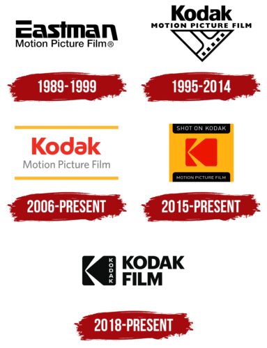
1989 – 1999
The initial logo consisted of the brand name: Eastman Motion Picture Film. The first word – the founder’s last name and the leading part of the company name Eastman Kodak Co. In the emblem, it is central. Executed in bold, large font with a capital E. The upper part of the letter is separated from the lower part, forming a strip symbolizing the film. The curve of the letter S and the glyphs of the other letters also evoke a similar association.
Below, the rest of the name is added in thin, small black letters: Motion Picture Film.
1995 – 2014
2006 – today
2015 – today
2018 – today
The latest logo completely changed the overall appearance. Designed by New York design studio Work-Order. It consists of a square logo and the short name of Kodak Film.
By 1999, the company had spun off film production into a separate division called Kodak Motion Picture Film, so the brand name changed and the word Eastman disappeared from the logo.
The name Kodak was invented and introduced by the company’s founder in 1888. He was looking for a name that did not exist before and in which the letter K was present at the beginning and end, as the letter conveyed strength and energy, according to the inventor.
The black square is a frame of film or a movie theater screen. The curved white line crossing it is an interesting technique, forming the letter K – the first letter in the brand name.
Font and Colors
The company logo has always been distinguished by black and white colors. They symbolize:
- the film industry, in which the brand shines;
- the color of film, originally wound into reels;
- the color of negatives, on which all images are black and white;
- the contrast between the company’s products and those of other manufacturers.
Black is the color of reliability and consistency. The parent company has been in the market for over 100 years. White represents new films that continue to be shot on the medium.
The font of the inscription is simple, even, and strict.
Kodak Motion Picture Film color codes
| Black | Hex color: | #000000 |
|---|---|---|
| RGB: | 0 0 0 | |
| CMYK: | 0 0 0 100 | |
| Pantone: | PMS Process Black C |
