The Konica Minolta logo expresses the serious ambitions of the corporation and its presence in every corner of the world. The emblem exudes a sense of global reach and care for all the inhabitants of the planet. The symbol represents the company’s mission to spread its values and products worldwide.
Konica Minolta: Brand overview
| Founded: | 1928 – 2003 (Minolta); 2003 – present (Konica Minolta) |
| Founder: | Kazuo Tashima |
| Headquarters: | Marunouchi, Chiyoda, Tokyo, Japan |
| Website: | konicaminolta.com |
Konica Minolta is a Japanese multinational technology company with revenues of up to $8 billion, producing office and medical equipment, software, and measuring instruments. It includes a number of subsidiaries (Business Solutions, Healthcare, Sensing, and others).
Meaning and History
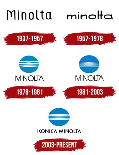
The first known Minolta logo appeared only in 1937, although the manufacturer itself was founded in 1928. However, it previously had another name in Japanese, which sounded like: Nichi-Doku Shashinki Shoten. The word Minolta was developed for one of the company’s brands in 1933. The corporation itself took this name in 1962. Therefore, the initial logo represented the brand. It did not have any particularly noteworthy style.
It was not until 1978 that the full-fledged logo with the blue circle, known today, was developed, and the company has not parted with it for more than 40 years.
What is Konica Minolta?
An international holding with headquarters in Tokyo. Main products: photocopiers, printers (AccurioPress, bizhub), faxes, diagnostic medical photo equipment (Sensing), ready-made solutions for business (Education Solutions, Workplace Hub). The company employs 44 thousand people.
1937 – 1957
The first emblem consists of the brand name. The name Minolta is formed by combining the first syllables of two Japanese words: seed (small) and numerous. The combination conveys the idea of:
- a unique brand, standing out among the multitude of others;
- expansion, growth, increasing the number of products, customers, and sales outlets.
The sound of Minolta is similar to the name of the company adopted in 1931 – Molta (Mechanismus Optik und Linsen von Tashima). This is a German abbreviation, as the advanced optical technologies were adopted by the Japanese businessman from the German partner (Heilemann) and optics specialist (Neumann). Therefore, the word Minolta could be a compound of: Min(iatur) (the camera was very compact), O(ptik), L(insen), and Ta(shima) (the founder’s last name).
1957 – 1978
1978 – 1981
1981 – 2003
2003 – today
In 2003, the merger of Konica and Minolta took place, forming the holding company Konica Minolta Holdings, Inc. Due to the name change, adjustments were made to the logo.
The visual symbol consists of an image of a blue globe with 5 white stripes and the updated name of the corporation. The image, which is emphasized in this and most previous logos, resembles the Earth. Together with the name Minolta (demonstrating the desire for growth and product distribution), it shows the company’s ambition to spread across the Earth.
The circle symbolizes the lens, as the first products of Minolta and Konica were cameras and photographic equipment.
The white stripes represent:
- Horizon. The sun rises from the horizon, leaving a light trail on the water. Likewise, Konica Minolta gains a new dawn after the merger and ascends to the sky to offer its products to the world.
- A flash of light. As the companies produce cameras, laser printers, and other light-related equipment, the reception conveys the direction of the holding’s work.
- Parallels corresponding to Japan on the globe layout.
- Company values: technology improvement, partnership for creating better solutions, desire to listen and hear clients, eco-friendliness, and social responsibility.
The logo was first designed by American graphic designer Saul Bass.
Font and Colors
The main colors of the emblem are associated with innovation and globality.
- Blue – a water surface, bringing peace and washing the shores of the founding country. Sky blue – a sign of expansion and growth. In Japanese culture, blue symbolizes renewal and flourishing. In general, blue is the color of stability, reliability, professionalism.
- White – inventions, new technologies, honesty, and transparency in business. Care for the environment, reducing harmful emissions. Light and illumination.
The font of the inscription is a modified Sebastian Medium Pro. Changes are expressed in fanciful bends of the usually straight partitions of the letters and the absence of a crossbar in the “A”. Bends – a symbol of graphs and light waves. Simplification of details – a sign of minimalism, focusing on the main thing, globalization. This is also evidenced by the free space between the two parts of the K.
Konica Minolta color codes
| Star Command Blue | Hex color: | #037ec5 |
|---|---|---|
| RGB: | 3 126 197 | |
| CMYK: | 98 36 0 23 | |
| Pantone: | PMS 7461 C |
| Black | Hex color: | #000000 |
|---|---|---|
| RGB: | 0 0 0 | |
| CMYK: | 0 0 0 100 | |
| Pantone: | PMS Process Black C |


