The Lennox logo is free and soaring, focusing on the air, its freshness, and purity. The emblem reflects the company’s main mission – to create a comfortable indoor climate for living.
Lennox: Brand overview
| Founded: | 1895 |
| Founder: | Dave Lennox |
| Headquarters: | Richardson, Texas, United States |
| Website: | lennoxinternational.com |
Lennox is an American company specializing in climate control systems. Starting in 1895 as a producer of riveted steel furnaces, the company expanded its operations. Production facilities are located in three US states and Mexico, and products are distributed in 100 countries through a 6,000-dealer network. The company’s revenue amounts to $3.8 billion per year.
Meaning and History
The establishment of the Lennox logo underwent several stages and differs for international and main divisions. Changes in visual identity occurred only in connection with major changes in the company’s structure. The direction of activity is conveyed in the emblem through color and graphic elements. The symbols are characterized by monochromacity, reflecting consistency and focus on a particular niche.
What is Lennox?
Lennox is a manufacturer of air conditioners, furnaces, boilers, thermostats, and ventilation systems, located in Texas. The company is a leader and pioneer in the industry, known for its first riveted steel furnaces with forced air systems. Lennox develops energy-efficient and environmentally friendly climate control systems for buildings.
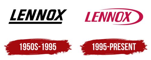
1950s – 1995
The first company logo consists of the name, written in large black letters, and a line that underlines the word.
The brand name is taken from the surname of founder Dave Lennox, who introduced the company’s furnaces for heating. Dave led the company for 7 years before selling the business. However, his name has firmly entered the brand’s history, as he, as an engineer, developed the first electric furnace fan and the idea of a central air conditioner for buildings.
The black color is associated with coal furnaces, which the company initially produced. The underline emphasizes the junctions of iron and riveted furnace structures.
Large letters symbolize the reliability and strength of the products, and the forward tilt represents growth aspirations.
1995 – today
In 1995, the company expanded its presence beyond North America, creating a separate operational division. This large-scale step was accompanied by a logo update. The rebranding became part of a strategy to refresh the brand, aimed at increasing its brightness and recognizability in new regions. The emblem consists of the name and a red arc surrounding it.
Compared to the first logo, a more elegant font with variable glyph thickness was chosen. Such a change demonstrates increased professionalism, individual approach, and expanded capabilities of climate technology. The play with thickness symbolizes the climate regulation process: adding and reducing coolness and warmth.
The arc around the word symbolizes:
- The globe, vividly demonstrating the expansion of the manufacturer.
- Airflows needed for heating and cooling spaces, which the brand specializes in.
The line resembles a bird striving forward, which, combined with the tilt of the inscription, illustrates development and improvement.
Font and Colors
The emblem is based on the color red, which symbolizes the warmth and comfort created by the brand’s products. The red color also reflects expression and deep dedication to the business, to which the company has devoted nearly 140 years.
This color is associated with speed, promising quick solutions to the customer’s problems and instant normalization of the room temperature. The bright shades enhance the visual perception of the emblem on digital media, evoking a sense of joy and festivity. The brand’s equipment looks stylish and adorns the home.
The red color also symbolizes innovation and leadership, perfectly characterizing the company with its own research center. The company has numerous innovations: intelligent thermostats with voice control, the PureAir S system that removes 99% of harmful components from the air, and air conditioners that work with solar panels.
The font of the inscription resembles bold Silo-BoldItalic.
Lennox color codes
| Maroon | Hex color: | #c51046 |
|---|---|---|
| RGB: | 197 16 70 | |
| CMYK: | 0 92 64 23 | |
| Pantone: | PMS 7636 C |


