Lukoil: Brand overview
Founded in 1991, Lukoil, a Russian multinational energy corporation headquartered in Moscow, has become a prominent player in the oil and gas sector. It emerged from the merger of three state-owned enterprises in Western Siberia – Langepasneftegaz, Urayneftegaz, and Kogalymneftegaz, named after the cities of the Khanty-Mansiysk Autonomous District where their headquarters were located. Lukoil’s longevity and successful operations ensure its continued importance in the global energy industry.
The early years of the company’s existence were marked by rapid growth and geographic expansion. In 1993, Lukoil became the first Russian corporation to be listed on the London Stock Exchange. A year later, it entered the Fortune Global 500 list. By the end of the 1990s, LUKOIL had become one of the world’s leading oil companies, operating in more than 40 countries.
Lukoil has experienced significant growth and diversification in the new millennium. Along with the expansion of exploration and production operations on domestic and international markets, LUKOIL began to develop retail trade and the petrochemical sector. An important strategic step was the acquisition of the Getty Oil Company in 2003, which created a strong foothold in the USA.
Today, LUKOIL is a titan of the global energy industry with a market capitalization of over $100 billion and more than 100,000 employees. Producing 2 million barrels of oil daily, Lukoil is one of the world’s largest and most successful energy corporations.
In 1991, LUKOIL was formed by the merger of three state-owned oil companies, marking its emergence as a significant entity in the global oil industry.
In 1993, LUKOIL achieved significant success by becoming the first Russian company to be listed on the London Stock Exchange, reflecting the development of the Russian financial system.
In 1994, LUKOIL made history again by gaining a place on the prestigious Fortune Global 500 list, strengthening its position as a key player in the world economy.
LUKOIL’s acquisition of Getty Oil Company in 2003 was a turning point in the Company’s history.
In 2008, LUKOIL opened its first gasoline station in the United States, marking a new era of convenience and accessibility for motorists.
In 2018, Lukoil celebrated another significant milestone by commissioning the first commercial oil well in the Arctic.
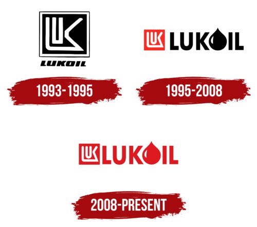
Meaning and History
1993 – 1995
1995 – 2008
2008 – today
The logo of the energy company is completely red in color – both in the background and in the text- which gives it dynamism. On the front side, there is a unique square emblem with an encrypted name. It is short and white and consists of the first three letters: “L” (with an elongated bottom part), “U” (in the shape of a fork), and “K” (connected by one line with the first glyph). The full name follows, where instead of the letter “O,” there is a drop symbolizing refined petroleum products. The font is rigid, blocky, and bold.
The red color makes the logo brighter and more energetic. The droplet, instead of the letter “O,” is a neat touch that shows what the company does without having to spell it out. The unique emblem on the front resembles a secret code, which makes it interesting and eye-catching.
Lukoil color codes
| Maximum Red | Hex color: | #df1920 |
|---|---|---|
| RGB: | 223 25 32 | |
| CMYK: | 0 89 86 13 | |
| Pantone: | PMS Bright Red C |
