


 Marathon Petroleum Logo PNG
The Marathon Petroleum logo embodies the idea of the journey and the energy that accompanies every trip. Its recognizable image has become integral to those moving forward, whether on long trips or everyday routes. This emphasizes the importance of a reliable energy source for achieving goals.
Marathon Petroleum traces its history to 1887, when Ohio Oil Company was founded in Lima, Ohio. Two years later, in 1889, it was acquired by John D. Rockefeller’s Standard Oil, placing the business inside the dominant oil empire of the period. After the U.S. Supreme Court broke up Standard Oil in 1911, Ohio Oil regained independence. It continued building its role in production, refining, and fuel marketing.
A new stage began in 1930, when Ohio Oil acquired Transcontinental Oil Company and adopted the Marathon name. The company expanded its refining, distribution, and transportation operations, turning the brand into a larger American oil business. In 1982, United States Steel acquired Marathon Oil, linking the energy company to a major industrial group during a period of corporate consolidation.
In 1998, Marathon Oil and Ashland Inc. formed Marathon Ashland Petroleum LLC, headquartered in Findlay, Ohio. The venture combined refining assets, fuel distribution, and transport infrastructure, with refining capacity above 1 million barrels per day. It gave Marathon a stronger downstream platform, separating the fuel and logistics side of the business from the older exploration-driven identity.
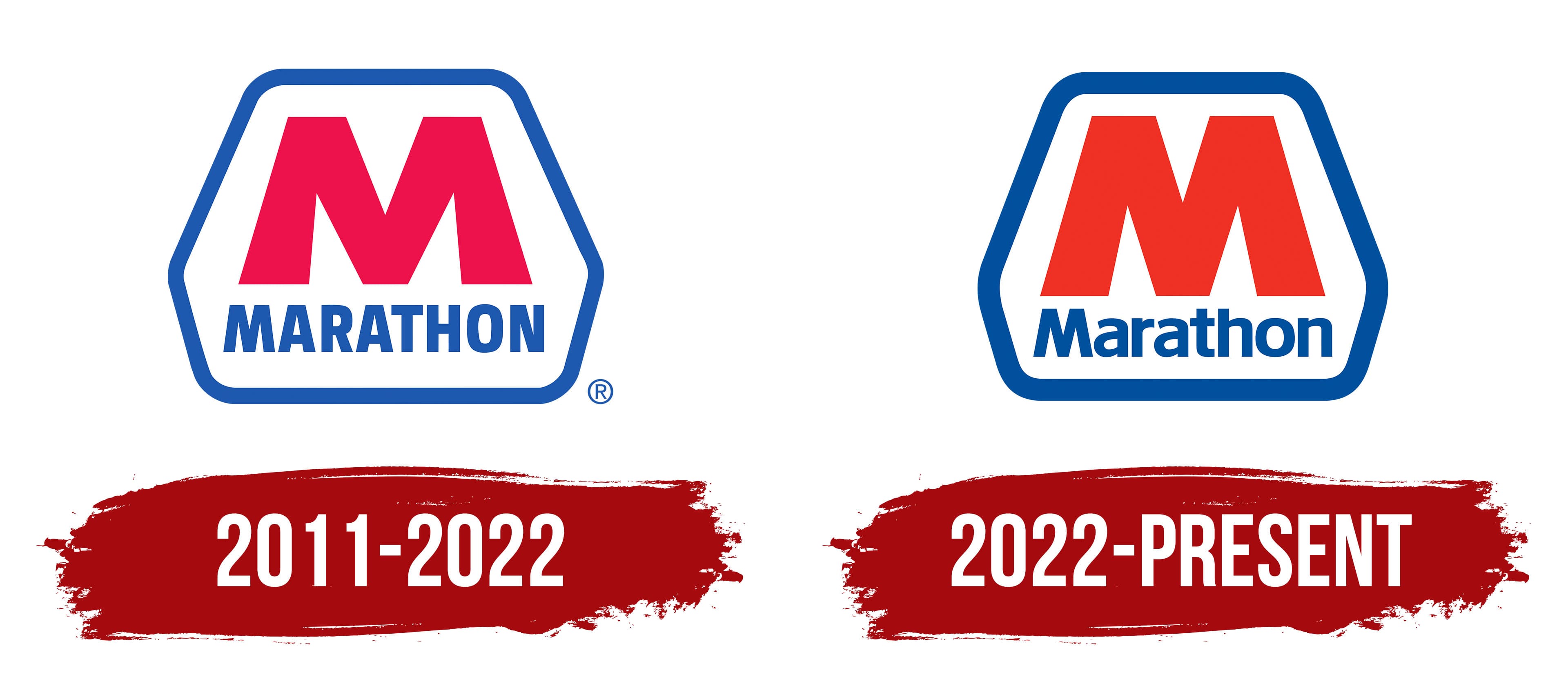
In 2011, Marathon Oil spun off Marathon Ashland Petroleum LLC and renamed it Marathon Petroleum Corporation. The new company focused on refining, marketing, and logistics. In 2018, Marathon Petroleum acquired Andeavor, expanding its U.S. refining base and strengthening its position among major downstream operators. Later, its refining capacity exceeded 3 million barrels per day, with petroleum products sold or distributed in more than 50 countries.
Meaning and History
What is Marathon Petroleum?
This is one of the largest oil refining companies in the United States, managing an extensive pipeline network through a subsidiary and operating the nation’s largest network of oil refineries. A key aspect of its operations is a vast retail network, which includes thousands of convenience stores and gas stations spread across the country. Its comprehensive business strategy, encompassing the entire cycle from refining crude oil to selling finished products and related goods to end consumers, sets the company apart from competitors. The organization also produces specialized petroleum products, such as oils and asphalt, used in various industries throughout the United States.
2011 – 2022
2022 – today
The Marathon Petroleum logo stands out with a simple yet powerful design. The large red letter “M” breaks out of a blue trapezoidal frame, evoking strength, movement, and energy.
The bold font emphasizes the “M,” and massiveness, with the edges slightly extending beyond the frame. This enhances the impression of energy that seems unable to stay contained. The red intensifies the effect, adding a sense of power and determination.
The blue frame surrounds the letter, creating a sense of stability. The trapezoidal shape with rounded corners adds softness to the strict design. The blue color of the frame symbolizes confidence and professionalism, balancing the active red. Together, these elements form a harmonious and balanced image.
Below the frame is the company name. The font is clean, modern, sans-serif, with thin blue lines. The text’s minimalism emphasizes the brand’s clarity and simplicity.
The name evokes associations with endurance, purposefulness, and overcoming challenges. It reminds me of the long, challenging journey a petroleum company must undertake, one that requires constant forward movement in a high-stress environment.
Every element of the visual mark is carefully thought out. The red letter announces power and force, the blue frame adds stability, and the text underscores modernity and simplicity. The Marathon Petroleum emblem conveys the company’s strength and confidence, creating a bold and memorable image.