


 Neste Oil Logo PNG
The Neste Oil logo stands out for its simplicity and precision. Its form speaks of movement and energy, which are at the core of the company’s activities. The emblem combines tradition with a modern approach, creating the image of a reliable partner ready to support development and sustainability in a changing world.
Neste began in 1948 as Finland’s state oil company, created to secure refined fuel supplies for a country with limited oil infrastructure. Based in Espoo, the company had to build technical knowledge, supply chains, and refining capacity almost from scratch. In 1955, Uolevi Raade became CEO and advanced the refinery program.
In 1957, Neste opened Finland’s first oil refinery in Naantali, using American technology. In 1965, it added the Porvoo refinery in Sköldvik, also known as Kilpilahti. These plants gave Finland a stronger domestic fuel base. Later, Neste took over Kesoil filling stations, expanding its retail network and linking refining with direct fuel sales.
In 1997, Neste merged with Imatran Voima Oy to form Fortum, which entered the stock market in December 1998. The merger created Neste Chemicals, which Industri Kapital later bought for $535 million. In 2004, Neste Jacobs Oy formed a joint venture with American Jacobs Engineering. In 2005, Fortum separated its oil division, creating Neste Oil Oyj as an independent company focused on refining, marketing, and renewable products.
In 2015, after a decade of moving toward renewables, the company returned to the Neste name. It kept two Finnish refineries and a fuel-station network across 14 countries, while developing renewable diesel, sustainable aviation fuel, and other renewable products. In 2021, Neste began producing renewable diesel at an industrial scale from used cooking oil and set a carbon-neutrality target for 2035.
Meaning and History
What is Neste Oil?
This Finnish oil refining company has grown from a small producer to a significant player in the global energy market. Its refineries in Porvoo and Naantali are among the largest in Northern Europe, producing a wide range of petroleum products, including specialized oils and motor fuels. One of its key strengths is its active presence in the Baltic region, where it operates an extensive network of gas stations offering both standard and premium fuel. With its logistics system, including ports and a fleet of tankers, the company ensures reliable product deliveries to customers worldwide, from Finland to Singapore.
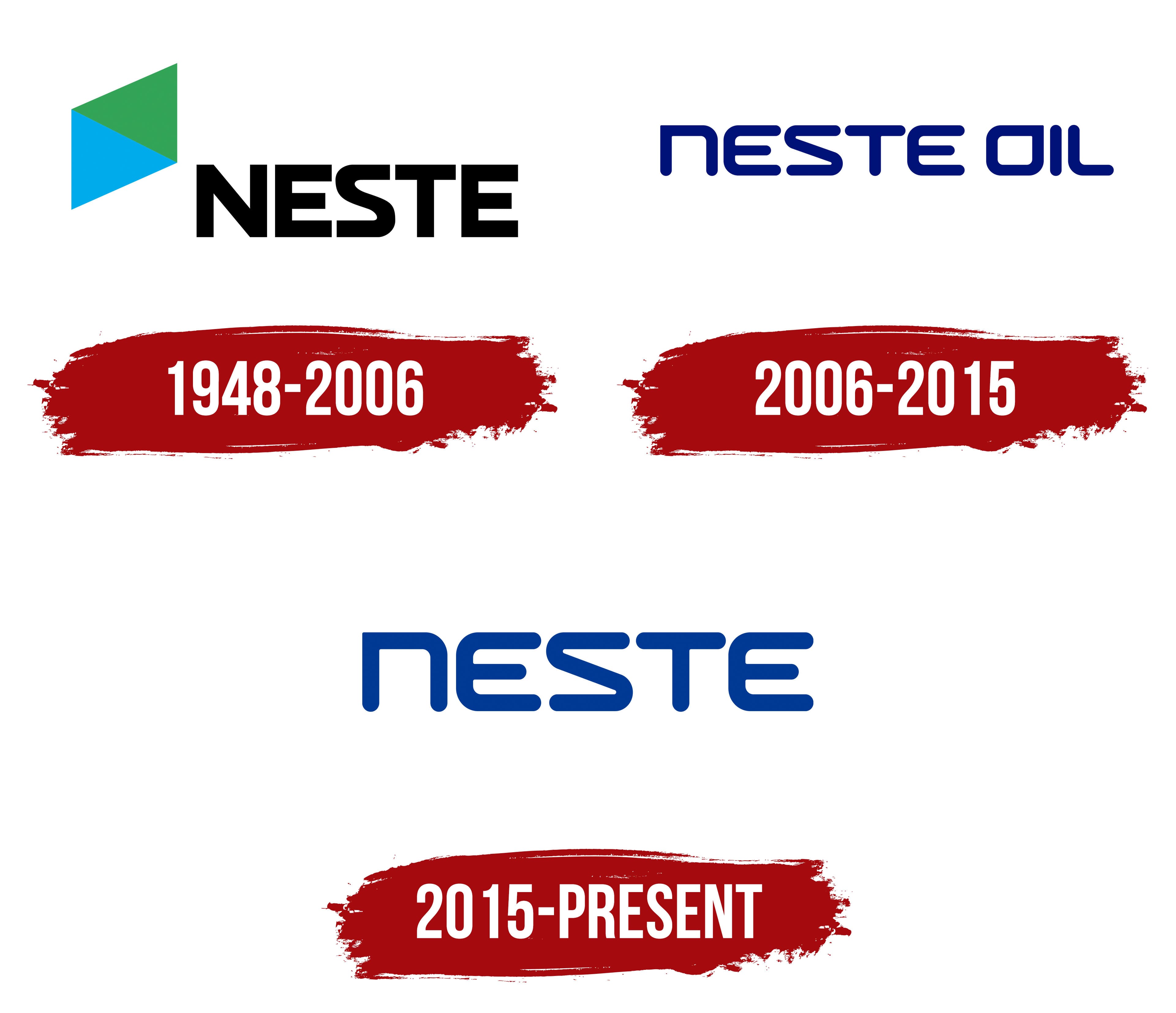
1948 – 2006

2006 – 2015
2015 – today
The Neste logo stands out with its minimalism and expressiveness. Its design combines rigidity with softness, creating a modern, approachable impression for the Finnish company. Rounded shapes and smooth lines give the visual mark a friendly appearance, while a small cut in the letter “n” adds uniqueness and emphasizes the brand’s character.
Each letter is designed as if drawn with a single continuous line, making the logo cohesive and easy to perceive. Special attention is drawn to the letter “S,” which resembles a “Z,” adding a distinctive element and setting the design apart from others. The font’s uniqueness is further emphasized by using a lowercase “n” rather than an uppercase one, which breaks conventional standards and adds individuality.
The blue font color symbolizes trust, stability, and professionalism, qualities the company takes pride in. The shade is calm and unobtrusive, reinforcing reliability and confidence.
The name references the company’s Finnish roots. In Finnish, it is associated with purity and freshness, echoing the brand’s focus on environmental technologies and innovative solutions. The name’s sound adds simplicity and reliability to the company’s image.
The letters’ shape, smooth lines, and transitions create a sense of movement and progress, reflecting the company’s drive to develop and implement cutting-edge technologies. The design is minimalist and memorable. It underscores Neste’s core values: reliability, innovation, and a commitment to improvement.