


 Newegg Logo PNG
The Newegg logo is original and memorable. It emphasizes innovation, the birth of new projects and ideas that lead to constant renewal of the company’s assortment and offers. The emblem symbolizes growth and youth.
Newegg grew out of Fred Chang’s earlier work in technology distribution. After moving from Taiwan to the United States, he founded ABS Computer Technologies in 1990, selling custom PCs through mail-order catalogs. That business showed him how strong demand had become for separate computer parts among people who built and upgraded their own machines.
In 2001, Chang founded Newegg in California, just after the dot-com crash had damaged confidence in online retail. Amazon and other internet companies were still under pressure. Still, Newegg focused on a narrower audience: technically informed buyers looking for computer components, accurate product details, customer reviews, and fast shipping. The company became profitable in its first year. It quickly turned into a key online store for gamers and PC builders.
In 2004, Newegg launched Rosewill, its private label for cables, keyboards, mice, cases, and other peripherals. Internet Retailer ranked Newegg among the top 10 U.S. online retailers in 2005, after its 2004 sales reached nearly $1 billion. In 2005, sales grew by another 30% to $1.3 billion. Chang stepped down as CEO and chairman on August 1, 2008, while staying on the board and executive committee. NeweggMall.com, Newegg.ca, and NeweggBusiness.com followed between 2008 and 2009.
By 2009, Newegg ranked second among online-only U.S. retailers, with 2008 net sales of $2.1 billion. It filed for an IPO in September 2009, then withdrew the plan in 2011. Hangzhou Liaison Interactive took control in 2016, and Digital Grid bought Newegg for $442 million in 2017 after a merger with Lianluo Smart Limited. Newegg Commerce, Inc. began trading on NASDAQ under the ticker NEGG on May 20, 2021, with a market value of $3.9 billion at the end of that month.
Meaning and History
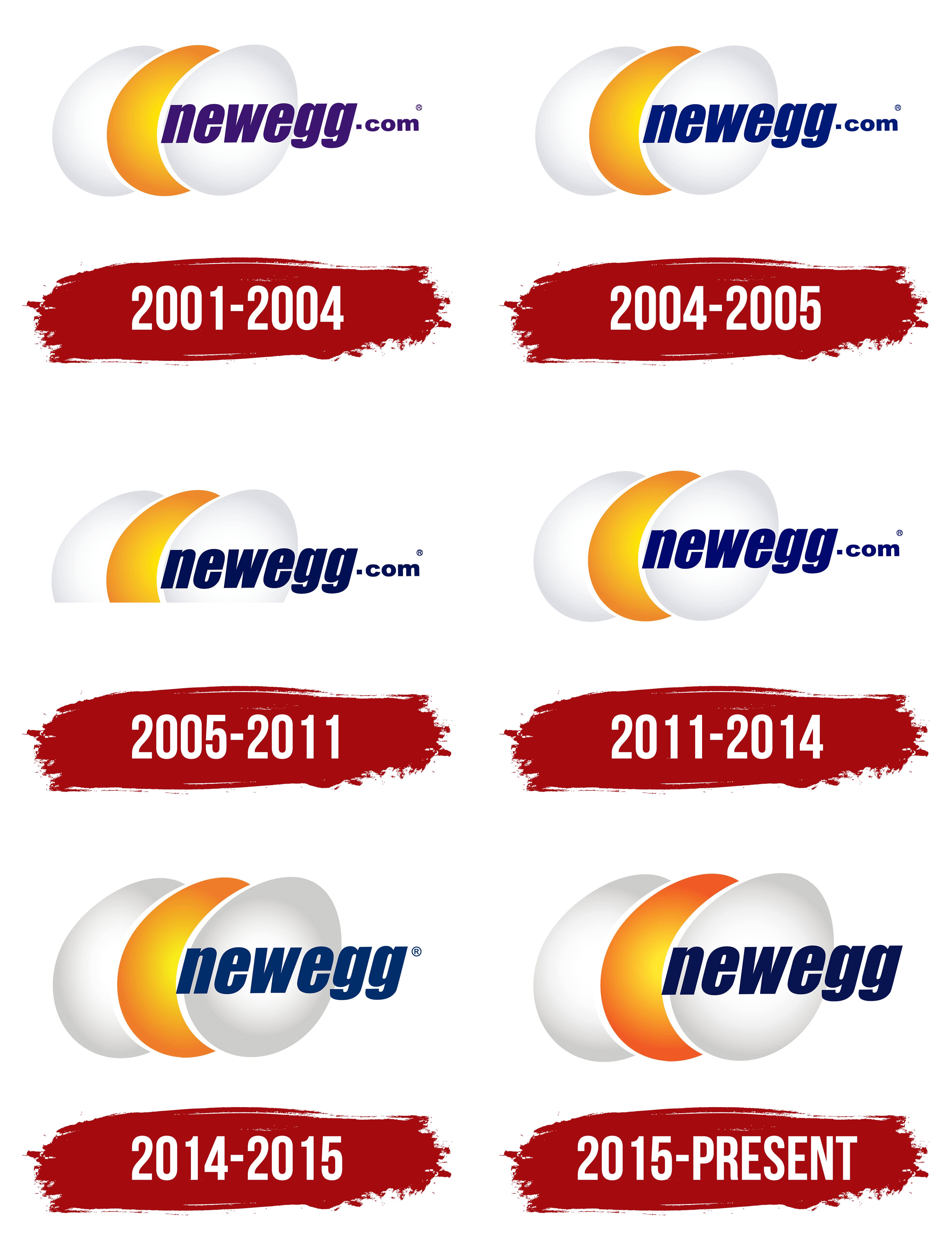
The company strives to stay up to date and regularly updates its visual identity. Since its foundation in 2001, there have been 6 changes. However, each of them represents a minor adjustment to the first version. Thus, it is more about finding the perfect option. The original idea of the golden egg proved so successful that it has continued to be used in the emblem design for over 20 years.
What is Newegg?
A large Chinese online retailer offering household goods, appliances, and electronics. It owns the following platforms: Newegg.com, NeweggMall.com, Newegg.ca, NeweggBusiness.com, JustGPU.com, and the following companies: Staff and Bridge. It provides software solutions and configurators, including: Logistics, PC Builder, Shuffle, and PC Finder.
2001 – 2004
The first company logo consists of three eggs, slightly overlapping: two white ones and a golden one in the middle. The central element features a label with the brand’s website address.
The three tilted eggs symbolize:
- The project’s youth and its recent market entry. The company has yet to demonstrate the full extent of its capabilities.
- An attempt to emphasize the project’s individuality. The golden egg, set against the background of ordinary white ones, hints at its distinctiveness and superiority.
- Profit. The store brings golden eggs, offering genuine, valuable, high-quality items and providing savings.
- Variety. Products of different groups are represented on the shelves.
The central element is a nod to the company’s founder, Fred Chang, originally from Taiwan. A common dish on the island is iron eggs. As a result of long cooking in soy sauce and drying, the product acquires a brown exterior and a light brown interior. These eggs are characterized by strength and rich flavor, as is the retailer, which stands firm and has its own style.
The number 3 is considered lucky, indicating the blessing of higher powers. It embodies talent and creativity. It also refers to the third millennium, when the retailer was born.
The inscription emerging from the egg hints at the idea of birth. At the time of the retailer’s foundation, the e-commerce industry was experiencing a downturn and problems related to the year 2000. The inscription is an attempt to tell about the bright prospects ahead. Thanks to optimism, the company successfully overcame difficulties and entered the top 10 largest online sellers in 2005.
2004 – 2005
2005 – 2011

2011 – 2014
2014 – 2015
2015 – today
The company was acquired by Chinese Liaison Interactive, which led to a gradual expansion of its scope of activities, including software development. The change of ownership was reflected in the logo as well.
Two main changes:
- An increase in egg size to showcase the giant’s growth and expansion.
- The removal of the domain name from the Newegg.com domain name registration. This approach indicated a move beyond the confines of a single e-commerce site. By that time, the company owned a range of stores with different domains and was preparing for global expansion.
Overall, the emblem conveys an impression of novelty, a desire to grow, and a commitment to bringing new ideas into the world.
Font and Colors
The visual sign combines orange, white, and dark blue.
- Orange is a warm shade that induces a sense of warmth. Shopping in the store lifts the mood. It represents the sun’s color, gold, as a hint of premium status, a high position among similar stores, and the best products.
- Dark blue signifies experience, reliability, computer technology, and artificial intelligence.
- White is the color of readiness for change, a shade of constant research and new beginnings.
The font is Fixture Italic Condensed. A slight forward tilt represents movement and dynamic development. The absence of capital letters prioritizes the user and their interests. It demonstrates the desire to be useful.